摘要
CSS (Cascading Style Sheets) describe the rendering of documents on
various media. When textual documents (e.g., HTML, WML) are laid out
on visual media (e.g., screen, paper), CSS represents the elements
of the document by rectangular boxes that are laid out one after the other or
nested inside each other in an ordering that is called a flow. This
module describes the characteristics of the flow and of the various kinds of
boxes.
CSS(カスケーディング・スタイルシート)は様々なメディアでの文書の表現方法を記述する言語である。
文書の原文(例えばHTMLやWML)が視覚的なメディアのために記述されている場合、
CSSはフローと呼ばれる順序である要素の後ろに来たり、
お互いにネストしたりする矩形のボックスによって文書内の要素を表現する。
このモジュールはフローの特徴や、ボックスの種類について規定するものである。
The flow includes "floating" boxes, but tables [CSS3TBL] and "absolute" and "fixed" positioning [CSS3POS] are described in other
modules. Also, the rules for partitioning a flow into pages (for paged media)
is described elsewhere [CSS3PAGE],
as are the special boxes for ruby annotations [CSS3RUBY] and the multicolumn layouts [CSS3COL].
フローには"浮動"ボックスも含まれる。
しかし、テーブル[CSS3TBL]と、
絶対配置や固定配置[CSS3POS]については他のモジュールにて定義される。
また、(ページドメディアの)ページ間でのフローの分割規則は[CSS3PAGE]で、
ルビ注釈の特別なボックスは[CSS3RUBY]、
マルチカラム・レイアウトは[CSS3COL]で定義される。
The box model builds on the inline text modules ([CSS3TEXT] and [CSS3LINE]), that describe how text is laid out on a
line, including treatment of superscripts, bidirectional ("bidi") and
vertical text.
ボックスモデルはインラインテキストモジュール([CSS3TEXT]、
[CSS3LINE])が基礎となっている。
それでは行にテキストがどのように配置されるのか定義しており、
superscriptsの扱いや、双方向("bidi")、そして縦書きテキストも含まれている。
The flow can be horizontal (typical for most languages), but in level 3 of
CSS, flows can also be vertical (typical for the Uighur script and often used
for ideographic scripts).
フローは(多くの言語では標準)水平方向だが、
CSSレベル3ではフローは垂直方向(ウイグル語と表意文字言語では標準)もサポートされる。
この文書の状態
This is a draft of a module of CSS level 3. It should eventually become a
CSS3 Recommendation, most likely as a chapter in a larger set of modules.
これはCSS3モジュールの草案である。
やがてはCSS3勧告になるもので、おそらくモジュールの中でも大きなものである。
All the properties and features described here that also exist in CSS
level 2 are intended to be backwards compatible, except in very rare cases
that are explicitly marked. There is a small number of new properties, mostly
to deal with vertical writing, and some properties from CSS2 have become
shorthand properties for more detailed new ones in CSS3.
ここで述べる全てのプロパティとフィーチャーはCSSレベル2と後方互換があり、
異なっている部分はごく希である。
若干の新しいプロパティと、縦書きの取り扱い、
いくつかのCSS2からあるプロパティは、
CSS3でより細かい指定を行えるようにするために簡略プロパティとなったぐらいである。
This draft should not be cited except as "work in progress." It is a work
item of the CSS working group which is part of the Style
activity (see summary). It may be modified
or dropped altogether at any point in time. Implementations for the purpose
of experimenting with the specification are welcomed, as long as they are
clearly marked as experimental.
この草案を"作業中"であることを明記せずに引用するべきではない。
これはスタイル作業(概要参照)
のCSSワーキンググループの草案である。
この草案は更新、削除されることがあるかもしれない。
(UAが)実験目的で実装することは歓迎するが、
その実装が実験目的であることは明示しなくてはいけない。
Feedback on this draft is invited. The preferred place for discussion of
this draft is the public, archived mailing
list www-style@w3.org (see instructions).
この草案へのフィードバックが欲しい。
この草案についての議論は公の場で行いたい。
アーカイブ、
メーリングリストwww-style@w3.org
(イントロダクション参照)。
Patent disclosures relevant to CSS may be found on the Working Group's
public patent disclosure page.
CSSにとって適切な特許開示情報は、
ワーキンググループの特許開示ページにて参照できる。
To find the latest version of this working draft, please follow the
"Latest version" link above, or visit the list of W3C Technical Reports.
この草案の最新バージョンは上記リンクの"最新の版"でフォローするか、
もしくはW3CTechnical Reportsのリストを参照して欲しい。
目次
1. 依存するモジュール
This CSS3 module depends on the following other CSS3 modules:
このモジュールは次のCSS3モジュールに依存している:
It has non-normative (informative) references to the following other CSS3
modules:
次は標準ではないが(有益な)参考になるCSSモジュールである:
- CSS3モジュール: テーブル - テーブル内でボックスモデルがどのように変更されるか。
- CSS3モジュール: ポジショニング - 絶対配置要素内でボックスモデルがどのように変更されるか。
- CSS3モジュール: ルビ - ルビ注釈によってボックスモデルがどのように変更されるか。
- 生成テキスト、リスト
- 選択子 [SELECT]
- CSS3モジュール: ボーダー [CSS3BORDER] — 'border-width'プロパティ
- CSS3モジュール: 色 [CSS3COLOR] — 色と透過
- [others?]
2. 表記方法
Each property is introduced by a table summarizing its usage. See [where? Introduction?] for an explanation. The values
'inherit' and 'initial' are
valid on all properties, but are omitted from the tables for brevity's sake.
They are explained in [where? Cascading module?]
それぞれのプロパティはその使い方を要約した表で紹介している。
説明のために[イントロダクションで良いのか?]を参照。
'継承'と'初期値'の値は全てのプロパティに存在する。
しかしコンパクトにするために表から省かれている。
それらは[カスケードモジュールで良いのか?]にて説明されている。
Note that non-normative notes generally start with the word
"note" and are rendered like this paragraph.
この段落のように「メモ」で始まる部分は標準ではない内容であることに注意。
Examples look like this.
例はこのように見える。
3. イントロダクション
[To do: provide some examples with XHTML and "generic XML."]
[TODO: XHTMLと"一般のXML"での例が必要。]
The formatting model of CSS for visual media is based on a "flow" of
rectangular boxes, that are either juxtaposed or nested, according to certain
rules. There are several kinds of boxes (block boxes, inline boxes, table
boxes, floating
boxes,...). Properties such as 'margin' and 'float' can modify the position of a box relative to
other boxes to a certain extent.
視覚メディアでのCSSのフォーマッティングモデルは、
ある規則に従って互いに並べられたり、ネストされている矩形のボックスの"フロー"が基礎となる。
それにはいくつかのボックスの種類がある(ブロックボックス、インラインボックス、
テーブルボックス、浮動ボックス等々)。
'margin'、
'float'のようなプロパティは、
ある程度他のボックスに関連してボックスの位置を変更できる。
Typically, an element in the source document corresponds to a box on the
display, but sometimes an element has more than one box (e.g., a list item
and its bullet, or a box that is broken over two lines), and sometimes there
is no box at all (if the rendering has been suppressed with the property
'display: none'). Conversely, every box either
belongs to a single element in the source, or it is an "anonymous" box that
belongs to no element but is created by the rules in the style sheet (but
then it indirectly belongs to the element that its parent box belongs to).
This relation is important for interactive presentations, including WYSIWYG
editors, because every event on a box, such as a mouse click, can
unambiguously be linked to a specific element in the document source.
一般的に、ソース文書の要素が表示上のボックスと一致する。
しかし、要素が1つ以上のボックスを持つこと(例えばリスト項目と、そのマーカーや、
ボックスが2行以上に渡って分割される場合)もあるし、
ボックスが無いこと('display: none'によって生成が抑制された場合)もある。
逆に、ソース上のひとつの要素に属しているボックスがある一方で、
どの要素にも属さず、スタイルシートの規則によって生成される"匿名"ボックスもある
(ただし親ボックスに属することによって、ある要素に間接的に属することにはなる)。
この関係はWYSIWYGエディタを含む、双方向のプレゼンテーションには重要である。
なぜならマウスのクリックのような全てのイベントはボックスで発生し、
明確に文書ソースの要素と詳細にリンクさせることができるからだ。
CSS level 3 supports three orientations of flows. In this module we will refer
to them as horizontal, vertical-rl and vertical-lr. Horizontal flow has
horizontal text and the flow grows downwards. This is the typical flow for
most languages, e.g., English, Greek or Arabic. Vertical-rl flow has vertical
text and the flow grows to the left. This orientation is often used in
Japanese and Chinese. Vertical-lr flow also has vertical text, but
the flow grows to the right ("lr" = "left to right").
This is the typical orientation for the Uighur script, one of the scripts
used for Mongolian. Horizontal flow that grows upwards is not supported, and
neither are diagonal flows nor complex shapes (spirals, zigzag,...). Such
texts can usually be achieved with a combination of SVG [SVG10] and CSS. The orientation of a flow is set
(indirectly) with the 'writing-mode' shorthand property.
CSSレベル3は3文書方向のフローをサポートしている。
このモジュール内でこれら水平フロー(horizontal)、
右からの垂直フロー(vertical-rl)、
左からの垂直フロー(vertical-lr)について説明する。
水平フローは水平方向のテキストが下方へと続く。
これは多くの言語、例えば英語、ギリシャ語、アラビア語等にとって一般的なものである。
右からの垂直(vertical-rl)フローは垂直方向のテキストが左へと続く。
この文書方向は日本語と中国語でしばしば用いられる。
左からの垂直(vertical-lr)フローもまた、
垂直方向のテキストだが、右へと続く("lr" = "left to right")。
これはウイグル語で一般的な文書方向で、モンゴル人に利用されている言語である。
水平フローは上方向へ続くものはサポートしない。
斜め方向のような複雑なフローもない(螺旋、ジグザグ。。。)。
そのようなテキストはSVG[SVG10]とCSSの連携によって実現される。
文書方向は'writing-mode'簡略プロパティで(間接的に)指定される。
Boxes have a content with a
certain width and height (which can often be set explicitly with the 'width' and 'height' properties). Around
that can be an optional area called the padding (the thickness of which is controlled with the 'padding' property; '0' means
no padding). Around the padding can be a border (controlled by the 'border'
property). Finally, boxes also have a margin around the border (specified with the 'margin' property). The
outside edges of these areas are called content
edge, padding edge, border
edge and margin edge respectively. When we talk
about the width/height of a box, we mean the width/height of the content
area, unless otherwise specified.
ボックスは内容(content)と確かな幅と高さ
(これは明示的に'width'と
'height'プロパティによって指定されることもある)を持つ。
その周りにはオプションの領域があり、パディング(padding)と呼ばれる
(その厚さは'padding'プロパティによって指定できる。
'0'はパディングが無いことを意味する)。
パディングの周りにはボーダー(border)がある
('border'プロパティによって指定できる)。
最後にボックスはボーダーの周りにマージン(margin)を持つ
('margin'プロパティによって指定できる)。
これらの領域の外辺をそれぞれ、内容辺(content edge)、
パディング辺(padding edge)、
ボーダー辺(border edge)、
マージン辺(margin edge)と呼ぶ。
私たちがボックスの幅及び高さについて述べる場合、
特に但し書きが無い限りは内容領域の幅及び高さを意味する。
Apart from the areas and edges defined above, the text uses a number of
other technical terms in the definitions of properties. Those terms are
always linked to the glossary at the end of this
document.
上記の領域と辺は別にして、プロパティの定義で多くの他の技術用語を使っている。
それらの用語は常にこの文書末尾の用語集へとリンクしている。
4. 'display'、'display-model'、'display-role'プロパティ
| 名前:
| display-model
|
| 値:
| inline-inside | block-inside | table | ruby
|
| 初期値:
| text
|
| 適用対象:
| 全要素
|
| 継承:
| しない
|
| パーセント値:
| なし
|
| メディア:
| visual
|
| 算出値:
| 指定値
|
| 名前:
| display-role
|
| 値:
| none | block | inline | list-item | run-in | compact | table-row |
table-cell | table-row-group | table-header-group | table-footer-group |
table-column | table-column-group | table-caption | ruby-text | ruby-base |
ruby-base-group | ruby-text-group
|
| 初期値:
| inline
|
| 適用対象:
| 全要素
|
| 継承:
| しない
|
| パーセント値:
| なし
|
| メディア:
| visual
|
| 算出値:
| 指定値
|
| 名前:
| display
|
| 値:
| inline | block | inline-block | list-item | run-in | compact | | table |
inline-table | table-row-group | table-header-group | table-footer-group |
table-row | table-column-group | table-column | table-cell | table-caption |
ruby | ruby-base | ruby-text | ruby-base-group | ruby-text-group | none
|
| 初期値:
| inline
|
| 適用対象:
| 全要素
|
| 継承:
| しない
|
| パーセント値:
| なし
|
| メディア:
| visual ('none'は全てのメディアに適用可能)
|
| 算出値:
| 各プロパティ参照
|
The 'display-model' property determines the
algorithm with which an element lays out its children, 'display-role' specifies
what role an element has in its parent's algorithm, and 'display' is a shorthand for
the most common combinations of the two.
'display-model'プロパティは、
その要素がどのように子供をレイアウトするのかを決める、
'display-role'プロパティは、
親要素内でのその要素の役割を決める。
そして、'display'プロパティは、
そのふたつのプロパティの一般的な組み合わせの簡略プロパティである。
The equivalence between 'display', 'display-model' and 'display-role' is as
follows:
'display'、
'display-model'、
'display-role'の関係は次のようになる:
|
| inline-inside
| block-inside
| table
| ruby
|
|
|
| none**
| none
| none
| none
| none
|
|
|
| inline
| inline
| inline-block
| inline-table
| ruby
|
|
|
| block
| ***
| block
| table
| ??
|
|
|
| list-item
| ***
| list-item
| *
| ??
|
|
|
| run-in
| run-in
| *
| *
| *
|
|
|
| compact
| compact
| *
| *
| *
|
|
|
| table-cell
| ***
| table-cell
| *
| ??
|
|
|
| table-caption
| ***
| table-caption
| *
| ??
|
|
|
| table-row-group**
| table-row-group
|
| table-header-group**
| table-header-group
|
| table-footer-group**
| table-footer-group
|
| table-column**
| table-column
|
| table-column-group**
| table-column-group
|
| table-row**
| table-row
|
| ruby-base**
| ruby-base
|
| ruby-text**
| ruby-text
|
| ruby-base-group**
| ruby-base-group
|
| ruby-text-group**
| ruby-text-group
|
|
|
|
The values of 'display-model' have the following meaning.
(For ease of reading, we describe only horizontal flow.)
'display-model'の値は次のような意味である。
(読みやすさのために水平フローに限定して述べている。)
- table
See the Tables module [CSS3TBL].
テーブルモジュール[CSS3TBL]参照。
- ruby
See the Ruby module [CSS3RUBY].
ルビモジュール[CSS3RUBY]参照。
- inline-inside
If this is not an inline-level
element, the effect is the same as for 'block-inside'. Otherwise the
element's inline-level children and text sequences that come before the first
block-level child are rendered as additional
inline boxes for the line boxes of the containing
block. Ditto for the text sequences and inline-level children after
the last block-level child. The other children and text sequences are
rendered as for 'block-inside'.
もし、これがインライン要素ではない場合、
その効果は'block-inside'と同じである。
そうではない場合、
最初のブロックレベルの子の前に来るインラインレベルの子要素とテキストは
包含ブロックの行ボックスに追加されたインラインボックスとして表示される。
ブロックレベルの子の後のテキストとインラインレベルの子についても同上。
他の子とテキストは'block-inside'として表示される。
- block-inside
Child elements are rendered as described for their 'display-role'.
Sequences of inline-level elements and anonymous inline
elements (ignoring elements with a display-role of 'none') are
rendered as one or more line
boxes. (How many line boxes depends on the line-breaking rules,
see the Text module [[!CSS3-text].)
子要素はその'display-role'値によって表示される。
インラインレベル要素と
匿名インライン要素(anonymous inline elements
(display-roleが'none'の要素は除く)はひとつ以上の
行ボックスによって表示される。
(いくつの行ボックスかは改行規則に依存する。テキストモジュール[[!CSS3-text]参照。)
Note that an element with 'display-model' of 'block-inside' may contain anonymous inline
elements. For example, the texts "Your" and "or your" are anonymous
inline elements of this paragraph:
'display-model'が
'block-inside'の要素は匿名インライン要素を含むかもしれない。
例えば、この段落の"Your"と"or your"が匿名インライン要素である:
<p>
Your <em>money</em> or your <em>life!</em>
</p>
The difference between 'inline-inside' and 'block-inside' is subtle. It is best illustrated with the
difference between inline elements and inline-block elements. Assume the
following document:
'inline-inside'と'block-inside'の違いは微妙だ。
インライン要素とインラインブロック要素の違いは良い例である。
次の文書を想定する:
<p>The two words <span>two words</span> appear twice in this para.</p>
Further assume the following style sheet:
そして次のスタイルシートを想定する:
p    { display-model: block-inside }
span { display-role: inline; display-model: inline-inside }
The second line is equivalent to (and would usually be written as) 'span {display: inline}'. The rendering might look like
this:
2行目は'span {display: inline}'と同じ意味である
(そして大抵はこのように書かれるだろう)。
これは次のように表示される:
If the 'display-model' of the span is changed to
'block-inside' (i.e., equivalent to 'span {display: inline-block}'), and we further set the
'width' to an appropriate value, e.g.:
spanの'display-model'を
'block-inside'に変更(つまり、
'span {display: inline-block}'と同様)した場合。
さらに適切な値として'width'も指定している:
p    { display-model: block-inside }
span { display-role: inline; display-model: block-inside;
       width: 2.5em}
then the rendering will become like this:
次のようになるだろう:
The values of 'display-role' have the following meaning.
(Where we talk about "next element," we ignore any intervening elements with
'display-role: none'.) The descriptions assume horizontal flow for easier
reading, but vertical flow is analogous.
'display-role'の値は次のような意味である。
("次の要素"について書いている場合、'display-role: none'の要素は無視して考える。)
次の説明は簡単にするために水平フローの場合であるが、垂直フローもこれに類似している。
- none
The element is not rendered. The rendering is the same as if the element
had been removed from the document tree, except for possible effects on
counters (see [generated] or [paged]).
その要素は表示されない。
その表示は文書ツリーからその要素が削除されたのと同じであるが、
カウンタの効果を除く([generated]もしくは[paged]参照)。
Note that :before and :after pseudo elements of this element
are also not rendered, see [generated].)
この要素の:beforeと:after疑似要素もまた表示されないことに注意。
[generated]参照。
- run-in
The effect depends on what comes after the element. If the next element
(in the depth-first, left to right tree traversal, so not necessarily a
sibling) has a 'display-model' of 'block-inside', the current element will be
rendered as if it had display-role 'inline' and was the first child of that
block element. Otherwise this element will be rendered as if it had
display-role 'block'. [Does this explain Ian's
tests?]
効果は後にくる要素に依存する。
次の要素
(その深度で、左から右へツリー移動、兄弟である必要はない)
が'display-model'に'block-inside'の場合、
要素はdisplay-roleが'inline'でそのブロック要素の最初の子であるかのように表示される。
それ以外の場合、要素はdisplay-roleが'block'であるかのように表示される。
[これは イアンのテストで説明するか?]
- compact
The effect depends on the intrinsic
size of this element and on what comes after it. If the next element
has a 'display-role' of 'block', and the intrinsic width of the compact
element is less than or equal to the left margin of that block (resp. the
right margin, if the block's 'direction' is 'rtl'), then the compact element
is rendered in the left (right) margin of the block at its intrinsic size and
baseline aligned with the first line box of the block. [Do we need a different alignment depending on script?]
In all other cases the compact element is rendered as if its display-role was
'block'.
効果はその要素の内在寸法(intrinsic size)と後に来る要素に依存する。
次の要素の'display-role'が'block'の場合、コンパクト要素の内在幅はその左マージン以下である
(ただし、ブロックの'direction'が'rtl'なら右マージンで考える)。
そしてコンパクト要素はそのブロックの左(右)マージンにその内在幅で、
またブロックの最初の行ボックスのベースラインにあわせて配置される。
[Do we need a different alignment depending on script?]
他の場合ねコンパクト要素はdisplay-roleが'block'であるかのように表示される。
- list-item
The element is rendered the same as if it had display-role 'block', but
in addition a marker is generated (see 'list-style').
要素はdisplay-roleか'block'であるかのように表示される。
ただし、マーカーを追加生成する('list-style'参照)。
- block
The element is rendered as a rectangular block. See Collapsing margins for its position relative to
earlier boxes in the same flow. In paged media [ref] or inside another
element that has two or more columns, the box may be split into several
smaller boxes.
矩形のブロックとして表示される。
同じフローの先のボックスに対する配置はマージンの相殺を参照。
ページドメディア[ref]もしくは他の2つ以上のカラムを持つ要素の内側では、
ボックスはいくつかの小さなボックスに分割されるかもしれない。
- inline
The element is rendered inside a line box. It may be split into several
boxes because of line breaking and bidi processing (see the Text module).
要素は行ボックス内に表示される。
これは改行や双方向テキストのために複数のボックスに分割されるかもしれない(テキストモジュール参照)。
- table-...
See the Tables module [CSS3TBL].
テーブルモジュール[CSS3TBL]参照。
The computed value of 'display-role' is influenced by the 'float' property (and, in case
the Positioning module [CSS3POS] is
in use, also by 'position'):
'display-role'の算出値は、
'float'プロパティ
(及び、ポジショニングモジュール[CSS3POS]の
'position')によって影響を受ける。
If the computed value of 'float' is 'none', the computed value
of 'display-role'
is the same as the specified value.
'float'の算出値が'none'の場合、
'display-role'の算出値は指定値と同じ。
Otherwise, the computed value of 'display-role' is 'block', unless the specified value is 'none' or 'list-item', in which
case it is the same as the specified value.
それ以外の場合、'display-role'の算出値は'block'となる。
ただし、指定値が'none'か'list-item'のどちらかの場合、
算出値は指定値と同じになる。
[The idea here is that a list item can float and still keep
its bullet. Is this useful? Or should list items turn into normal blocks when
they float?]
[これはリストアイテムを浮動させてもマーカーも付いてくるというアイデアだ。
これは有用だろうか?
もしくは浮動させる時に通常のブロックに戻すべきだろうか?]
(As usual, the above holds after processing 'inherit' and 'initial'.)
いつも通り、上記は処理後の'inherit'と'initial'を持つ。
[Add an elaborate illustration showing line boxes, block elements, margins
between them, a marker, etc.]
[行ボックス、ブロック要素、それらのマージン、マーカー等を見せる、手の込んだイラストを追加しよう。]
Here is an HTML example with various types of boxes:
ボックスのHTMLでの様々なタイプの例:
<style type="text/css">
  h3 { display: run-in; margin: 1em 0 }
  h3:after { content: ". " }
  p { display: block; margin: 1em 0 }
  img { display: block; margin: 2em }
  span { display: inline-block; padding: 0.6em;
    font-size: 70%; vertical-align: middle }
</style>
<h3>First heading</h3>
<h3>Second heading</h3>
<p>This paragraph has an image that is displayed as a block:
  <img src="w3c_home" ALT="W3C">
  and also an inline-block:
  <span>
    This element<br>
    has two lines
  </span>
A possible rendering is as follows:
次のように表示されるだろう:
The first h3 was not rendered inline, because it
was not followed by a block. The top and bottom margin that was set on h3 only apply when the element is rendered as a block.
最初のh3はインラインとしては描画されない。
なぜなら次がブロックではないからだ。
h3に設定された上下のマージンは、
その要素がブロックとして表示される時にしか適用されない。
4.1. 通常フローレイアウトと他のフローとの混在
In document formats that combine different layout models (e.g., a document
type that combines SVG with HTML in a single document), it may be necessary
to introduce additional values for 'display-model', for the layout models that
are not defined by CSS3. It is up to the specification of such formats to
define appropriate keywords.
異なるレイアウトモデルが混在する場合(例えばSVGとHTMLがひとつの文書内にある場合等)で、
そのレイアウトモデルがCSS3で定義されているわけではない場合、
'display-model'に値が追加される必要があるかもしれない。
適当なキーワードを定義することはそのようなフォーマットの仕様次第である。
[Do we recommend a naming scheme?]
[名前スキームを推奨すべきか?]
5. 'padding'プロパティ
| 名前:
| padding
|
| 値:
| [ <length> | <percentage> ]{1,4}
|
| 初期値:
| 各プロパティ参照
|
| 適用対象:
| 全要素
|
| 継承:
| しない
|
| パーセント値:
| 包含ブロックの幅*
|
| メディア:
| visual
|
| 算出値:
| 各プロパティ参照
|
| 名前:
| padding-top , padding-right, padding-bottom, padding-left
|
| 値:
| [ <length> | <percentage> ]
|
| 初期値:
| 0
|
| 適用対象:
| 全要素
|
| 継承:
| しない
|
| パーセント値:
| 包含ブロックの幅*
|
| メディア:
| visual
|
| 算出値:
| <length>
|
Sets the thickness of the padding around a box. The value may not be
negative. The color/pattern of the element's background extends into the
padding. See the 'background' property.
ボックス周辺のパディングの厚みを設定する。
値は負ではないかもしれない。
要素の背景の色、及びパターンはパディング領域にも広がる。
'background'プロパティを参照。
'Padding' is a
shorthand that sets the four other properties at the same time. If 'padding' has 4 values, they
are for top, right, bottom and left in that order. If left is omitted, it is
the same as right. If bottom is omitted it is the same as top, if right is
omitted it is the same as top.
'padding'は4つの他のプロパティの簡略プロパティである。
'padding'が4値を持つ場合、
それぞれ、上、右、下、左の順となる。「左」が省略された場合、それは「右」と同じ値になる。
「下」も省略された場合、「上」と同じ値になる。
「右」も省略された場合、「上」と同じ値になる。
When the padding is 0, we say that the padding is absent.
パディングが0の場合、パディングは無くなる。
Note that percentages on 'padding-top' and 'padding-bottom' are relative to the width of the containing block, not the height (at
least in a horizontal flow; in a vertical flow they are relative to the
height).
'padding-top'と
'padding-bottom'の
パーセント値は包含ブロックのwidthが基準であり、
heightでは無いことに注意(これは水平フローの場合。垂直フローではheightを基準とする)。
6. 'border-width'プロパティ
[Move this to the Border module? For the Box model, we just
need the fact that borders have a certain width, without saying how it is
specified.]
[ボーダーモジュールへ移すべきか?
ボックスモデルにとってはボーダーに幅があるという事実が必要である。
これ無しにどのように説明できるのだろうか。]
| 名前:
| border-top-width, border-right-width, border-bottom-width, border-left-width
|
| 値:
| <length> | <percentage> | thin | medium
| thick
|
| 初期値:
| medium
|
| 適用対象:
| 全要素
|
| 継承:
| しない
|
| パーセント値:
| 包含ブロックの幅*
|
| メディア:
| visual
|
| 算出値
| 指定値
|
| 名前:
| border-width
|
| 値:
| <border-width>{1,4}
|
| 初期値:
| (各プロパティ参照)
|
| 適用対象:
| 全要素
|
| 継承:
| しない
|
| パーセント値:
| なし
|
| メディア:
| visual
|
| 算出値:
| 各プロパティ参照
|
[Border-width doesn't allow percentages in CSS2; should we
allow percentages (of the containing block's width) in CSS3?]
[border-widthはCSS2ではパーセント値が許可されていなかった。
CSS3では(包含ブロックの幅に対する)パーセント値を許可すべきだろうか?]
These properties set the thickness the border. For the style, color, etc. of the border, as
well as for the 'border' shorthand property,
see the Border module [CSS3BORDER].
これらのプロパティはボーダーの厚みを設定する。
ボーダーのスタイルや色、その他の指定は'border'簡略プロパティで行える。
ボーダーモジュール[CSS3BORDER]を参照。
The <border-width> can be '<length> | thin | medium
| thick'. The <length> may not be negative. The lengths
corresponding to 'thin', 'medium' and 'thick' are not specified, but the
values are constant throughout a document and thin <= medium <= thick.
A UA could, e.g., make the thickness depend on the 'medium' font size: one
choice might be 1, 3 & 5px when the 'medium' font size is 17px or less.
<border-width>は'<length> | thin | medium | thick'値をとる。
<length>は負の値ではないかもしれない。
'thin'、'medium'、'thick'の長さは定義しない。
しかし、これらの値の関係は一定で、thin <= medium <= thickとなる。
UAはこれらの太さを'medium'フォントサイズに依存させることができる:
一例として、'medium'フォントサイズが17pxもしくはそれ以下の場合、1、3、5pxといった具合である。
'Border-width'
is a shorthand that sets the four 'border-*-width' properties. If it has four
values, they set top, right, bottom and left in that order. If left is
missing, it is the same as right; if bottom is missing, it is the same as
top; if right is missing, it is the same as top.
'border-width'は、
4つの'border-*-width'プロパティの簡略プロパティである。
4つの値がある場合、それらは上、右、下、左の順の意味である。
もし「左」が無い場合、「右」と同じ値をとる。
もし「下」も無い場合、「上」と同じ値をとる。
もし「右」も無い場合、「上」と同じ値をとる。
Note that the initial width is 'medium', but the initial
style is 'none' and therefore the computed width is 0. See [CSS3BORDER].
幅の初期値は'medium'であるが、スタイルの初期値は'none'であり、これにより算出値がゼロになることに注意。
[CSS3BORDER]参照。
When the computed width of the border is 0, we say that the border is
absent.
ボーダーの算出幅が0の場合、ボーダーは無くなる。
7. 'margin'プロパティ
| 名前:
| margin-top , margin-right, margin-bottom, margin-left
|
| 値:
| <length> | <percentage> | auto
|
| 初期値:
| 0
|
| 適用対象:
| 全要素
|
| 継承:
| しない
|
| パーセント値:
| 包含ブロックの幅*
|
| メディア:
| visual
|
| 算出値:
| <length>
|
| 名前:
| margin
|
| 値:
| [ <length> | <percentage> | auto ]{1,4}
|
| 初期値:
| (各プロパティ参照)
|
| 適用対象:
| 全要素
|
| 継承:
| しない
|
| パーセント値:
| 包含ブロックの幅*
|
| メディア:
| visual
|
| 算出値:
| 各プロパティ参照
|
These properties set the thickness of the margin. The value may be negative, but the UA may
impose a lower bound.
これらのプロパティはmarginの厚さを指定する。
値は負かもしれない。
しかし、UAの実装の制限はあるかもしれない。
'Margin' is a
shorthand to set top, right, bottom and left together. If four values are
given, they set top, right, bottom and left in that order. If left is
omitted, it is the same as right. If bottom is omitted, it is the same as
top. If right is omitted it is the same as top.
'margin'は上、右、下、左を共に指定する簡略プロパティである。
もし値が4つ指定されているなら、それらは上、右、下、左の順での指定となる。
もし「左」が省略されていた場合、「右」と同じ値をとる。
もし「下」も省略されていた場合、「上」と同じ値をとる。
もし「右」も省略されていた場合、「上」と同じ値をとる。
The meaning of 'auto' on 'margin-left' '-right',
'-top' and '-bottom' is as follows:
'margin-left'、'-right'、'-top'、'-bottom'に'auto'が指定されている場合の意味は次の通り:
Margins must satisfy certain constraints, which means that the computed
value may be different from the specified value. See equation
(1) below.
マージンは全体に広がらなくてはいけない。。
その意味は算出値は指定値とは違うかもしれないということである。
下記、equation (1)を参照。
Note that in a horizontal flow, percentages on
'margin-top' and
'margin-bottom'
are relative to the width of the containing
block, not the height (and in vertical flow, 'margin-left' and 'margin-right' are relative to the height,
not the width).
水平フローにおいて、
'margin-top'と
'margin-bottom'のパーセント値は、
包含ブロックのheightではなくwidthを基準としていることに注意
(垂直フローの場合、'margin-left'と
'margin-right'はwidthではなくheightを基準とする)。
Note that 'margin-top' and 'margin-bottom' do not apply to
non-replaced, inline elements (in horizontal flow); see [CSS3LINE].
'margin-top'と
'margin-bottom'は非置換インライン要素には適用されない
(水平フローの場合)。
[CSS3LINE]参照。
8. 'width'、'height'プロパティ
| 名前:
| width, height
|
| 値:
| <length> | <percentage> | <number> | auto
|
| 初期値:
| auto
|
| 適用対象:
| 'display-model'が
'inline-inside'のインラインレベル要素を除く全ての要素
|
| 継承:
| しない
|
| パーセント値:
| 包含ブロックのwidthもしくはhiehgt。ただし説明を参照。
|
| メディア:
| visual
|
| 算出値:
| <length> もしくは 'auto' (説明参照)
|
[Idea by David Baron: add keyword values 'intrinsic' and
'min-intrinsic' to force an element to have its intrinsic or minimum width.]
[David Baronのアイデア:
要素に内在寸法、もしくはその最小値を強制する、
'intrinsic'と'min-intrinsic'のキーワード値を追加する。]
This property sets the width resp, height of the content area.
The value may not be negative and in addition the UA may impose a certain
lower bound.
このプロパティは内容領域の幅と高さを指定する。
この値に負の値ではないかもしれないが、UAの実装の限界があるかもしれない。
Width and height are symmetric: the role of width and height are exactly
interchanged in horizontal and in vertical text. Below we explain only width;
height can be derived from that by interchanging "horizontal" and "vertical."
幅と高さは対照的である。
幅と高さの役割は、横書きテキストと縦書きテキストではまさに反対に入れ替わる。
幅についてのみ述べると、
水平フローと垂直フローの変換によって高さになれる。
The computed value is normally a <length>, but in the
following cases it can also be 'auto':
算出値は通常、<length>だが、
次のケースでは算出値は'auto'である:
In these two cases, a specified value of 'auto'
cannot be replaced by a <length> on the basis of information
that is available at the start of the element, i.e., based solely on the
width and height of preceding elements and ancestors.
これらのふたつのケースにおいて、
'auto'の指定値は要素の開始位置で入手できる情報を基にして
<length>で置換することはできない。
つまり、前の要素や祖先要素の幅と高さを基準とする。
8.1. <length>、<percentage>値
A <percentage> is relative to the computed value of the
width or height of the containing block, but if
that value is 'auto' the computed value for the
percentage is also 'auto'.
<percentage>は包含ブロックの幅もしくは高さの算出値を基にする。
しかしこれらの値が'auto'なら、パーセント値の算出値もまた'auto'になる。
Note: when 'width' or 'height' is set to a value other than 'auto' on a replaced element, the size of content area is
set to that value and the content may be scaled or otherwise deformed to fit
the area; see "the 'auto' value" below. If both 'width' and 'height' are set, the scaling
may even be different in the two directions; see the 'fit' property.
メモ:
置換要素の'width'
もしくは'height'が
'auto'以外の値の時、
その内容領域のサイズをその値にし、内容はその領域にフィットするように拡大・縮小、
もしくは変形するかもしれない。
以下の"'auto'値"参照。
'width'と
'height'が共に設定されている場合、
その拡大・縮小方法はふたつの方向で違うかもしれない。
'fit'プロパティを参照。
8.2. <number>値
A <number> value sets the width or height to that many
times the intrinsic width resp. height of
the element. [It is only defined for replaced
elements?] The computed value is the result of
that multiplication (a <length>) [or is
it the number? does it matter?].
<number>値を幅もしくは高さに指定すると、
それはその要素の内在寸法の幅及び高さの倍数となる。
[これは置換要素に対してのみの定義とする?]
算出値は(<length>との)乗算の結果である。
[もしくは実数?それは重要か?]
If a replaced element does not have an intrinsic size, the
computed value is UA dependent?
置換要素が内在寸法を持たない場合、算出値はUA依存とするのか?
Here are some examples. Compare the following rules to set the size of an
image, assuming 'height'
is 'auto' in each case:
いくつかの例を用意した。
次の規則をひとつの画像のサイズに指定したものを比べてみよう。
どちらのケースも'height'は
'auto'であると想定している:
img {width: 50px}  /* 50pxの幅 */
img {width: 50%}   /* 包含ブロックの幅の半分 */
img {width: 50em}  /* 50×当該要素のフォントサイズ */
img {width: auto}  /* 内在寸法 */
img {width: 1}     /* 同上。つまり、内在寸法 */
img {width: 0.5}   /* 内在幅の半分 */
Note that <number> does not exist in CSS
level 2.
<number>はCSSレベル2には存在しなかったことに注意。
8.3. 'auto'値
We describe the meaning of 'auto' on elements
that have horizontal flow. Vertical flow
is analogous, but with the roles of 'width' and 'height' interchanged.
水平フローの要素での'auto'の意味について説明しよう。
垂直フローの場合も似ているが、
'width'と
'height'の役割が入れ替わることになる。
For replaced elements there are two cases. (1) Both width and height are
'auto': in this case both are set to the intrinsic size. (2) Only one of the two is 'auto': in this case 'auto' is
computed as the size that keeps the aspect ratio the same, i.e., width :
height = intrinsic-width : intrinsic-height. If the intrinsic width or height
is zero, the element is not scaled and the computed value of 'auto' is the intrinsic size. If the
element does not have an intrinsic size and no aspect ratio either, the
computed value is UA dependent.
置換要素にはふたつのケースがある。
(1)幅と高さの両方が'auto'の場合:
このケースでは共に内在寸法となる。
(2)ふたつのうち、ひとつだけに'auto'が指定されている場合:
このケースの'auto'は同じアスペクト比を保つサイズを算出する。
つまり、幅 : 高さ = 内在幅 : 内在高 となるようにする。
固有幅もしくは高さがゼロの場合、その要素は拡大・縮小されず、
'auto'の算出値は内在寸法となる。
もし要素が内在寸法もアスペクト比も持たない場合、算出値はUA依存となる。
For non-replaced elements, 'auto' on 'height' is always the intrinsic height that corresponds to the
element's computed width. The computed value of 'auto' on 'width' depends on the type of box:
非置換要素では、'height'の
'auto'は常に要素の算出された幅から求められる
内在高になる。
'width'の
'auto'の算出値はボックスのタイプに依存する:
If the element is a flow root other
than the root element, width is the
intrinsic width.
要素がルート要素(root element)以外の
フロールート(flow root)の場合、
幅は内在幅になる。
If the element is the root element
on paged media, the value is the computed width value of the 'size' property.
要素がページドメディアでルート要素であれば、
その値は'size'プロパティの算出幅である。
Otherwise, if the element is a block-level
element and its containing block
also has a horizontal flow, equation (1) below determines the width.
それ以外の場合、要素がブロックレベル要素で、
その包含ブロックもまた
水平フローならば、
下記のequation (1)で決めた幅になる。
Otherwise, if the element is block-level and the containing block has a
different orientation, the computed value
is the intrinsic width.
それ以外の場合、要素がブロックレベル要素で包含ブロックが異なる
文書方向の場合、
算出値は内在幅となる。
Otherwise (i.e., the element is positioned, is a table element or a
ruby), see the positioning [CSS3POS], table [CSS3TBL] or ruby [CSS3RUBY] modules.
それ以外の場合(例えば、配置要素であったり、テーブル要素、もしくはルビ等)は
ポジショニング[CSS3POS]、
テーブル[CSS3TBL]、
ルビ[CSS3RUBY]モジュールを参照。
Note that in CSS2, floating elements (case 1) were given a
certain small, UA-dependent width, but in CSS3 they are given their intrinsic
width (often referred to as "shrink-wrapped").
CSS2では浮動要素(ケース1)は本当に小さいサイズか、UA依存の幅が設定されたが、
CSS3ではその内在幅を設定する。
(しばしば"適当縮小"(shrink-wrapped)として参照された)。
8.4. ブロックレベル要素におけるwidth、height、marginsの制約
For block-level elements with horizontal flow in a containing block also with horizontal flow, the
computed values of the 'width' and margins must satisfy this constraint:
水平フローのブロックレベル要素で、
その包含ブロックもまた水平フローの場合、
'width'の算出値とマージンは以下の等式を成立させなくてはいけない:
(1)
(width of containing block) = margin-left + border-left + padding-left +
width + padding-right + border-right + margin-right
(包含ブロックの幅) = margin-left + border-left + padding-left +
width + padding-right + border-right + margin-right
The following cases can occur:
次のケースがある:
None of width, margin-left and margin-right are specified as 'auto' and
the values satisfy the constraint.
width、margin-left、margin-right全ての指定値が'auto'ではなく、等式が成立している場合。
None of width, margin-left or margin-right was specified as 'auto' and
the equation is not satisfied. There are two sub-cases: (1) if the 'direction' of the element
is 'ltr', the specified value of 'margin-right' is ignored
and 'margin-right' is set to the value that makes the equation true; (2) if
'direction' is 'rtl', it is 'margin-left' that is ignored and computed
from the equation.
width、margin-left、margin-rightの指定値が'auto'ではなく、等式が成立していない場合。
これにはふたつのサブケースがある: (1)
要素の'direction'が
'ltr'の場合、
'margin-right'の指定値は無視され、
'margin-right'には等式を成立させる値が設定される。
(2) 'direction'が
'rtl'の場合、
'margin-left'は等式を成立させるために無視される。
If exactly one of width, margin-left or margin-right is 'auto', its value
is computed from the equation.
width、margin-leftもしくはmargin-rightのうちにひとつが'auto'の場合、
その値は等式が成立するように算出される。
If width and one or both margins are 'auto', the margins that are 'auto'
are set to 0 and the equation is solved for width.
widthと片方、もしくは両方のマージンが'auto'の場合、マージンは共に'auto'となり、
更にそれらはゼロと算出され、widthによって等式を成立させる。
If both margin-left and margin-right are 'auto', the equation is solved
under the extra constraint that margin-left = margin-right.
margin-leftとmargin-rightが共に'auto'の場合、
margin-left = margin-rightとなるように等式を成立させる。
この項目を単独で読むと、誤解してしまう表現になっていますが、
margin-left = margin-rightを成立させてセンタリングさせるためには、
widthに'auto'値以外が指定されている必要があります(内在寸法を持たない要素の場合)。
そのことはひとつ手前の項目で暗示されていることに注意してください。
If, after solving the equation, width has a value that is smaller than
'min-width', the
computed value of 'width'
is set to the computed value of 'min-width' and the constraint is evaluated
again as if width had been specified with this value.
もし等式を解いた後にwidth値が'min-width'より小さい場合は、
'width'の算出値を'min-width'とし、
その値がwidthの指定値であるものとして等式を再計算する。
If, after solving the equation, width has a value that is larger than both
'max-width' and 'min-width', the computed
value of 'width' is set to
the larger of 'max-width' and 'min-width' and the constraint is evaluated
again as if 'width' had
been specified with this value.
もし等式を解いた後にwidthの値が'max-width'と
'min-width'より大きい場合、
'width'の算出値は、
'max-width'と
'min-width'の大きい方の値を設定し、
その値が'width'の指定値であるものとして等式を再計算する。
Note: case 5 can be used to center block-level elements:
メモ: ケース5はブロックレベル要素のセンタリングに使える:
BLOCKQUOTE {
    width: 30em;
    margin-left: auto;
    margin-right: auto }
This is different from 'text-align: center', which centers each line
inside the block, but not the block inside its parent.
これは'text-align: center'とは違う。
'text-align: center'は行毎にその中のブロックをセンタリングするもので、
ブロックを親要素内でセンタリングするものではない。
Block-level elements with a vertical flow inside a containing block with a
vertical flow are analogous, but with a constraint on height and
margin-top/margin-bottom:
垂直フローの包含ブロック内の垂直フローのブロックレベル要素も似ているが、
等式はheightとmargin-top、margin-bottomで作られる。
(2)
(height of containing block) = margin-top + border-top + padding-top +
height + padding-bottom + border-bottom + margin-bottom
(包含ブロックの高さ) = margin-top + border-top + padding-top +
height + padding-bottom + border-bottom + margin-bottom
9. 'box-width'、'box-height'プロパティ(それとも'box-sizing'?)
| 名前:
| box-width, box-height
|
| 値:
| <length> | <percentage> | auto
|
| 初期値:
| auto
|
| 適用対象:
| 'width'と'height'と同様
|
| 継承:
| しない
|
| パーセント値:
| 'width'と'height'参照
|
| メディア:
| visual
|
| 算出値:
| <length> もしくは 'auto' (説明参照)
|
'Box-width' and
'box-height', if not
set to 'auto', override 'width' and 'height' respectively. They set the width/height
from border-edge to border-edge. I.e., 'box-width:
X' is equivalent to setting 'width: (X - padding-left - border-left -
padding-right - border-right)'
'Box-width'と
'box-height'が
'auto'以外であれば、
'width'もしくは
'height'をオーバーライドする。
これらはボーダー辺からボーダー辺までの幅もしくは高さを指定する。
例えば'box-width: X'は
'width: (X - padding-left - border-left - padding-right - border-right)'となるように設定される。
BUTTON { box-width: 10% }
The computed value is either the specified <length>, or
the result of adding the relevant padding to the computed value of 'width' or 'height', except that if the
computed value of 'width'
resp. 'height' is 'auto', then so is 'box-width' resp. 'box-height'.
算出値は指定値の<length>か、
パディングを考慮した'width'もしくは、
'height'との算出値である。
しかし'width'と
'height'の算出値が
'auto'の場合は異なり、
その時は'box-width'、
'box-height'の値になる。
The property 'box-sizing' was first proposed to provide an upgrade path
for certain browsers that interpreted 'width' the wrong way. 'Box-width' and 'box-height' are proposed as improved versions
of 'box-sizing'.
However, newer versions of those browsers have already fixed the bug and it
is not clear that these properties are really needed anymore.
In cases where
they could be useful on their own, it might be both more powerful and easier
to use if there were a more generic solution, based on the idea of an extra
box around the element, that can have not just its own width, but also other
properties, such as borders, position, etc. Such an extra box can result from
a transformation (XSLT, behaviors or otherwise, even something expressed in
CSS itself), or from an extension of the box model, where every element has
an (or as many as needed) implicit parents, addressed by a pseudo-element
':container' or similar.
'box-sizing'プロパティは当初、
'width'を間違って解釈しているブラウザとの互換性のために提案されたものだ。
'box-width'と'box-height'は、
'box-sizing'の改良版として提案されたものである。
しかし、新しいバージョンのこれらのブラウザはこのバグを修正し、
これらのプロパティの存在理由が不明確になった。
これらが単独で役に立つかもしれないケースで、
要素の周囲に
(幅やボーダーや配置等、他のプロパティについてもそれ自身とは違う値を持つことができる)特別なボックスを作る
アイデアに基づいたもっと一般的な解決策があれば、もっとパワフルかつ手軽に利用できるだろう。
そのような特別なボックスは変換(XSLT、もしくはそうでない場合はCSS自身で表された何か)
もしくはボックスモデルの拡張から生成でき、
各要素がひとつの(もしくは必要なら多くの)含みを持った親を持つことは、
疑似要素':container'もしくは、
それに似たものによってすでに述べた通りである。
| 名前:
| box-sizing
|
| 値:
| content-box | border-box
|
| 初期値:
| content
|
| 適用対象:
| 'width'または'height'が適用される要素
|
| 継承:
| しない
|
| パーセント値:
| なし
|
| メディア:
| visual
|
| 算出値:
| 'content-box'か'border-box'
|
Description:
解説:
- content-box
This is the behavior of width and height as specified by CSS2. The
specified width and height apply to the width and height respectively of the
content box of the element. The padding and border of the element are laid
out and drawn outside the specified width and height.
これはCSS2で定められたwidthとheightの仕様である。
指定のwidthとheightは要素の内容ボックスの幅と高さに適用される。
要素のパディングとボーダーは指定されたwidthとheightの外側にレイアウトされ、描画される。
- border-box
The specified width and height on this element determine the border box
of the element. That is, any padding or border specified on the element is
laid out and drawn inside this specified width and height. The content width
and height is computed by subtracting the border and padding widths of the
respective sides from the specified width and height. This is the behavior of
width and height as commonly implemented by legacy HTML user agents for
replaced elements and input elements.
この要素で指定されたwidthとheightはボーダーボックスの大きさを設定する。
これは要素のパディングもしくはボーダーはwidthとheightの内側にレイアウトされ、
描画されるということである。
内容の幅と高さは指定されたwidthとheightから、
それぞれ両端のパディングとボーダーを減算して算出される。
これはレガシーな(過去の遺物となった)HTMLブラウザで、
置換要素やinput要素のために実装されていたwidthとheightの仕様である。
Yet another possibility: Introducing simple expressions can
also solve the same problem, but in a different way: BUTTON { border:
2px solid; width: 10% - 2 * 2px }
もうひとつの可能性:
単純な表現の異なる方法で同じ問題を解決できる:
BUTTON { border:
2px solid; width: 10% - 2 * 2px }
And yet another idea is to create a pseudo-element
':container' that represents a second box that every box has around itself:
BUTTON:container {width: 10%}. Indeed, the ':container' could
have borders, padding and margins as well, and maybe even another
':container' around itself, but then cascading would suffer.
他のアイデアは疑似要素':container'を作ることだ。
これはボックスの周囲に2番目のボックスを作り:
BUTTON:container {width: 10%}で実現するものだ。
まあ、':container'はボーダーとパディングとマージンを持ち、
':container'を自身の更に外側にも持ちうるが、カスケードは大変だろう。
10. 'min-width'、'max-width'、'min-height'、'max-height'プロパティ
| 名前:
| max-width, max-height
|
| 値:
| <length> | <percentage> | auto |
inherit
|
| 初期値:
| auto
|
| 適用対象:
| 'width'と'height'と同じ
|
| 継承:
| しない
|
| パーセント値:
| 'width'と'height'参照
|
| メディア:
| visual
|
| 算出値:
| <length>もしは'auto' (説明参照)
|
Set the maximum width and height of an element's content area.
'Auto' means there is no maximum.
要素の内容領域の最大幅と最大高を設定する。
'auto'は最大値は無しという意味である。
CSS2では'auto'ではなく'none'だったのですが。。。
| 名前:
| min-width, min-height
|
| 値:
| <length> | <percentage>
|
| 初期値:
| 0
|
| 適用対象:
| 'width'と'height'と同じ
|
| 継承:
| しない
|
| パーセント値:
| 'width'と'height'参照
|
| メディア:
| visual
|
| 算出値:
| <length>もしくは'auto' (説明参照)
|
Set the minimum width and height of an element's content area.
要素の内容領域の最小幅と最小高を設定する。
'Min-width'
overrides 'max-width',
and both override 'width',
in case any of them conflict. Analogous for 'min-height', 'max-height' and 'height'
'min-width'は
'max-width'や、
'width'と衝突する場合はこれらをオーバーライドする。
'min-height'、
'max-height'、
'height'の場合も同様である。
11. 'fit'、'fit-position'プロパティ
[This section should move to the "Generated & Replaced
Content" module.]
[このセクションは生成・置換内容モジュールに移動するべきだ。]
| 名前:
| fit
|
| 値:
| fill | none | meet | slice
|
| 初期値:
| fill
|
| 適用対象:
| 置換要素
|
| 継承:
| する
|
| パーセント値:
| なし
|
| メディア:
| visual
|
| 算出値:
| 指定値
|
| 名前:
| fit-position
|
| 値:
| [ [<percentage> | <length> ]{1,2} | [
[top | center | bottom] || [left | center | right] ] ] | auto
|
| 初期値:
| 0% 0%
|
| 適用対象:
| 置換要素
|
| 継承:
| する
|
| パーセント値:
| 自身のボックスのwidthもしくはheightを基準とする
|
| メディア:
| visual
|
| 算出値:
| 指定値
|
The 'fit' property gives
a hint for how to scale a replaced element if neither its 'width' nor its 'height' property is 'auto'. Not all replaced objects can be scaled, but images
typically can.
'fit'プロパティは置換要素の
'width'も、
'height'も'auto'では無い場合に、
内容をどのように拡大縮小すればよいのかを指定する。
全ての置換オブジェクトが拡大縮小できるわけではないが、画像は一般的にできる。
- fill
Scale the object's height and width independently so that the content
just touches all edges of the width × height box.
オブジェクトの高さと幅を独立して拡大縮小させ、
内容がwidth × heightのボックスの辺一杯になるようにする。
- none
Do not scale the object.
オブジェクトを拡大縮小しない。
- meet
Make the object as large as possible with its width <= 'width' and height <= 'height', while preserving its
aspect ratio. Position the object as for 'hidden'.
オブジェクトを幅 <= 'width'、
高さ <= 'height'の範囲で、
可能な限り大きくし、アスペクト比を維持する。
オブジェクトの位置は'hidden'と同様。
- slice
Make the object as small as possible with its width >= 'width' and height >= 'height', while preserving its
aspect ratio. Position the object as for 'hidden'.
See 'overflow' for how to render the parts that stick out of the box.
オブジェクトを幅 >= 'width'、
高さ >= 'height'の範囲で、
可能な限り小さくし、アスペクト比を維持する。
オブジェクトの位置は'hidden'と同様。
ボックスからはみだした部分の表示方法については'overflow'参照。
See the 'overflow'
property for what happens to parts of the object that stick out of the box.
'overflow'プロパティ参照。
これはオブジェクトのボックスからはみ出した部分をどうするのかを決めるプロパティである。
The keywords are intended to convey the visual effect in the
case that 'overflow'
is 'hidden', which is expected to be the most common
case.
これらのキーワードは'overflow'が
'hidden'の場合の表示結果であることを意図している。
なぜならそれが最も一般的な事例だと考えているからだ。
The 'fit-position' determines the alignment of
the object inside the box. The values have the same meaning as the values on
'background-position', with the
addition of the value 'auto', specifically:
'fit-position'プロパティは
ボックス内でのオブジェクトの位置を決める。
値は'background-position'と同じ意味であり、
それに加えて'auto'値がある:
-
- <percentage> <percentage>
With a value pair of '0% 0%', the upper left corner of the image is
aligned with the upper left corner of the box's padding edge. A value pair of
'100% 100%' places the lower right corner of the image in the lower right
corner of padding area. With a value pair of '14% 84%', the point 14% across
and 84% down the image is to be placed at the point 14% across and 84% down
the padding area.
'0% 0%'のペアの場合、画像の左上の角がボックスのパディング辺の左上の角に配置される。
'100% 100%'なら画像の右下の角がパディング領域の右下の角に配置される。
'14% 84%'なら、画像の横14%、上から84%の位置がパディング領域の横14%、上から84%の位置に配置される。
- <length> <length>
With a value pair of '2cm 2cm', the upper left corner of the image is
placed 2cm to the right and 2cm below the upper left corner of the padding
area.
'2cm 2cm'であれば、画像の左上の角がパディング領域の左から2cm、上から2cmの位置に配置される。
- 'top left', 'left top'
Same as '0% 0%'.
'0% 0%'と同じ。
- 'top', 'top center', 'center top'
Same as '50% 0%'.
'50% 0%'と同じ。
- 'right top', 'top right'
Same as '100% 0%'.
'100% 0%'と同じ。
- 'left', 'left center', 'center left'
Same as '0% 50%'.
'0% 50%'と同じ。
- 'center', 'center center'
Same as '50% 50%'.
'50% 50%'と同じ。
- 'right', 'right center', 'center right'
Same as '100% 50%'.
'100% 50%'と同じ。
- 'bottom left', 'left bottom'
Same as '0% 100%'.
'0% 100%'と同じ。
- 'bottom', 'bottom center', 'center bottom'
Same as '50% 100%'.
'50% 100%'と同じ。
- 'bottom right', 'right bottom'
Same as '100% 100%'.
'100% 100%'と同じ。
- 'auto'
Put one of the object's corners in the corresponding corner of the box,
depending on the element's 'writing-mode':
オブジェクトの角のひとつをボックスの対応する角に置く。
これは要素の'writing-mode'に依存する。
| writing-mode
| 角
|
| lr-tb
| top left
|
| rl-tb
| top right
|
| tb-rl
| top right
|
| tb-lr
| top left
|
| bt-rl
| bottom right
|
| bt-lr
| bottom left
|
The computed value is the same as the specified value, i.e., the keywords
are not replaced by percentages and the percentages are not replaced by
something else. (This is an exception to the general rule that percentages
are computed to some other value before being inherited.)
算出値は指定値と同じで、例えばキーワードはパーセント値に置換されないし、
パーセント値も他の値に置換されない。
(これは本来、パーセント値は他の値に継承される前に計算されることに対する例外である。)
Note: these properties do not exist in CSS2.
これらのプロパティはCSS2には存在しなかった。
Note that areas of the box not covered by the replaced
element will show the element's 'background'.
置換要素で覆われないボックスの領域では、
要素の'background'が見えているだろう。
Note: the 'fit' property has the same meaning as the fit attribute in [SMIL10], except that the value "scroll" is not
available, because the 'overflow' property can be used instead.
メモ:
'fit'プロパティは、
[SMIL10]の
fit属性と同じ意味だが、
"scroll"値が使えない点が異なる。
なぜなら'overflow'プロパティをその代わりに使えるからである。
12. 'crop'プロパティ
[This section should move to the "Generated & Replaced
Content" module.]
[このセクションは生成・置換内容モジュールに移動するべきだ。]
| Name:
| crop
|
| Value:
| <shape> | none
|
| Initial:
| auto
|
| Applies to:
| replaced elements
|
| Inherited:
| no
|
| Percentages:
| relative to intrinsic size
|
| Media:
| visual
|
| Computed value:
| specified value
|
Do we want this? Or should people just copy the image and
cut it before sending it to a browser?
Call 'none' 'auto' instead? That's what it's called in
'clip'.
This property allows a replaced element to be just a rectangular area of
an object, instead of the whole object.
The 'crop' property adds
a step when determining the intrinsic
width and height of an element. With 'crop' the notion of computed intrinsic
width and height are introduced. When the layout algorithms reference the
"intrinsic width" (and/or height), they are referring to the computed
intrinsic width and height.
The computed intrinsic width and height of an element are the result of
applying the crop to the actual intrinsic width and height of the element.
- 'auto'
- The element's computed intrinsic width and height are the same as its
actual intrinsic width and height.
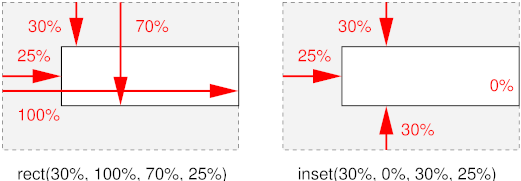
- rect(top, right, bottom,
left)
- Each of the four arguments can be a <length> or a
<percentage>. All percentage values are computed relative to
the intrinsic dimensions of the element. Values are offsets relative to the
top left of the element. The computed intrinsic width and height of the
element are determined by subtracting the left from the right for the width,
and similarly top from bottom for the height. However, if this computation
results in a negative value, it is considered to be zero.
- inset-rect(top, right, bottom,
left)
- Like rect(), except that the values are offsets relative to the
respective edges of the element.
If the element does not have an intrinsic width, the UA may in some cases
be able to infer the intrinsic width that the style sheet writer assumed.
First the UA must find the computed 'width' and computed 'height' and then the intrinsic width can be found
as follows (the intrinsic height is analogous):
- If 'crop' is 'auto', the assumed intrinsic width is the same as the
computed value of 'width'
- If 'crop' is 'rect(t, r, b, l)' and r is a percentage, the intrinsic
width can be solved from the equation: r = computed 'width' + l
- If 'crop' is 'rect(t, r, b, l)' and r is not a percentage, the
intrinsic width cannot be computed and the result is UA
dependent.
- If 'crop' is 'inset-rect(t, r, b, l)', then the intrinsic width can
always be solved from the equation intrinsic width = l + computed 'width' + r
Note: 'crop' does not impact the scaling, stretching,
tiling or positioning of the replaced element. 'crop' simply allows the
author to essentially use a part of a replaced element in place of the
element itself for all intents and purposes. For control over scaling,
stretching and positioning, please see the 'fit', 'fit-position' and 'position' properties.
The following example displays both the whole sheep and its head:
<p>Here is Woolly, the CSS sheep:
<img src="woolly" alt="Woolly">
<p>And here he is as a thumbnail:
<img src="woolly" alt="Woolly thumbnail"
  style="crop: rect(0px, 115px, 85px, 30px)">
The result might look like this:
13. 浮動ボックス(Floating boxes)
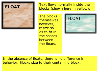
A float is a box that creates a new flow, while the parent flow wraps
around it. The 'float'
property determines where the box is positioned relative to the parent flow:
left or right (for horizontal flows), top or bottom (for vertical flows)
浮動するボックスは新しいフローを作り出し、
親フローはその周りに回り込む。
'float'プロパティは、
ボックスが親フローの中での相対配置を決定する:
leftもしくはright(水平フローの場合)、topもしくはbottom(垂直フローの場合)
Example: the following rule floats all IMG boxes with
class="icon" to the left (and sets the left margin to '0'):
例: 次の規則でclass="icon"の画像のボックスは全て左へと浮動する
(そして左マージンは'0'になる):
IMG.icon {
  float: left;
  margin-left: 0;
}
Consider the following HTML source and style sheet:
次のHTMLソースとスタイルシートでどのようになるか考えてみよう:
<!DOCTYPE HTML PUBLIC "-//W3C//DTD HTML 4.0//EN">
<HTML>
  <HEAD>
    <TITLE>Float example</TITLE>
    <STYLE type="text/css">
      IMG { float: left }
      BODY, P, IMG { margin: 2em }
    </STYLE>
  </HEAD>
  <BODY>
    <P><IMG src=img.gif alt="This image will illustrate floats">
       Some sample text that has no other...
  </BODY>
</HTML>
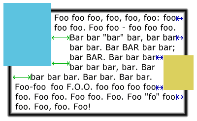
The IMG box is floated to the left. The content that follows is formatted
to the right of the float, starting on the same line as the float. The line
boxes to the right of the float are shortened due to the float's presence,
but resume their "normal" width (that of the containing block established by
the P element) after the float. This document might be formatted as:
IMGボックスは左へと浮動する。
それに続く内容は浮動体の右側へと配置され、浮動したのと同じ行から始まる。
浮動体の存在のために、行ボックスは浮動体の右側へと縮められるが、
それらの幅は浮動体が無くなると"元"(包含ブロックであるP要素の設定した幅)に戻る。
この文書は次のようになるだろう:
Formatting would have been exactly the same if the body of the document
had been:
文書の本体が次のようになっても、同じ結果になるだろう:
<BODY>
  <P>Some sample text
  <IMG src=image.gif alt="This image will illustrate floats">
           that has no other...
</BODY>
because the content to the left of the float is displaced by the float and
re-flowed down its right side.
何故なら浮動体の左の内容は浮動体によって置き換えられ、
右へと押し出されるからである。
13.1. 'float'プロパティ
| 名前:
| float
|
| 値:
| left | right | top | bottom | inside | outside | start | end | none
|
| 初期値:
| none
|
| 適用対象:
| 配置要素、生成要素、ルート要素を除く全ての要素
|
| 継承:
| しない
|
| パーセント値:
| なし
|
| メディア:
| visual
|
| 算出値:
| 指定値
|
The values have the following meanings:
値は次の意味を持つ:
- left, top
If the containing block has horizontal flow: the element generates a box that
is floated to the left. Content flows on the right side of the box, starting
at the top (subject to the 'clear' property). If the containing block has vertical flow the box is floated to the top and
content flows on the bottom side of the box (subject to the 'clear' property).
包含ブロックが
水平フローの場合:
要素が生成したボックスは左へと浮動する。
内容はそのボックスの右側へとフローし、
その上端からスタートする
('clear'による)。
包含ブロックが
垂直フローの場合、
ボックスは上へと浮動し、内容はボックスの下へフローする
('clear'による)。
Note: for readability it is recommended to use 'left' in style sheets for horizontal flow and 'top' for vertical flow.
メモ:
可読性のために水平フローのスタイルシートでは'left'を、
垂直フローでは'top'を使うことを推奨する。
It would be more intuitive (less surprising) if 'left' only
worked in horizontal flow and 'top' only in vertical flow.
'left'は水平フローでのみ、'top'は垂直フローでのみなら、
もっと直感的だろう(困惑しない)。
- right, bottom
Analogous to 'left', but content flows on the
left side, respectively the top side of the box.
'left'と似ているが、
内容はボックスの左側、上側にそれぞれフローする。
- inside
Same effect as 'left' or 'right' depending on whether the float will appears on a
right, resp. left page in paged media. Same as 'left' on non-paged media. (See the Paged media module
[ref] for information on left/right pages.)
ページドメディアで、右、左のページそれぞれに、
'left'もしくは'right'と同じように現れるだろう。
非ページドメディアでは'left'と同じである。
(左右のページについての情報はページドメディアモジュール参照[ref])
- outside
Same effect as 'right' or 'left' depending on whether the float will appears on a
right, resp. left page in paged media. Same as 'right' on non-paged media.
ページドメディアで、右、左のページそれぞれに、
'right'もしくは'left'と同じように現れるだろう。
非ページドメディアでは'right'と同じである。
- start
Same effect as either 'left', 'right', 'top' or 'bottom, depending on the
'direction' of the
containing block, as follows:
'left'、'right'、'top'、'bottom'と同じ効果である。
ただし、包含ブロックの'direction'に依存し、次のようになる:
| 'direction'
| 効果
|
| ltr
| left/top
|
| rtl
| right/bottom
|
- end
- Same effect as either 'left', 'right', 'top' or 'bottom', depending on
the 'direction' of the
containing block, as follows:
'left'、'right'、'top'、'bottom'と同じ効果である。
ただし、包含ブロックの'direction'に依存し、次のようになる:
| 'direction'
| 効果
|
| ltr
| right/bottom
|
| rtl
| left/top
|
- none
The box is not floated.
ボックスは浮動しない。
Note: The keywords 'start' and 'end' are intended to be
mnemonic for floating towards the "start of the line" and "end of the line"
respectively. They are most useful for floats that must float to the left or
right depending on the script and in those cases avoid having to use language
selectors.
メモ: 'start'と'end'キーワードはそれぞれ浮動の方向を"start of the line"と、
"end of the line"として表したニーモニックのつもりである。
これらは最も便利なもので、
言語に依存して左もしくは右へと浮動させる必要があった浮動体でも、
言語セレクタを使う必要が無くなるからだ。
Note that the computed value of 'display-role' is influenced by 'float'.
'display-role'の算出値は
'float'の影響を受けることに注意。
A floating box causes the content of elements in its parent flow to wrap
around the rectangular outline of the floating box only, not around any
descendant box of the floating box that may stick out of the floating box.
(Note that whether such a descendant overlaps other content or is clipped
depends on the 'overflow' property.)
浮動ボックスは親フロー内の要素の内容を浮動ボックスの矩形の周りに回り込ませるが、
浮動ボックスの子孫ボックスは(浮動ボックスから出ているかもしれないが)その限りではない。
(そのような子孫は他の内容と重なるか、
'overflow'
プロパティによって切り取られているかもしれないことに注意。
["Floating" to top/bottom of a page is a different
mechanism; text does not wrap around such elements. See "paged media"
module.]
[ページの上下に浮動するのは異なる仕組みである;
テキストはそのような要素のまわりでは回り込まない。
ページドメディアモジュール参照。]
Here are the
precise rules that govern the behavior of floats (rules are for horizontal flow, vertical flow is analogous):
これは浮動体のふるまいを決める正確な規則である
(これは水平フローのものだが、
垂直フローでもこれに似ている):
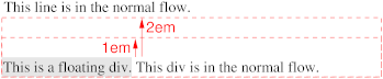
Principle of horizontal containment: The left margin edge of a left-floating box may not be to the
left of the left edge of its containing
block. An analogous rule holds for right-floating boxes. (Note that
margins can be negative, so the content might still be outside the
containing block.)
水平抑制の原則:
左浮動ボックスの左マージン辺は
包含ブロックの左辺の左には移動しないかもしれない。
右浮動ボックスでも似た規則である。
(マージンが負の場合、内容は包含ブロックの外まで移動するかもしれないことに注意。)
Principle of vertical containment: A floating box's top
margin edge may not be higher than the top of its containing block.
垂直抑制の原則:
浮動ボックスの上マージン辺はその包含ブロックの上端より上には移動しないかもしれない。
Principle of avoidance of overflow: The right margin
edge of a left floating box may not be to the right of the right edge of its
containing block, unless its left margin edge coincides with the containing
block's left edge. Analogous for a right-floating box. (This makes floating
boxes "wrap" when their collective width would be wider than the containing
block. The only case where a float can cause overflow is when the float
itself is wider than the containing block.)
はみ出し回避の原則:
左浮動ボックスの右マージン辺は、
左マージン辺が包含ブロックの左辺と同じ位置にならない限り、
包含ブロックの右辺の右には移動しないかもしれない。
右浮動ボックスについても似たことが言える。
(これは包含ブロックの幅で浮動ボックスのそれぞれの幅の合計にあわせて、
浮動ボックスが"回り込む(wrap)"ことになる。)
Principle of preservation of ordering: The top margin
edge of a floating box may not be higher than the top margin edge of any
float or block-level box in the current flow that is generated by an earlier
element in the document.
順序保存の原則:
浮動ボックスの上マージン辺は、
文書で先に出現した要素によって生成された現在のフローのいかなる浮動ボックス、
ブロックレベルボックスの上マージン辺よりも上には移動しないかもしれない。
Principle of progressive rendering: The top margin edge
of a floating box may not be higher than the top of any line box that
contains a box generated by an element earlier in the source. (This ensures
that lines above the current one, that may already have been rendered, do not
have to be redrawn.)
前方表示の原則:
浮動ボックスの上マージン辺は、
ソースで先に出現した要素によって生成されたボックスを含むいかなる
行ボックス
よりも上には移動しないかもしれない。
(これは現在の行と同じ行に並ぶため、
それはすでに行われたかもしれない表示を再描画しなくて済むことを確認する。)
Principle of excluded quarter planes: If there is an
earlier left-floating box in the current flow, the left margin-edge of the
current box must be to the right of that box's right margin-edge or the
current box's top margin edge must be below its bottom margin edge. If there
is an earlier right floating box, the right margin-edge of the current box
must be to the left of the earlier box's left margin edge, or the current
box's top margin edge must be below its bottom margin edge. (Note: another
name for this principle might be "avoiding overlap", but it is stronger than
that.)
重複回避の原則:
現在のフローに先に出現した左浮動ボックスがあれば、
現在のボックスの左マージン辺が、
先のボックスの右マージン辺の右側にくるように移動するか、
現在のボックスの上マージン辺が、
先のボックスの下マージン辺の下側にくるように移動しなくてはいけない。
先に出現した右浮動ボックスがある場合、
現在のボックスの右マージン辺が、
先のボックスの左マージン辺の左側にくるように移動するか、
現在のボックスの上マージン辺が、
先のボックスの下マージン辺の下側にくるように移動しなくてはいけない。
(メモ: この原則に別の名前をつけるとしたら"重複回避の原則"だろう。
しかし、これは今のものより強い。)
この邦訳では別名の方を採用しました。
元の原則名を直訳すると「四分面除外の原則」とよく分からないものになります。
英語圏の文化に詳しければもう少しかみ砕いた訳があるのかもしれませんが。。。
Principle of tight packing: A floating box must be
placed as high as possible without violating principles 1-6.
上詰めの原則:
浮動ボックスは1から6の原則から外れない限り、上へと配置されなくてはいけない。
Principle of meaningful names: A left-floating box must
be put as far to the left as possible, a right-floating box as far to the
right as possible, without violating principles 1-7.
端寄せの原則:
1から7の原則から外れない限り、
左浮動ボックスはできるだけ左に、右浮動ボックスはできるだけ右に配置されなくてはいけない。
Note: in CSS2, the rules were the same, but phrased and
numbered differently: 2 + 3 are now 6, 4 is now 2, 5 is now 4, 6 is now 5, 7
is now 3, 8 is now 7, 9 is now 8.
メモ:
CSS2では、ほぼ同じ規則だったが、文章と順序が違った:
2と3は6に、4は2に、5は4に、6は5に、7は3に、8は7に、9は8になった。
In a multicolumn box [link], [...]
マルチカラムボックス[link]で、[...]
Here is an illustration of the rules. Assume this source fragment:
このスタイルシートでの例。
ソースにこれらのIDがあることを前提とする:
<STYLE TYPE="text/css">
  P { width: 24em }
  #L1 { float: left; width: 8em; height: 3em }
  #L2 { float: left; width: 4em; height: 6em }
  #R1 { float: right; width: 6em; height: 9em }
  #L3 { float: left; width: 7em; height: 9em }
  #R2 { float: right; width: 3em; height: 5em }
</STYLE>
<P>
  <IMG ID=L1 SRC="L1.png" ALT="L1">
  <IMG ID=L2 SRC="L2.png" ALT="L2">
  <IMG ID=R1 SRC="R1.png" ALT="R1">
  <IMG ID=L3 SRC="L3.png" ALT="L3">
  <IMG ID=R2 SRC="R2.png" ALT="R2">
  blah bla blah bla blah...
</P>
The figure below shows the result. Note that L3 could not be to the right
of L1 and L2, so it had to be below both of them. R2 could not be placed
higher than L3, because it came after L3.
下の図のような結果になる。
L3がL1とL2の右に移動できず、これらの下側に移動したことに注意。
R2がL3より上に移動していないことに注意。L3の後にR2が出現したからである。
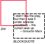
A float can overlap boxes in its parent flow
(e.g., when a normal flow box next to a float has negative margins or a
negative 'text-indent'). When an inline-level box overlaps with a float, it
should be rendered in front of the float. When a block-level box overlaps, it must be rendered
behind the float. Note that any textual content of that block-level box
should still be drawn in front of the float, because it is considered part of
(possibly anonymous) inline-level boxes. On the other
hand, the content of a block-level replaced
element is drawn behind it.
浮動体は親フローのボックスと重なることができる
(例えば、浮動体が負のマージンを持つか、
負の'text-indent'を持つ場合に、
次の通常フローのボックスと重なる)。
インラインレベルボックスが浮動体と重なる時は、
浮動体の手前に表示するべきである。
ブロックレベルボックスが重なる場合、
浮動体の奥に表示されなくてはいけない。
ブロックレベルボックスの内容は浮動体の手前に表示されるべきであることに注意。
なぜなら、
(おそらく匿名)
インラインレベルボックスの一部だからである。
一方、ブロックレベル置換要素の内容は奥に描画される。
For performance reasons, however, a UA may choose to draw inline-level
boxes behind the float as well.
パフォーマンスを理由に、UAはインラインレベルボックスを浮動体の背後に描画することを選択するかもしれない。
Note that this is a change from CSS2 and CSS1, where a UA was
not allowed to draw those inline-level boxes behind the float.
これはCSS2及びCSS1からの変更である。
今まではUAがインラインレベルボックスを浮動体の背後に描画することを認めていなかった。
Here is an illustration, showing what happens when a float overlaps
borders of elements in the normal flow.
次のイラストは浮動体が通常フローの要素のボーダーと重なった場合に何が起こるのかを示すものである。
このセクションのこれ以降の文章は読まない方が賢明でしょう。
CSS2の考え方とも違っていて、矛盾(前景と背景と浮動体の関係)がありますし、
全体的に支離滅裂です。
原文自体が口語に近いのか、他の部分に比べて極端に訳しにくいです。
かなり外した訳かもしれません。
The problem seems to be that we expect the background of
blocks with a negative top margin to obscure the text of earlier blocks, but
we don't expect a "normal" block (with a nonnegative margin) to obscure any
text that might overflow from the previous block. Maybe the negative margin
has an effect on the z-index. Or maybe we should say that blocks with
negative margins do not obscure earlier text, unless specified to do
so by means of z-index.
問題は負の上マージンを持ったブロックの背景が先行するブロックのテキストを覆うと考えることだろう。
しかし、
(負のマージンを持たない)
"通常の"ブロックが先行するブロックからはみ出したテキストを覆うとは考えない。
たぶん、負のマージンはz-indexに影響がある。
もしくは、明言すべきなのだろう。
z-indexによってそうするのが指定されない限りは、
負のマージンを持ったブロックは先行するテキストを覆い隠さないと。
Note that the rule about blocks behind floats and floats behind text may
lead to a visually inconsistent situation, as in the following figure.
浮動体の背後にブロックがあるという規則と、
テキストの背後の浮動体があるという規則は、
次の図のように、視覚的に一貫性が無い規則かもしれない。
An old idea (at least from
1996) is to add a value 'contour' to 'float', so that the float is no longer rectangular,
but takes on its "intrinsic" shape. This allows to wrap text around it much
tighter. The syntax of 'float' becomes:
古いアイデア(少なくとも1996年)で、
'contour'値を'float'に追加し、
浮動体がもはや矩形ではなく、"固有の"図形をとるというものがあった。
これはテキストの周囲へのきちんとした回り込みを可能にする。
'float'の文法は:
Value: [ <float-side> || <wrap-type> ]
where <float-side> is: left | right | top | bottom | inside |
outside | start | end | none; and <wrap-type> is box | contour. The
default <float-side> is 'none' and the default <wrap-type> is
'box'.
<float-side>は: left | right | top | bottom | inside | outside |
start | end | none; で、<wrap-type>は box | contourであった。
<float-side>のデフォルトは'none'で、<wrap-type>のデフォルトは'box'。
How to find the shape of an object depends on the type of object. For a
GIF or PNG image, the contour is the boundary between fully transparent parts
of the image and the rest. For other objects, it is possible to define a
'shape' property to explicitly define the desired contour, but that may be
taking it too far.
オブジェクトの形をどのように見つけるのかはオブジェクトのタイプに依存している。
GIFかPNG画像なら、形は画像の完全に透明な部分とそれ以外の部分である。
他のオブジェクトでは、望みの形を明示するために'shape'プロパティを定義することもできる。
しかし、これはあまりにほど遠く、できないかもしれない。
For a left-floating object, only the right and bottom edges of the contour
are used, and the contour is "simplified" so that there are no holes and text
is never interrupted by part of the float.
左浮動オブジェクトでは、輪郭辺の右と下のみ使うことができ、
輪郭は"単純化"し、穴とテキストがなくなり、浮動体の一部によって邪魔されることがなくなった。
13.2. clearプロパティ
| 名前:
| clear
|
| 値:
| none | left | right | top | bottom | inside | outside | start | end |
both
|
| 初期値:
| none
|
| 適用対象:
| ブロックレベル要素
|
| 継承:
| しない
|
| パーセント値:
| なし
|
| メディア:
| visual
|
| 算出値:
| 指定値
|
This property indicates which sides of an element's box(es) may
not be adjacent to an earlier floating box. (It may be that the
element itself has floating descendants; the 'clear' property has no effect on those.)
このプロパティは、
ある要素のボックスのどちら側が、
先行する浮動ボックスに隣接しないかを指定する。
(要素自身は浮動体の子孫を持つかもしれないが、
'clear'プロパティはそれらには影響しない。)
This property only applies to block-level elements (including
floats). For compact and run-in boxes, this
property applies to the final block box to which the compact or run-in box
belongs.
このプロパティはブロックレベル要素(浮動体を含む)にのみ適用できる。
コンパクトとランインボックスは、
このプロパティはコンパクト、もしくはランインボックスが属する最後のブロックボックスには適用される。
Values have the following meanings when applied to non-floating block
boxes:
非浮動ブロックボックスに適用した場合、値は次の意味を持つ:
- left, top
If the element is in a horizontal
flow, the top margin of the generated box is increased enough that
the top border edge is below the bottom margin edge of any left-floating
boxes that resulted from elements earlier in the source document. If the
containing block has a vertical flow, the
right margin is increased so that the right border edge is to the left of the
left margin edge of any earlier top-floating boxes. In vertical-lr
flow, the left margin is increased until the left border edge is to the
right of the right margin edge of any earlier top floats.
要素が水平フロー内であれば、
生成されたボックスの上マージンは、
上ボーダー辺がソース文書で先行する要素の、
あらゆる左浮動ボックスの下マージン辺よりも下側にくるように、
十分に確保される。
包含ブロックが垂直フローの場合、
右ボーダー辺が先行するあらゆる上浮動ボックスの左に来るように右マージンが確保される。
垂直フロー(lr)の場合、
左ボーダー辺が先行するあらゆる上浮動体の右マージン辺より右側に来るように左マージンが確保される。
- right, bottom
Analogous, but the margin is increased to stay clear of any right/bottom
floating boxes, rather than left/top ones.
同様だが、
左もしくは上浮動ボックスではなく、
右もしくは下浮動ボックスの解除のためにマージンが確保される。
- inside
Same effect as 'left' or 'right' depending on whether the element's boxes will
appears on a right, resp. left page in paged media. Same as 'left' on non-paged media. (See the Paged media module
[ref] for information on left/right pages.)
ページドメディアにおいて右、左それぞれのページで
'left'や'right'と同様の効果がある。
非ページドメディアでは'left'と同じである。
(左右のページについての情報はページドメディアモジュール[ref]参照。)
- outside
- Same effect as 'right' or 'left' depending on whether the element's boxes will
appears on a right, resp. left page in paged media. Same as 'right' on non-paged media.
ページドメディアにおいて右、左それぞれのページで
'right'や'left'と同様の効果がある。
非ページドメディアでは'right'と同じである。
- start
Same effect as either 'left', 'right', 'top' or 'bottom, depending on the
'direction' of the
element, as follows:
'left'、'right'、'top'、'bottom'と同じ効果があるが、
次のように要素の'direction'に依存する:
| 'direction'
| 効果
|
| ltr
| left/top
|
| rtl
| right/bottom
|
- end
Same effect as either 'left', 'right', 'top' or 'bottom', depending on
the 'direction' of the
element, as follows:
'left'、'right'、'top'、'bottom'と同じ効果があるが、
次のように要素の'direction'に依存する:
| 'direction'
| 効果
|
| ltr
| right/bottom
|
| rtl
| left/top
|
- both
The generated box is moved clear of both left/top and right/bottom
floating boxes of earlier elements in the source document.
生成されたボックスはソース文書で先行する、
左/上と、右/下両方の浮動ボックスを解除する。
- none
No constraint on the box's position with respect to floats.
浮動体に対するボックスの配置に影響は無い。
[Be more precise about the order in which margins are
established: collapse first, then add effect of clear; collapse positive
margins only, then add 'clear, then add negative margins; collapse earlier
elements only, then add clear, then collapse following elements... Need to
dig out an old thread on www-style.]
[マージンが確定される順には几帳面であれ:
最初に相殺し、その時にclearの効果を加える。
正のマージンのみ相殺し、clearの効果を加え、負のマージンを追加する。
先行要素のみ相殺し、clearの効果を加え、先行要素を相殺する。。。
www-styleの昔のスレッドを引っ張り出す必要がある。]
When the property is set on floating elements, it results in a
modification of the rules for positioning the
float. An extra constraint is added:
プロパティが浮動体に設定された場合、
浮動体の配置に関するルールの修正が発生する。
ひとつ余計に条件が追加される:
The top margin edge of the float must be
below the bottom margin edge of all earlier left-floating boxes (in the case
of 'clear: left'), or all earlier right-floating boxes (in the case of
'clear: right'), or both ('clear: both').
浮動体の上マージン辺は、
全ての先行する左浮動ボックス('clear: left'の場合)、
もしくは、全ての先行する右浮動ボックス('clear: right'の場合)、
もしくは、その両方('clear: both')の下マージン辺の下側に配置される。
[define vertical case]
[垂直フローの場合も定義せよ]
Example. Assuming a rule such as this:
例。このようなスタイルを仮定すると:
P { clear: left }
formatting might look like this:
このように見えるだろう:
13.3. clear-afterプロパティ
| 名前:
| clear-after
|
| 値:
| none | left | right | top | bottom | inside | outside | start | end |
both
|
| 初期値:
| none
|
| 適用対象:
| ブロックレベル要素
|
| 継承:
| しない
|
| パーセント値:
| なし
|
| メディア:
| visual
|
| 算出値:
| 指定値
|
It is sometimes useful to make sure that the bottom border of a
block-level element goes below floating elements. The 'clear-after' property
increases the bottom padding as needed. The padding-bottom will be calculated
from the bottom margin-edge of the lowest float that originates in the same
flow and comes before the end of the element, i.e., including floating
descendants of the element itself.
ブロックレベル要素の下辺が浮動体の下側にくるようにできると便利なこともある。
'clear-after'プロパティは下パディングを必要に応じて拡張する。
下パディングは同じフロー、
もしくはその要素の終端の手前にある、
最も下側の浮動体の下マージン辺から算出される。
つまり、要素自身の浮動体の子孫も含まれることになる。
Which padding is increased depends in fact on the orientation: in
horizontal orientation ('writing-mode' is 'lr-tb' or 'rl-tb'), the bottom
padding is increased, in vertical orientation ('tb-rl' or 'bt-rl') the left
padding and in vertical-lr ('tb-lr' or 'bt-lr') the right padding.
どのパディングが実際に拡張されるのかは実際には文書方向に依存する:
水平フロー(
'writing-mode'が
'lr-tb'もしくは、
'rl-tb')の場合、
下パディングが拡張される。
垂直フロー('tb-rl'もしくは、
'bt-rl')の場合、
左パディングが、
垂直フロー(lr)('tb-lr'もしくは、
'bt-lr')の場合、
右パディングが拡張される。
Note: Since a floating element is a flow root,
setting 'clear-after' on such an element only takes
into account any descendant floats in the flow established by the element
itself.
メモ:
浮動要素はフロールートであり、
'clear-after'
が設定された要素でのみ、
その要素自身によって作り出されたフロー内の子孫の浮動体も対象とする。
The value of the property determines which kinds of floats are taken into
account:
プロパティの値はどの浮動体を対象とするのかを決める:
- none
No effect.
効果無し。
- left, top
Only left and top floating elements are considered.
leftもしくはtopの浮動要素が対象となる。
- right, bottom
Only right and bottom floating elements are considered,
rightもしくはbottomの浮動要素が対象となる。
- inside
If the bottom of the element occurs on a right-hand page, only left
floating elements are considered. On a left-hand page, only right floating
elements. On media that are not paged, 'inside' means the same as 'left'.
要素の下が右手のページで発生した場合、leftの浮動要素のみが対象となる。
左手のページでなら、rightの浮動要素のみである。
ただし、非ページドメディアでなら、'inside'は'left'と同じである。
- outside
Analogous
同じ。
- start
If the 'direction'
of the element is 'ltr', same as 'left', otherwise same as 'right'.
要素の'direction'が'ltr'の場合、'left'と同じ。
それ以外の場合は'right'と同じ。
- end
If the 'direction'
of the element is 'ltr', same as 'right', otherwise same as 'left'.
要素の'direction'が'ltr'の場合、'right'と同じ。
それ以外の場合は'left'と同じ。
- both
Both left/top and right/bottom floats are considered.
上下左右全ての浮動体を対象とする。
Instead of a new property 'clear-after', another idea is to add one or
more values to 'clear'. If 'clear' is turned into a set, instead of a single
value, one could add the value'after' (clears both left and right floats) or
several values like 'left-after' and 'right-after':
新しい'clear-after'プロパティの代わりに、
他のアイデアとして'clear'に値を追加する案もある。
'clear'値が変更された場合、
単一の値の代わりに、
'after'値を追加できるようになる(left、right値と共に浮動を解除する)、
もしくは'left-after'や'right-after'のような値を追加することもできる。
| 名前:
| clear
|
| 値:
| none | [ left | right | top | bottom | inside | outside | start | end |
both | after]+
|
| 初期値:
| none
|
| 適用対象:
| ブロックレベル要素
|
| 継承:
| しない
|
| パーセント値:
| なし
|
| メディア:
| visual
|
| 算出値:
| 指定値
|
The following rule would ensure that a SECTION starts below all preceding
floats and doesn't end until after all floats it contains:
次の指定は、SECTIONの開始は全ての先行する浮動体の下側になり、
その内包する浮動体の後まで終端にならない。
section {clear: left right after}
13.4. 'float-displace'プロパティ
| 名前:
| float-displace
|
| 値:
| line | indent | block | block-within-page
|
| 初期値:
| line
|
| 適用対象:
| 全てのブロックレベル要素
|
| 継承:
| する
|
| パーセント値:
| なし
|
| メディア:
| visual
|
| 算出値:
| 指定値と同じ
|
| 算出値
| 指定値
|
This property determines the line wrapping policy in the presence of
floats. Values have the following meanings:
このプロパティは浮動体の周りの行の回り込み方を指定する。
値は次の意味を持つ:
- line
Line boxes should be shortened and moved so as to avoid floats. The
margin, border, padding and background of the element are not affected by
floats. (This is the behavior as described in CSS2.) [add
description or image?]
行ボックスは浮動体を避けるように移動し、短くなる。
その要素のマージン、ボーダー、パディング、背景は浮動体に影響を受けない。
(これはCSS2の仕様そのものである。)
[説明画像が必要?]
- indent
The distance between the margin edge of the floats and the start of the
line box is set to the distance between the active reference indent edge (see the 'indent-edge-reset'
property) and the content edge of the block box. This ensures that relative
indents are preserved in the presence of floats.
浮動体のマージン辺と行ボックスの開始位置との間の距離をアクティブな
参考インデント辺
('indent-edge-reset'
プロパティ参照)とそのブロックボックスの内容辺との距離に設定する。
相対インデントは浮動体の前で保護されることを保証する。
- block
-
The containing block's width as used by the horizontal formatting model is
reduced by the width of the floats intruding upon its content area (not
taking into account floating descendants or floating elements that appear
later in the document tree). The block is then flowed in this reduced
containing block width.
水平フローでは利用できる包含ブロックの幅は、
その内容領域に浮動体が入り込み、減少してしまう
(文書ツリーで後から出現する子孫の浮動体や、浮動要素は対象外)。
ブロックは減少した包含ブロックの幅のままになる。
If the effective containing block width is, by the algorithm given above,
reduced to a value smaller than the sum of the margin-left,
border-width-left, padding-left, width, padding-right, border-width-right,
and margin-right values (treating any 'auto' values as zero) then the
margin-top of the block is increased until the effective containing block
width is no longer so constrained or until all floats have been cleared,
whichever occurs first.
有効な包含ブロックの幅が、
上記のアルゴリズムによってmargin-left、
border-width-left、
padding-left、
width、
padding-right、
border-width-right、
margin-right値('auto'値はゼロとして)の合計より小さくなる場合、
ブロックの上マージンは有効な包含ブロックの幅になるか、
もしくは全ての浮動体が解除されるまで拡張され続ける。
- block-within-page
As for the 'block' value, but the determination of intrusions that adjust
the width of the block is done separately on each page on which the block
appears. Thus, the block may be narrowed on the first page due to one or more
intrusions, but may expand (or contract) its width on subsequent pages with
different intrusions. The computed value of the 'width' property for this
case is...?
'block'値に似ているが、
各ページで分割されたブロックの調整された幅は、
浮動体の存在状況によって決まる。
このように、最初のページにおいてブロックはその状況、
もしくは更なる浮動体の存在によって狭くなっているかもしれないが、
次のページでは違った浮動体の存在状況によってその幅は広がっている(もしくは縮んでいる)かもしれない。
このケースでの'width'プロパティの算出値は。。。?
A set of rules for HTML might look like this:
HTMLにこのようにスタイルを指定する:
OL, UL, LI {float-displace: indent}
TABLE {float-displace: block}
Lines in a list will get extra indentation when they are next to a float,
so you can still see that they are part of the list, and tables will be made
narrower as a whole.
リスト内の行はその次に浮動体がある場合に特別にインデントされるため、
それはリストの一部だとわかるだろう。
そしてテーブルは全体として狭くなっているだろう。
14. 'indent-edge-reset'プロパティ
| 名前:
| indent-edge-reset
|
| 値:
| none | margin-edge | border-edge | padding-edge | content-edge | inherit
|
| 初期値:
| none
|
| 適用対象:
| フォーマッティングコンテキスト内のブロックレベル要素を持つ全ての要素。
|
| 継承:
| しない
|
| パーセント値:
| なし
|
| メディア:
| visual
|
| 算出値:
| 指定値
|
This property determines which edge to use as the reference indent edge when calculating the amount of
indent to preserve when the value of 'float-displace' is set to 'indent'.
このプロパティは、
'float-displace'に
'indent'が指定されている場合に、
どれだけのインデントを保つのかを計算するために、
参考インデント辺(reference indent edge)として、
どの辺を使うのかを指定する。
- none
This block does not introduce a new reference edge.
このブロックは新しい参考辺を示さない。
- margin-edge
- border-edge
- padding-edge
- content-edge
A new reference indent edge is introduced by this block. Which edge is
used as the reference indent edge is determined by which value is given.
新しい参考インデント辺はこのブロックで示される。
参考インデント辺に使われる辺はどの値かによって決まる。
The reference indent edge is the nearest ancestor in the same formatting
context which has a non-none value for 'indent-edge-reset'. If no ancestor in
the formatting context has a value specified for this property, then the
content edge of the root of the formatting context is used.
参考インデント辺は同じフォーマッティングコンテキストで、
'indent-edge-reset'
の値がnone以外の直近の祖先要素のものである。
フォーマッティングコンテキストの祖先がこのプロパティの値を持たない場合、
フォーマッティングコンテキストのルート要素の内容辺を用いる。
15. マージンの相殺(Collapsing margins)
The top and bottom margins of a block-level
box define the minimum distance of the box to block-level boxes
above and below it. The actual distance between boxes is the maximum of the
margins involved (unless there are any negative margins, see below). We say
that such margins collapse.
ブロックレベルボックスの上下のマージンは、
そのボックスから上下のブロックレベルボックスまでの最小限の距離とする。
ボックス間の実際の距離は関係するマージンの最大値である
(負のマージンの場合は下記参照)。
これをマージンの相殺と言う。
For example, in this HTML fragment
例えばこのHTMLでは
<UL STYLE="margin-bottom: 1em">
  <LI STYLE="margin-bottom: 0.5em">...</LI>
</UL>
<P STYLE="margin-top: 0.6em">
  ...
</P>
and assuming there are no paddings and borders, the bottom of the last
line box of the <LI> will be 1em above the top of the first line box of
the <P>, since 1em is the maximum of the three margins.
これらにはパディングやボーダーは無いものとすると、
<LI>の最後の行ボックスの下端は、
<P>の最初の行ボックスの上端から更に、
1em上になるだろう。
1emが3つのマージンの中で最大のものだからである。
The principle is that adjacent margins of block-level boxes in the same
flow collapse. The precise rules are below.
原則として、同じフローのブロックレベルボックスのマージンが調整を受ける。
細かい規則は以下のものである。
When the margins of two or more boxes collapse, it means that the computed
value of all margins involved is the maximum of the nonnegative specified
margins plus the minimum of the negative specified margins. E.g., if there are four margins that collapse and their
values are 1.5cm, 2cm, -1cm and -1.2cm, the computed value of all four of
them will be max(1.5cm, 2cm) - max(1cm, 1.2cm) = 2cm - 1.2cm = 0.8cm.
2つ以上のボックスのマージンか相殺される場合、
それは関係する全てのマージンの計算結果は正のマージンの最大値プラス、
負のマージンの最小値であるということだ。
例えば、4つの相殺するマージンが1.5cm、2cm、-1cm、-1.2cmだった場合、
これら4つ全てを計算すると、
max(1.5cm, 2cm) - max(1cm, 1.2cm) = 2cm - 1.2cm = 0.8cm
となる。
Note that this means that "collapsing" is a commutative
relation (if margin A collapses with margin B, then margin B collapses with
margin A) as well as a transitive relation (if A collapses with B and B
collapses with C, then A collapses with C).
この意味は"マージンの相殺"は関係を入れ替えることが可能ということであり
(マージンAがマージンBと相殺される場合、
マージンBはマージンAと相殺される)、
同様に、
過渡的な関係でもある(AとBが相殺し、BとCが相殺する場合、AとCが相殺するということだ)。
For the purposes of these rules, elements with 'display:
none' are treated as if they did not exist at all.
この規則の目的は、
'display: none'の要素は存在しないかのように扱うためである。
Margins of floating
boxes never collapse, neither with normal flow boxes nor with other
floating boxes.
浮動ボックスのマージンは常に相殺されない。
相手が通常フローのボックスであっても、浮動ボックスであっても同様である。
Note that margins of absolutely positioned boxes also do not
collapse with any other margins. See [CSS3POS].
絶対配置ボックスのマージンもまた、他のマージンと相殺されないことに注意。
[CSS3POS]参照。
[CSS2 said that margins of relatively positioned boxes also
do not collapse, but that looks like a mistake.]
[CSS2では相対配置ボックスのマージンもまた相殺されないとしていたが、
これは間違いだと思う。]
In a horizontal flow, the following
margins collapse:
水平フローでは、次のマージンが相殺される:
The bottom margin of a box and the bottom margin of its last child,
provided both are block-level and the former has no bottom padding, no bottom
border and horizontal flow.
ボックスの下マージンと、
その最後の子の下マージン。
ただし、
これら双方がブロックレベルで、
前者が下パディングも下ボーダーも持たず、
水平フローの場合に限る。
The top margin of a box and the top margin of its first child, provided
both are block-level and the former has no top padding, no top border and
horizontal flow.
ボックスの上マージンと、
その最初の子の上マージン。
ただし、
これら双方がブロックレベルで、
前者が上パディングも上ボーダーも持たず、
水平フローの場合に限る。
The bottom margin of a box and the top margin of its next sibling,
provided both are block-level.
ボックスの下マージンと次の兄弟要素の上マージンで、これらが共にブロックレベルの場合。
The top and bottom margin of a block-level
box, if the the box has a height of 'auto' or 0, no top or bottom padding, no top or bottom
border and no content (i.e., no line boxes and no replaced content).
ブロックレベルボックスの上下のマージン。
ただし、
そのボックスのheightが'auto'かゼロで、
上下のパディングがなく、
上下のボーダーもなく、
内容も無い場合(つまり、行ボックスがなく、置換内容も無いもの)。
Note that "no content" is not the same as "empty element" in XML. For
example, an empty element may have content because of generated text [CSS3GENCON], and a nonempty element
may have no content, when none of its descendants has any content. Example:
"内容が無い"ということはXMLの"空要素"と同じではないことに注意。
例えば、空要素は生成テキスト
[CSS3GENCON]
による内容を持つかもしれないし、
空要素でなくてもその子孫が内容を持たなければ内容は無い。
例:
<style type="text/css">
  div.test:before {content: "Test"}
  em {display: none}
</style>

<div class="test"/>

<div><em>Nothing here...</em></div>
The first div is an empty element, but does have content (and
thus its top and bottom margins are not adjacent and do not collapse). The
second div is not an empty element, but nevertheless it has no
content, and its top and bottom margins are therefore adjacent and will
collapse.
最初のdivは空要素だが、
内容は持つ(そして、この上下マージンは調整も相殺もされない)。
2番目のdivは空要素ではないが、
それにも関わらず内容は無い。
そのため、上下マージンは調整され、相殺される。
A vertical-rl flow is analogous. To be
precise, if the orientation of a flow is
vertical-rl:
右からの垂直フローでも同様である。
正確のために、文書方向がvertical-rlの場合:
The left margin of a box collapses with the left margin of its last
child, provided both are block level and the former has no left padding, no
left border and vertical orientation.
ボックスの左マージンは、その最後の子要素の左マージンと相殺される。
ただし共にブロックレベルで、前者は左パディング、左ボーダーを持たず、文書方向が垂直の場合に限る。
The right margin of a box collapses with the right margin of its first
child, provided both are block level and the former has no right padding, no
right border and vertical orientation.
ボックスの右マージンは、その最初の子要素の右マージンと相殺される。
ただし共にブロックレベルで、前者は右パディング、右ボーダーを持たず、文書方向が垂直の場合に限る。
The left margin of a box and the right margin of its next sibling,
provided both are block-level.
ボックスの左マージンとその次の兄弟要素の右マージンは、共にブロックレベルのものの場合、相殺される。
The left and right margin of a block-level box, if it has a width of
'auto' or 0, no left or right padding, no left or
right border and no content (i.e., no line boxes and no replaced content).
ブロックレベルボックスの左右のマージンは、
widthが'auto'かゼロで、
左右のパディングがなく、左右のボーダーもなく、更に内容も無い場合に相殺される
(つまり、行ボックスがなく、置換内容も無い)。
Analogously, if the orientation is vertical-lr, the following margins collapse:
似ているのが、文書方向が左からの垂直フローの場合で、
次のようにマージンが相殺される。
The right margin of a box and the right margin of its last child,
provided both are block level and the former has no right padding, no right
border and vertical-lr orientation.
ボックスの右マージンは、その最後の子要素の右マージンと相殺される。
ただし、共にブロックレベルで前者が右パディング、右ボーダーを持たず、左からの垂直フローの場合に限る。
The left margin of a box and the left margin of its first child, provided
both are block level and the former has no left padding, no left border and
vertical-lr orientation.
ボックスの左マージンは、その最初の子要素の左マージンと相殺される。
ただし、共にブロックレベルで前者が左パディング、左ボーダーを持たず、左からの垂直フローの場合に限る。
The right margin of a box and the left margin of its next sibling,
provided both are block-level.
ボックスの右マージンとその次の兄弟要素の左マージンは、共にブロックレベルのものの場合、相殺される。
The left and right margin of a block-level box, if it has a width of
'auto' or 0, no left or right padding, no left or
right border and no content (i.e., no line boxes and no replaced content).
ブロックレベルボックスの左右のマージンは、
widthが'auto'かゼロで、
左右のパディングがなく、左右のボーダーもなく、更に内容も無い場合に相殺される
(つまり、行ボックスがなく、置換内容も無い)。
Here are some examples. Assume these style rules:
いくつかの例を挙げる。これらのスタイルが指定されたものとする:
H1 { margin-bottom: 2.2em }
H2.subtitle { margin-top: -1em }
P { margin-top: 0.9em; margin-bottom: 0 }
UL { margin-top: 1.6em }
LI { margin-top: 0.6em }
BLOCKQUOTE.break { margin-top: 0.8em; border: thin solid }
In the following example, the bottom of the h1 and the top of the h2
collapse to a margin of 2.2em - 1em = 1.2em:
次の例ではh1の下とh2の上のマージンは
2.2em - 1em = 1.2em
に相殺される。
<H1>The flight of the bumblebee</H1>
<H2 CLASS=subtitle>Accompanied by winds and woods</H2>
In the following example the bottom of the first p, the top of the UL, the
top of the LI and the top of the second P collapse to a margin of 1.6em =
max(0, 1.6em, 0.6em, 0.9em):
次の例の最初のPの下、ULの上、LIの上、2番目のPのマージンは 1.6em = max(0, 1.6em, 0.6em, 0.9em) に相殺される。
<P>...in the following list:</P>
<UL>
  <LI><P>one item must be the first</P></LI>
</UL>
In the following example, the margins between the H1 and the BLOCKQUOTE
collapse (2.2em), but the border of the BLOCKQUOTE keeps the P from
collapsing with either of them. The P starts 0.9em below that border:
次の例では、H1とBLOCKQUOTEの間のマージンは相殺されている(2.2em)が、
BLOCKQUOTEのボーダーがそれらとPとの相殺を防いでいる。
Pはボーダーの下、0.9emのところに配置される:
<H1>ceasar's words</H1>
<BLOCKQUOTE CLASS=break>
  <P>gallia est omnis divisa in partes tres...</P>
</BLOCKQUOTE>
Note that in paged media [CSS3PAGE] margins that occur at the top or bottom of a
page disappear, in a mechanism similar to (but not the same as) collapsing.
ページドメディア[CSS3PAGE]では、
ページの上下端にあるマージンは無くなる。
そのメカニズムは相殺に似ている(だが同じではない)。
Note that the combination of collapsing margins with floats can interfere
with progressive rendering to a certain extent. For example, in the following
situation, the position of the floating div won't be known until the position
of the div after the float has been calculated, because the two margins (1em
and 2em) have to collapse:
浮動体とマージンの相殺の連携は、
その範囲での表示処理の進行を邪魔してしまうことに注意。
例えば、浮動体のdivの位置は、浮動体が計算された後に(後続の)divの位置が決まるまで分からない。
なぜなら、2つのマージン(1emと2em)は相殺されなくてはいけないからだ。
  ...
  This line is in the normal flow.
</div>
<div style="display: block; margin-top: 1em">
  <div style="float: left; background: silver">
    This is a floating div.
  </div>
  <div style="display: block; margin-top: 2em">
    This div is in the normal flow.
  </div>
</div>
16. 'overflow'プロパティ
| 名前:
| overflow
|
| 値:
| visible | hidden | scroll | auto
|
| 初期値:
| visible
|
| 適用対象:
| ブロックレベル要素と置換要素
|
| 継承:
| しない
|
| パーセント値:
| なし
|
| メディア:
| visual
|
| 算出値:
| 指定値
|
'Overflow' is a
shorthand for 'overflow-x' and 'overflow-y'. It sets both to the same value.
'overflow'は
'overflow-x'と
'overflow-y'の簡略プロパティである。
これは両方に同じ値を設定する。
This property specifies whether the content of a block-level or replaced
element is clipped when it overflows the element's box (which is acting as a
containing block for the content). Values have the following meanings:
このプロパティはブロックレベルの内容、
もしくは置換要素が要素のボックス
(これは内容のための包含ブロックのようにふるまう)
からはみ出した場合に、
それを切り取るかどうかを指定する。
値は次の意味を持つ:
- visible
This value indicates that content is not clipped, i.e., it may be
rendered outside the content box.
この値は内容を切り取らない。
つまり、内容は内容ボックスの外側にも描画されるかもしれない。
- hidden
This value indicates that the content is clipped and that no scrolling
mechanism (see below) should be provided
to view the content outside the clipping region; users will not have access
to clipped content (though access through some alternative mechanism, such as
the DOM may still be possible). The size and shape of the clipping region is
specified by the 'overflow-clip' property.
この値は内容を切り取り、
その切り取った内容を見るためのスクロール手段
(下記参照)
を提供しない。
ユーザは切り取られた内容にはアクセスできない
(DOMのような代替メカニズムでアクセスはできるかもしれない)。
サイズと切り取られる形は'overflow-clip'で指定される。
- scroll
This value indicates that the content is clipped to the content box and
that if the user agent uses a scrolling mechanism that is visible on the
screen, that mechanism should be displayed for a box whether or not any of
its content is clipped. Compared to 'auto', this avoids any problem with
scrollbars appearing and disappearing in a dynamic environment. When this
value is specified and the target medium is 'print' or 'projection',
overflowing content should be printed.
この値は内容が内容領域で切り取られ、
ユーザエージェントは画面上で見えるスクロール手段を
内容が切り取られるか否かに関わらず、ボックスに提供する。
'auto'に比べると、これは状況によってスクロールバーが表示されたり、
表示されなかったりといった問題を避けることができる。
この値が'print'や'projection'メディアに指定された場合、
はみ出した内容は印刷されるべきである。
- auto
The behavior of the 'auto' value is UA-dependent, but should cause a
scrolling mechanism to be provided for overflowing boxes.
'auto'値はUA依存であるが、ボックスからはみ出した場合にはスクロール手段が提供されるべきである。
Note that 'text-overflow' (see [CSS3TEXT]) can be used to give a visual indication
where text has been clipped.
'text-overflow'
([CSS3TEXT]参照)
はテキストが切り取られた場所で視覚的な指示を出すために利用できることに注意。
Note that 'scroll' and 'auto' make the element into a flow root.
'scroll'と'auto'は
要素をフロールートにすることに注意。
The scrolling mechanism depends on the UA. The
most common mechanism is a scrollbar, but panners, hand cursors, page
flickers, etc. are also possible. The mechanism that is recommended for
mobile devices is the marquee effect.
スクロール手段はUAに依存する。
最も一般的な手段はスクロールバーであるが、パン、ハンドカーソル、ページフリッカー等もある。
モバイルデバイスに推奨されるその手段はマーキー効果である。
[Should there be a way for the author to select a particular
scrolling mechanism (even if not all UAs support all methods)?]
[(必ずしも全てのUAが全ての動作をサポートしないだろうが)著者がスクロール手段を選択可能にするべきだろうか?]
A UA that uses marquee should use the marquee
properties to control the way the content moves. If 'overflow' is 'auto', the content moves only if it overflows; with 'scroll' it moves also if it does not overflow.
マーキーを用いるUAは内容の移動をコントロールするのにmarquee propertiesプロパティを用いるべきである。
'overflow'が'auto'の場合、内容が動くのは内容がはみ出した場合のみ、
'scroll'ははみ出していなくても動く。
Even if 'overflow' is set to 'visible', content may be clipped to a UA's document
window by the native operating environment.
'overflow'が
'visible'の場合であっても、
OS環境によってUAのウインドウからはみ出す内容は切り取られる。
Example(s):
例:
Consider the following example of a block quotation (BLOCKQUOTE) that is
too big for its containing block (established by a DIV). Here is the source
document:
次の(DIVの作り出した)包含ブロックより大きいブロックレベルの引用(BLOCKQUOTE)の例について考えてみよう。
ソースは次の通り:
<DIV>
<BLOCKQUOTE>
<P>I didn't like the play, but then I saw
it under adverse conditions - the curtain was up.
<DIV class="attributed-to">- Groucho Marx</DIV>
</BLOCKQUOTE>
</DIV>
Here is the style sheet controlling the sizes and style of the generated
boxes:
次のスタイルシートは生成されるボックスのサイズとスタイルを決める:
DIV { width : 100px; height: 100px;
      border: thin solid red;
      }

BLOCKQUOTE   { width : 125px; height : 100px;
      margin-top: 50px; margin-left: 50px;
      border: thin dashed black
      }

DIV.attributed-to { text-align : right; }
The initial value of 'overflow' is 'visible', so the BLOCKQUOTE would
be formatted without clipping, something like this:
'overflow'の初期値は'visible'であり、
BLOCKQUOTEは次のように切り取られずに表示されるだろう:
Setting 'overflow'
to 'hidden' for the DIV element, on the other hand, causes the BLOCKQUOTE to
be clipped by the containing block:
DIV要素に'overflow'に'hidden'を指定すると、
BLOCKQUOTEは包含ブロックによって切り取られる。
A value of 'scroll' would tell UA's that support a visible scrolling
mechanism to display one so that users could access the clipped content.
'scroll'値はユーザが切り取られた内容にアクセスできるように、
それを表示するスクロール手段をサポートするようにUAに指示する。
Implementation note: it is recommended that scrolling causes the content
and the padding to scroll, but the border and the margin to remain fixed.
Also, any visible scrolling mechanism (scrollbars, panner, etc.) should be
placed just inside the border.
実装メモ:
内容とパディングがスクロールすることを推奨するが、
ボーダーとマージンは固定されたままであること。
また、どのようなスクロール手段も(スクロールバー、パン等)ボーダーの内側に配置されるべきである。
The combination of collapsing margins, 'max-height' and 'overflow: auto' can lead to subtle differences in
implementations, unless special care is taken. A UA should assume that an
element can be rendered without a scrolling mechanism first, perform
all the collapsing of margins, and check that the content height is indeed
less than the 'max-height'. If it is not, the process is
repeated under the assumption that a scrolling mechanism is needed.
マージンの相殺との組み合わせでは、
'max-height'と
'overflow: auto'は特別なケアをしない限り、実装において微妙な違いが出る。
UAは要素を最初にスクロール手段無しで表示し、
全てのマージンの相殺を行い、
そして内容の高さが'max-height'より小さいかチェックせよ。
もしそうでなければ、スクロール手段を必要としていると仮定して繰り返し処理するべきである。
In the following document fragment, the outer DIV has 'height: auto', but 'max-height:
5em'. The inner DIV has large margins that do not fit in 5em, but a
small content that does:
次の文書では、外側のDIVは'height: auto'だが
'max-height: 5em'である。
内側のDIVは5emに合わない大きなマージンを持つが、内容は小さい:
...
    #d1 { overflow: auto; max-height: 5em }
    #d2 { margin: 3em; line-height: 1 }
...
<div id="d1">
  <div id="d2">
    This DIV has big margins.
  </DIV>
</DIV>
If we assume that d1 needs scroll bars, then all contents of d1 will be
inside the scrolling region, including the single line of text and twice 3em
of margins, which adds up to 7em. Since 7em is greater than 5em, the maximum
allowed height, it seems we made the right assumption and d1 indeed needs
scrollbars.
d1はスクロールバーが必要だと仮定すると、
d1の全内容(スクールされる部分)は、1行のテキストと、ふたつの3emのマージン、合計7emになる。
7emは5emは最大高より大きいので、この仮説は正しくd1はもちろんスクロールバーを必要とすることになるように思える。
However, we should have started by assuming that no scrollbars are needed.
In that case the margins of d2 collapse with the margins of d1 and the
content height of d1 is just the height of the line of text, 1em, which is
less than 5em, proving that the assumption was correct and d1 indeed should
not have scrollbars.
しかし、スクロールバーが必要無いと最初に仮定するべきである。
このケースではd2のマージンをd1のマージンと相殺すると、
d1の内容の高さはテキストの行高だけになり、1emとなる。
これは5emより小さい。
この仮説は正しく、d1はスクロールバーを必要としないことがわかる。
Do we want to give the designer control over what kind of scrolling
mechanism is provided? Or where it is positioned? In that case we should also
provide ways to set the color of the visible parts of that mechanism, e.g:
デザイナがスクロール手段をコントロールできるようにしたいか?
もしくは、それが置かれる場所も?
このケースではこの手段の表示部分の色も設定できるようにするべきだと思う。
例えば:
scroller: scrollbar | panner | invisible
scroller-color: <color>
scroller-background: <color>
scroller-position: [ top | bottom | left | right | center ]{1,2}
An 'invisible' scrolling mechanism is one that takes up no space in the
rendering. It may be tied to the mouse wheel, to a combination of keys, to
something that pops up on top of the box when it gets the focus or is
hovered, etc. If scrollbars or panners have a 3D look, the "shadows" will be
automatically computed as for the 3D border styles. The 'scroller-position'
syntax is more is actually restricted more restricted than shown: 8 positions
around the edge of the box for 'panner', and 4 edges for 'scrollbar'.
スクロール手段が'invisible'なら、スペースもなく表示されない。
しかしそれはフォーカスを受け取った時や、ホバー時等に、
ボックスの上にポップアップし、
マウスホイールやキーの組み合わせ等で操作できるかもしれない。
スクロールバー、もしくはパンが見た目、3Dである場合、
"陰"は3Dボーダースタイルのように自動的に計算される。
'scroller-position'は実際には更に制限されつつ、表示位置を制限することができる。
'パン'ならボックスの辺の周り8箇所、
'スクロールバー'ならボックスの周り4箇所である。
17. 'overflow-x'、'overflow-y'プロパティ
| 名前:
| overflow-x
|
| 値:
| visible | hidden | scroll | auto | inherit
|
| 初期値:
| visible
|
| 適用対象:
| ブロックレベル要素と置換要素
|
| 継承:
| しない
|
| パーセント値:
| しない
|
| メディア:
| visual
|
| 算出値:
| 指定値だが、'visible'は異なるので次の説明を参照
|
All values are treated the same as for 'overflow', but on this property, they only
affect whether or not the element is horizontally clipped or has a horizontal
scrolling mechanism.
全ての値は'overflow'と同じであるが、
このプロパティではそれらは要素の水平方向の切り取りと、水平方向のスクロール手段にしか影響しない。
| 名前:
| overflow-y
|
| 値:
| visible | hidden | scroll | auto | inherit
|
| 初期値:
| visible
|
| 適用対象:
| ブロックレベル要素と置換要素
|
| 継承:
| しない
|
| パーセント値:
| なし
|
| メディア:
| visual
|
| 算出値:
| 指定値だが、'visible'は異なるので次の説明を参照
|
All values are treated the same as for 'overflow', but on this property, they only
affect whether or not the element is vertically clipped or has a vertical
scrolling mechanism.
全ての値は'overflow'と同じであるが、
このプロパティではそれらは垂直方向の切り取りと、垂直方向のスクロール手段にのみ影響する。
The computed value is the specified value, except in the following case:
combinations of 'overflow-x' and 'overflow-y' where one is 'visible' and the other is 'scroll' or 'auto' are not
possible. In that case the computed value of 'visible' will be 'auto'.
算出値は指定値であるが、次のケースは除く:
'overflow-x'と
'overflow-y'の組み合わせで、
ひとつが'visible'、
もうひとつが'scroll'か'auto'は実現できない。
このケースでは'visible'の算出値は'auto'となる。
[Many combinations give the same result: need to decide if
it is easier to add extra values to 'overflow' instead: scroll-auto,
auto-scroll, hidden-auto, auto-hidden, hidden-scroll, scroll-hidden,
visible-hidden, hidden-visible. Do the combinations with 'hidden' make
sense?]
[多くの組み合わせが同じ結果になる:
新しい値を'overflow'に追加するのが簡単か判断する必要がある。
追加するのであれば、scroll-auto、auto-scroll、hidden-auto、auto-hidden、hidden-scroll、scroll-hidden、
visible-hidden、hidden-visible。
'hidden'との組み合わせは解釈可能か?
18. marqueeプロパティ
| 名前:
| marquee-style
|
| 値:
| none | slide | scroll | alternate
|
| 初期値:
| alternate
|
| 適用対象:
| ブロックレベル要素と置換要素
|
| 継承:
| する
|
| パーセント値:
| なし
|
| メディア:
| visual
|
| 算出値:
| 指定値
|
| 名前:
| marquee-direction
|
| 値:
| forwards | backwards | ahead | reverse | left | right | up | down | auto
|
| 初期値:
| auto
|
| 適用対象:
| ブロックレベル要素と置換要素
|
| 継承:
| する
|
| パーセント値:
| なし
|
| メディア:
| visual
|
| 算出値:
| 指定値
|
| 名前:
| marquee-speed
|
| 値:
| slow | normal | fast | <length> [ / <time> ]?
|
| 初期値:
| normal
|
| 適用対象:
| ブロックレベル要素と置換要素
|
| 継承:
| する
|
| パーセント値:
| なし
|
| メディア:
| visual
|
| 算出値:
| <length>
|
| 名前:
| marquee-repetition
|
| 値:
| <integer> | infinite
|
| 初期値:
| infinite
|
| 適用対象:
| ブロックレベル要素と置換要素
|
| 継承:
| する
|
| パーセント値:
| なし
|
| メディア:
| visual
|
| 算出値:
| キーワード、もしくは<length>
|
| 名前:
| marquee
|
| 値:
| <'marquee-style'> || <'marquee-direction'> ||
<'marquee-speed'> || <'marquee-repetition'>
|
| 初期値:
| (各プロパティ参照)
|
| 適用対象:
| ブロックレベル要素と置換要素
|
| 継承:
| する
|
| パーセント値:
| なし
|
| メディア:
| visual
|
| 算出値:
| (各プロパティ参照)
|
These properties only apply if the UA uses a marquee effect for 'overflow'. The 'marquee' property is a
shorthand for the other four. The values have the following meaning:
これらのプロパティはUAが
'overflow'
にマーキー効果を与える為だけに適用される。
'marquee'プロパティは
他の4つの簡略プロパティである。
値は次の意味を持つ:
'Marquee-style':
- none
The content does not move at all.
内容は全く動かない。
- slide
The content starts completely outside the content box, then moves into
view and continues until it completely disappears at the other end.
内容は内容ボックスの完全に外側から始まり、
表示領域の中を終端が完全に消えるまで移動し続ける。
- scroll
The content starts completely outside the content box, then moves into
view and continues until the last part is inside the content edge.
内容は内容ボックスの完全に外側から始まり、
表示領域の中を最後の部分が内容辺の内側に来るまで移動し続ける。
- alternate
The content starts visible, with one edge of the content
against an edge of the box and then moves until the opposite edge of the
content is against the opposite edge of the box. It depends on the size of
the content (bigger or smaller than the box) and the 'marquee-direction'
at which edge the content starts.
内容は見えている状態(ボックスの辺と内容の辺が同じ位置)から始まり、
内容辺が反対側のボックスの辺に到達するまで移動し続ける。
これは内容の大きさ(ボックスに対して大きいか、小さいか)に依存し、
どちらの辺から始まるかは'marquee-direction'に依存する。
Note that 'none' can also be
achieved with 'overflow: hidden'.
'none'は'overflow: hidden'でも同様であることに注意。
'Marquee-direction':
- left
The content starts by moving left.
内容は左へ流れる。
- right
The content starts by moving right.
内容は右へ流れる。
- up
The content starts by moving up.
内容は上へ流れる。
- down
The content starts by moving down.
内容は下へ流れる。
- forwards
The direction depends on 'writing-mode': the initial direction is the
inline progression direction (i.e., to the
right if the 'writing-mode' is 'lr-tb'.)
方向は'writing-mode'に依存する:
初期方向はインライン進行方向(inline progression direction)である。
(つまり、'writing-mode'が
'lr-tb'であれば右へと流れる。)
- backwards
The content starts by moving against the inline
progression direction (i.e., to the left if the 'writing-mode' is 'lr-tb'.)
内容はインライン進行方向と反対へ移動する。
(つまり、'writing-mode'が
'lr-tb'であれば左へと流れる。)
- ahead
The content starts by moving in the block
progression direction (i.e., down if 'writing-mode' is 'lr-tb'.)
内容はブロック進行方向(block progression direction)へ流れる。
(つまり、'writing-mode'が
'lr-tb'であれば下へと流れる。)
- reverse
The content starts by moving against the block
progression direction (i.e., up if 'writing-mode' is 'lr-tb'.)
内容はブロック進行方向と反対へと流れる。
(つまり、'writing-mode'が
'lr-tb'であれば上へと流れる。)
- auto
If the content doesn't overflow, or overflows only horizontally (in
horizontal orientation, or vertically
in vertical orientation), then the effect is the same as 'backwards'. Otherwise the effect is the same as 'reverse'.
内容がはみ出さない場合、もしくは水平方向へのはみ出しのみの場合
(文書方向が水平の場合、
垂直フローの場合は垂直方向)、'backwards'と同じである。
それ以外の場合'reverse'と同じである。
If the content overflows in one direction (say: vertically), but 'marquee-direction'
is set to another direction (say: 'left'), this
prohibits the marquee effect from being used to access the clipped text. The
UA should provide some other scrolling mechanism in that case.
内容がひとつの方向に対して(垂直方向とする)はみ出していても、
'marquee-direction'が
他の方向('left'とする)だと、
これは切り取られたテキストへのアクセスがmarquee効果によって不能となってしまう。
UAはこのケースに対して他のスクロール手段を提供すべきである。
Note that content moves either horizontally or vertically,
not both at the same time. Even if the content overflows in both directions
and 'marquee-direction' is 'auto', the content only moves up (and down), not
sideways. (The UA should provide a scrollbar or other mechanism to access the
text clipped off the side.)
内容は水平、あるいは垂直に移動し、
同時に両方へは移動しないことに注意。
内容が両方向にはみ出し、
'marquee-direction't@
'auto'なら、内容は上(もしくは下)にのみ流れ、横には流れない。
(UAは横の切り取られたテキストにアクセスするためにスクロールバーか他の手段を提供すべきである。)
'Marquee-speed':
- slow
The content moves at a slow speed. This should be slower than 'normal'.
内容はゆっくりとしたスピードで流れる。
これは'normal'よりも遅いべきである。
- normal
The content moves at a normal speed. This should be
such that a normal reader can read text in the medium font that is moving 'backwards' or 'reverse' at this speed.
内容は通常スピードで流れる。
これは中サイズのフォントで書かれたテキストが
'backwards'または'reverse'で流れても普通に読むことができる速度であるべきだ。
- fast
The content moves at a fast speed. This should be faster than 'normal'.
内容は速いスピードで流れる。
これは'normal'よりも速いべきである。
- <length>
The content moves this much per second. Negative values are allowed.
(E.g., '-4.25px' and 'forwards' has the same effect as '4.25px' and 'backwards'.)
内容は毎秒この距離を流れる。
負の値でも良い。
(例えば、'-4.25px'で'forwards'は、
'4.25px'で'backwards'と同じ効果になる。)
- <length>/<time>
The content moves <length> per <time>. The <time> may
not be 0. Negative values are allowed. (E.g., '8.5px/-2s' with 'forwards' is
equivalent to '4.25px' with 'backwards' and also to '-8.5px/2s' with 'forwards'.)
内容は毎<time>ごとに<length>ずつ流れる。
<time>は0ではないかもしれない。
負の値でも良い。
(例えば、'8.5px/-2s'で'forwards'は、
'4.25px'で'backwards'と同じで、
'-8.5px/2s'で'forwards'もまた同様である。
[Any limit to the conformance requirements on
<length>? Or is that for the profile to say?]
<length>との要求が一致する限界は?
また、プロファイルに入れるか?]
'Marquee-repetition':
- <integer>
The content moves this many times. The number may not be negative.
内容は何度も流れる。
数字は負の値ではないかもしれない。
- infinite
The content moves continually.
内容は流れ続ける。
The following may be used to produce a "news ticker" effect on mobile
devices:
次の例はモバイルデバイスにおいて、"ニュースティッカー(電光掲示板の流れるニュース)"の効果を産むのに使われるかもしれない:
p { overflow: scroll;
    white-space: nowrap;
    marquee: slide infinite }
To make an overflowing list item on a mobile device move only when it has
the focus, one could use the following style rules. (By default, the content
will alternate continuously):
モバイルデバイスではみ出すリストアイテムを作り、
フォーカスがある間だけそれを流す。
これは次のスタイルシートで実現できる。
(初期値によって、内容はalternateとcontinuouslyになっている):
li { overflow: hidden;
     white-space: nowrap }
li:focus { overflow: scroll }
19. overflow-clipプロパティ
| 名前:
| overflow-clip
|
| 値:
| auto | rect(...) | inset-rect(...)
|
| 初期値:
| auto
|
| 適用対象:
| ブロックレベル要素と置換要素
|
| 継承:
| しない
|
| パーセント値:
| widthとheight基準、説明参照
|
| メディア:
| visual
|
| 算出値:
| 指定値
|
'Overflow-clip'
defines what part of an element's content is visible when 'overflow' is 'hidden'. Note that the element's background, padding and
border are not clipped, although those of any children are.
'overflow-clip'は
'overflow'が
'hidden'の場合に要素の内容の一部だけを表示するように指定する。
子要素の背景、パディング、ボーダーは切り取られるが、その要素のそれは切り取られないことに注意。
- auto
The content is clipped to the element's content
area (typically a rectangle of 'width' by 'height', unless the box
is split because of page breaks).
内容は要素の内容領域で切り取られる
(一般的に改ページによってボックスが分割されない限り、'width'と'height'の矩形である)。
- rect(T, R, B, L)
The content is clipped to a rectangle given by four offsets from the top
left corner of the content area (or another corner, depending on 'writing-mode'). See
below for the exact meaning of T, R, B and
L.
内容は左上の角
(もしくは他の角。'writing-mode'に依存する)
からの4つのオフセットによって決められた矩形で切り取られる。
T、R、B、Lの正確な意味は以下を参照。
- inset-rect(t, r, b, l)
The content is clipped to a rectangle given by four offsets from the four
edges of the content area. See below for the exact meaning of t,
r, b and l.
内容は内容辺の4辺からのオフセットで定義された矩形で切り取られる。
t、r、b、lの正確な意味は以下を参照。
The four arguments of 'rect()' and 'inset-rect()' must be lengths, percentages or the keyword 'auto'. They may be negative. Percentages refer to the
actual values of 'width' or 'height'. I.e., even if their computed value is
'auto', an argument of '100%' still refers to the full width or height of the
content. Note: this is similar to how percentages work on
'background'. The keyword 'auto' means the same as '0' (T,
L, t, r, b and l), or
'100%' (R and B).
'rect()'と'inset-rect()'の4つの引数は、
長さ、パーセント値、'auto'キーワードのいずれかでなければいけない。
これらは負の値かもしれない。
パーセント値は'width'か
'height'の実効値を基準とする。
つまり、算出値が'auto'の場合、
'100%'という引数はその内容の全幅、もしくは全高をとなる。
メモ: これは'background'での
パーセント値の解釈に似ている。
'auto'キーワードはT、L、t、r、b、lにおいては'0'と同じで、
R、Bでは'100%'と同じである。
If 'writing-mode' is 'tb-lr' or 'tb-rl', the four
arguments define the top, right, bottom and left edges of the clipped area,
respectively. T, B and t are measured
downwards from the top of the content area; R, L and
l are measured rightwards from the left edge; r is
measured leftwards from the right content edge; and b is measured
up from the bottom edge. See the figure below.
もし'writing-mode'が
'tb-lr'もしくは'tb-rl'の場合、
4つの引数は切り取られた領域の辺の上、右、下、左をそれぞれ指定することになる。
T、Bとtは内容領域の上端から計られる。
RとLとlは左辺から右方向へ計られる。
rは内容辺の右から左方向へと計られる。
bは下辺から上へと計られる。
下の図を参照。
For other orientations, the offsets are rotated: for 'rl-tb' and 'rl-bt',
the T, B and t are measured from the right
edge; for 'lr-tb' and 'lr-bt' they are measured from the left edge; for
'bt-lr' and 'bt-rl' they are measured from the bottom. The other arguments
are rotated accordingly.
他の文書方向の場合、オフセットは循環する:
'rl-tb'と'rl-bt'ではT、Bとtは右辺から計られる。
'lr-tb'と'lr-bt'では左辺から計られる。
'bt-lr'と'bt-rl'では下辺から計られる。
他の引数も同様に循環する。
The computed value of the property is the same as the specified value,
i.e., percentages are not replaced by absolute lengths.
プロパティの算出値は指定値と同じである。
つまり、パーセント値は長さに置き換えられない。
Note that percentages are not allowed in CSS level 2.
パーセント値はCSSレベル2では認められていなかったことに注意。
Note that there is also a 'clip' property (see [CSS3POS]). It is independent of 'overflow' but only applies
to absolutely positioned elements.
'clip'プロパティ
([CSS3POS]参照)でも使われることに注意。
これは'overflow'に依存しないが、
絶対配置要素にのみ適用される。
[What is the use case for this property, apart from the fact
that its functionality was possible with 'clip' in CSS2 (but never
implemented and not maintained in CSS 2.1)?]
[このプロパティは現実とはかけ離れていたCSS2の'clip'の動作との溝を埋めるためのものか?
(だがCSS 2.1では変更され、採用されなかった)]
20. visibilityプロパティ
| 名前:
| visibility
|
| 値:
| visible | hidden | collapse
|
| 初期値:
| visible
|
| 適用対象:
| 全要素
|
| 継承:
| する
|
| パーセント値:
| なし
|
| メディア:
| visual
|
| 算出値:
| 指定値
|
The 'visibility'
property specifies whether the boxes generated by an element are rendered.
Invisible boxes still affect layout. (Set the 'display' property to 'none' to suppress box generation altogether). Values have
the following meanings:
'visibility'プロパティは
要素によって生成されるボックスが表示されるかどうかを指定する。
非表示ボックスはレイアウトに影響する
('display'プロパティに
'none'を設定した場合はボックスの生成自体を抑制する)。
値は次の意味を持つ:
- visible
The generated box is visible.
生成されたボックスは表示される。
- hidden
The generated box is invisible (fully transparent), but still affects layout.
生成されたボックスは見えない
(完全に透明になる)が、
レイアウトには影響する。
- collapse
Please consult the section on dynamic row and column effects [ref] in
tables. If used on elements other than rows or columns, 'collapse' has the same meaning as 'hidden'.
テーブルでの行と列の動的な効果[ref]を選択可能にする。
行、列以外に用いた場合、'collapse'は
'hidden'と同じである。
Note that there is a separate property 'opacity' (see the Color
module [CSS3COLOR]) to set the
transparency of elements to
values between fully opaque and fully transparent.
'opacity'
([CSS3COLOR]参照)という、
要素を不透明から完全に透明になるまで
透明度を指定できるプロパティもあることに注意。
In the following example, pressing either form button invokes a
user-defined script function that causes the corresponding box to become
visible and the other to be hidden. Since these boxes have the same size and
position, the effect is that one replaces the other. (The script code is in a
hypothetical script language. It may or may not have any effect in a
CSS-capable UA.)
次の例では、フォームのそれぞれのボタンを押すとユーザ定義のスクリプト関数が呼ばれ、
対応するボックスが表示され、違うボックスは非表示になる。
これらのボックスは同じ大きさで同じ位置にあり、
この効果はそれを他のものと置き換えていることになる。
(スクリプトのソースコードは仮定の言語である。
これはCSSを解釈できるUAで効果があるかもしれないし、無いかもしれない。)
<!DOCTYPE HTML PUBLIC "-//W3C//DTD HTML 4.0//EN">
<HTML>
<HEAD>
<STYLE type="text/css">
<!--
   #container1 { position: absolute;
                 top: 2in; left: 2in; width: 2in }
   #container2 { position: absolute;
                 top: 2in; left: 2in; width: 2in;
                 visibility: hidden; }
-->
</STYLE>
</HEAD>
<BODY>
<P>Choose a suspect:</P>
<DIV id="container1">
   <IMG alt="Al Capone"
        width="100" height="100"
        src="suspect1.jpg">
   <P>Name: Al Capone</P>
   <P>Residence: Chicago</P>
</DIV>

<DIV id="container2">
   <IMG alt="Lucky Luciano"
        width="100" height="100"
        src="suspect2.jpg">
   <P>Name: Lucky Luciano</P>
   <P>Residence: New York</P>
</DIV>

<FORM method="post"
      action="http://www.suspect.org/process-bums">
   <P>
   <INPUT name="Capone" type="button"
          value="Capone"
          onClick='show("container1");hide("container2")'>
   <INPUT name="Luciano" type="button"
          value="Luciano"
          onClick='show("container2");hide("container1")'>
</FORM>
</BODY>
</HTML>
21. 用語集
When a definition below mentions the value of a property, it refers to the
computed value [CSS3VAL]:
以下の定義がプロパティの値について述べる際に、
算出値[CSS3VAL]を参照する:
- ルートボックス(root box), ルート要素(root
element)
The box resp. element that has no parent box resp. element. The root
element of the source document generates the root box.
ボックス、要素それぞれは親ボックス、親要素を持たない。
文書ソースのルート要素がルートボックスを生成する。
- 配置ボックス(positioned box), 配置要素(positioned element)
A box resp. element whose 'display-role' property is not 'none' and whose 'position' property is either 'absolute' or 'fixed'. A
positioned element generates a positioned box. Note that 'position' does not apply to
the root element.
ボックス、要素それぞれの
'display-role'プロパティは
'none'ではなく、
'position'プロパティは
'absolute'か'fixed'である。
配置要素は配置ボックスを生成する。
'position'は
ルート要素に適用されないことに注意。
- 浮動ボックス(floating box), 浮動要素(floating
element)
A box resp. element whose 'display-role' property is not 'none', whose 'position' property is either 'static' or 'relative' and whose
'float' property is not
'none'. A floating element generates a floating box.
Note that 'position'
and 'float' do not apply
to the root element.
ボックス、要素それぞれの
'display-role'プロパティは
'none'ではなく、
'position'プロパティは
'static'か'relative'で、
'float'プロパティは
'none'ではない。
浮動要素は浮動ボックスを生成する。
'position'と
'float'は
ルート要素には適用されない。
- 通常フローボックス(normal-flow box), 通常フロー要素(normal-flow element)
A box resp. element whose 'display-role' property is not 'none', whose 'position' property is 'static' or 'relative', whose
'float' property is 'none' and whose orientation is the same as its parent's. The
root box resp. element is also a normal-flow
box resp. element.
ボックス、要素それぞれの
'display-role'プロパティは
'none'ではなく、
'position'プロパティは
'static'か'relative'で、
'float'プロパティは
'none'で、
文書方向はその親要素と同じである。
ルートボックスとルート要素はそれぞれ、
通常フローボックスであり、通常フロー要素である。
- ブロックレベルボックス(block-level box), ブロックレベル要素(block-level element)
Informally: an element that creates a block whose width is determined by
its parent, not by its content. Formally: a normal-flow box resp. element whose 'display-role' property
is 'block', 'list-item', 'run-in' (under certain
conditions) or 'compact' (under certain conditions).
See the 'display-role' property for when 'run-in' and 'compact' are
rendered as block-level boxes.
非公式: 要素はブロックを親から幅を決めて生成し、その内容からではない。
公式: 通常フローボックスと通常フロー要素それぞれは
'display-role'が
'block'、'list-item'、'run-in'(状況依存)、
'compact'(状況依存)である。
'run-in'と'compact'で
ブロックレベルボックスとして表示される場合については、
'display-role'プロパティを参照。
- インラインレベルボックス(inline-level box), インラインレベル要素(inline-level element)
- Informally: an element that is rendered inside a line box. Formally: a normal-flow box resp. element whose 'display-role' property
is 'inline', 'run-in' (under certain conditions) or
'compact' (under certain conditions). See the 'display' property for when
'run-in' and 'compact' are
rendered as inline-level boxes.
非公式: 要素は行ボックス内に表示される。
公式: 通常フローボックス、通常フロー要素それぞれは
'display-role'が
'inline'、'run-in'(状況依存)、'compact'(状況依存)である。
'run-in'と'compact'が
インラインレベルボックスとして表示される場合については
'display'プロパティを参照。
- フロールート(flow root)
A box (or element) that is either the root
box, a positioned box, a floating box, a block-level box that has a different orientation than its parent, or else an inline-level box with 'display-model' set to 'block-inside' or a box with 'display-role' set to 'table-cell' or 'table-caption',
or any other box with 'overflow' set to 'scroll' or 'auto'. It is called
a "flow root," because it is the root of a flow.
ルートボックスのボックス(もしくは要素)は、
配置ボックス、
浮動ボックス、
親の文書方向とは異なる
ブロックレベルボックス、
'display-model'に
'block-inside'が指定された
インラインレベルボックス、
'display-role'に
'table-cell'か
'table-caption'が指定されたボックス、
'overflow'に
'scroll'か'auto'が指定されたボックスである。
これらは"フロールート"と呼ばれ、フローのルートとなる。
- フロー(flow), 通常フロー(normal flow)
A flow consists of a flow root box with
all its children that are normal-flow boxes, plus all their children
that are normal-flow boxes, etc., recursively. The word "normal flow" is
sometimes used as a synonym for flow.
フローはフロールートボックスと、
それの通常フローボックスの子要素、
そして更にそれらの通常フローボックスの子要素、等々。。。で構成される。
"通常フロー"という用語はフローの同意語としても使われる。
- 水平フロー(horizontal flow)
A flow with horizontal text, i.e., whose
flow root has a horizontal orientation.
水平方向のテキストを持つフローである。
つまり、フロールートは
水平文書方向を持つ。
- 垂直フロー(vertical flow)
A flow with vertical text, i.e., whose
flow root has vertical-rl or vertical-lr orientation.
垂直方向のテキストを持つフローである。
つまり、フロールートは
右からの垂直か、左からの垂直
文書方向を持つ。
- 文書方向(orientation)
The orientation of an element. An element can have one of three
orientations:
要素の方向である。
要素は3つの文書方向を持つことができる。
horizontal: elements with 'writing-mode' of
'lr-tb' or 'rl-tb' have lines that are horizontal and are added top to bottom
水平方向:
要素は'writing-mode'が'lr-tb'か'rl-tb'で上から下へと水平な行を持つ。
vertical-rl: elements with 'writing-mode' of
'tb-rl' or 'bt-rl' have lines that are vertical and are stacked from right to
left
右からの垂直方向:
要素は'writing-mode'が'tb-rl'か'bt-rl'で右から左へと垂直な行を持つ。
vertical-lr: elements with 'writing-mode' of
'bt-lr' or 'tb-lr' have lines that are vertical and are added from left to
right
左からの垂直方向:
要素は'writing-mode'が'bt-lr'か'tb-lr'で左から右へと垂直な行を持つ。
Vertical refers to both vertical-rl and
vertical-lr.
垂直方向とは、右からの垂直と左からの垂直両方を意味する。
The orientation of the containing block
of the root element is per definition
the same as that of the root element itself.
ルート要素の
包含ブロックの文書方向は
ルート要素自身のそれと同じである。
- インライン進行方向(inline progression direction), ブロック進行方向(block progression direction)
The inline progression direction of an element roughly corresponds to the
direction in which letters follow each other, while the block progression
direction is the direction in which blocks follow each other. They are given
by the 'writing-mode' property, according to this
table. (See the Text module [CSS3TEXT] for a fuller explanation.)
要素のインライン前進方向は、その文字の進行方向のおよそ一致する。
ブロック進行方向はブロックが互いに進行する方向である。
これらは'writing-mode'プロパティで与えられ、
次の表のようになる。
(詳細はテキストモジュール[CSS3TEXT]参照。)
| writing-mode
| インライン進行方向
| ブロック進行方向
|
| lr-tb
| 右
| 下
|
| lr-bt
| 右
| 上
|
| rl-tb
| 左
| 下
|
| rl-bt
| 左
| 上
|
| tb-rl
| 下
| 左
|
| tb-lr
| 下
| 右
|
| bt-rl
| 上
| 左
|
| bt-lr
| 上
| 右
|
- (要素の)包含ブロック(containing block (of an element))
The containing block of a normal-flow
element or of a floating element
is the content area of the nearest ancestor
that is either a flow root or a block-level element.
通常フロー要素の包含ブロック、
もしくは浮動要素の包含ブロックは、
最も近いフロールートか、
ブロックレベル要素の祖先の
内容領域である。
The containing block of the root
element is chosen by the UA, but it is suggested that UAs use the
viewport.
ルート要素の包含ブロックはUAが決定するが、
それはUAの用いる閲覧領域(viewport)であることを提案する。
The containing block of a positioned
element is the padding edge of the
nearest ancestor that is a flow root.
[Check this with Position module.]
配置要素の包含ブロックは、
祖先であるフロールートの
パディング辺である。
[配置モジュールも確認せよ。]
Note that if this nearest ancestor has columns, the
containing block is a column. See the multicolumn module[ref].
この直近の祖先がカラムを持つ場合、
包含ブロックはカラムである。
マルチカラムモジュール[ref]参照。
- 内在寸法(intrinsic size), 内在幅(intrinsic
width), 内在高(intrinsic height)
-
The width & height that an element has "naturally," i.e., without
outside constraints. We don't define where the intrinsic size of replaced elements
comes from, but we assume there is one. (For raster images, it is typically
the size in pixels; for vector graphics, the design size.) All occurrences of
the intrinsic size of replaced elements in this specification refer to the
computed intrinsic size, i.e., after applying the 'crop' property to it, unless
explicitly stated otherwise.
要素の幅と高さは元々それらを持ち合わせている。
つまり、指定がない場合である。
置換要素の内在寸法の決め方定義しないが、
それはあると仮定する。
(ラスター画像では一般的に中身のピクセル数がサイズである。
ベクター画像ではデザイン時のサイズである。)
本仕様での置換要素の内在寸法は算出内在寸法を参照する。
つまり、明示されていない限りは'crop'プロパティが適用された後である。
The intrinsic width of a non-replaced element in a horizontal flow is found as follows: set 'display' to 'block' and
find the minimum width such that increasing the width (1) does not lead to a
different number of line breaks and (2) does not decrease the number of child
elements that overflow (see 'overflow'). The intrinsic height is the box's
height at that width. Vertical flow is analogous, but find the minimum height
and the corresponding width. The intrinsic size of elements with a 'display' value that is not
defined by this specification should be defined in the specification that
defined that value.
水平フローでの非置換要素の内在幅は次のように決めることができる:
'display'が
'block'の場合、最小の幅は幅を増加させることで
(1)改行が異なる数にならず、
(2)はみ出した
('overflow'参照)
子要素の数を減少させない状況である。
内在高はその幅でのボックスの高さである。
垂直フローでも同様だが、最小の高さを決めて幅を決める。
本仕様で定義していない'display'の値を伴う要素の内在寸法は
その値を定義している仕様で定義されるべきである。
The intrinsic size of non-replaced elements is used, e.g., to determine
when a 'compact' element is rendered as a block, or what the optimal size of
a table is.
非置換要素の内在寸法は利用される。
例えば、'compact'要素がブロックとして表示するかどうか決める場合や、
テーブルの最良の大きさを求める場合である。
- 最小内在寸法(minimum intrinsic size)、最小内在幅(minimum intrinsic width), 最小内在高(minimum
intrinsic height)
[The width of floats, abs. pos. elts. and table cells is
min(intrinsic width, max(minimum intrinsic width, available width)). Need a
definition for minimum intrinsic size here...]
浮動体、絶対配置要素、テーブルセルの幅は
min(内在幅, max(最小内在幅, 利用可能幅))である。
ここで最小内在幅を定義する必要がある。。。
- リンク要素(link element)
An element that is the source anchor of a link. See the '@link' rule and the 'collapse' property.
リンクのアンカー元である要素。
@link規則と、
'collapse'プロパティ参照。
- 置換要素(replaced element)
A link element whose 'content' property is 'link'. (Informally: an element whose content is not
rendered by the box model of this chapter. The prime example is an image,
i.e., a link in the source document that is replaced by the image that it
points to; hence the name.)
リンク要素の
'content'プロパティが'link'である要素。
(非公式:
この章のボックスモデルによって表示されない内容の要素。
主な例は画像、つまり、ソース文書からリンクされ、画像によって置換されるものを指す。
これが名前の由来である。)
- 行ボックス(line box)
Sequences of inline-level elements are laid out one after
the other, aligned on their baselines and broken over several lines according
to the rules for line breaking and text alignment. Each resulting line is
wrapped in a box that is called the line box and whose height is determined
from the various 'line-height' and 'line-box-contain' properties of each of
the boxes on the line. Line boxes are then stacked together with no
intervening margins to form the content of a block-level box. See the Line
box model [CSS3LINE].
インラインレベル要素が、
次々とレイアウトされ、ベースラインに揃えられて改行の規則に従っていくつもに分割され、
テキストが並べられる。
それぞれの行は行ボックスと呼ばれるボックスに包まれ、
その高さは'line-height'と
'line-box-contain'プロパティによって決まる。
行ボックスはブロックレベルボックスの内容領域に隙間無く積まれていく。
行ボックスモデル[CSS3LINE]参照。
- (要素の)名目フォント(nominal font (of an element))
The first font in the list of fonts of the 'font' property for which the
UA can determine the position of the element's dominant baseline (see 'dominant-baseline')
in the font's em-box.
UAが要素の有力なベースラインの位置を'font'プロパティのフォントリストの最初のフォントのemボックスから決める
('dominant-baseline'参照)。
Note that this usually means that the UA actually has that
font. Note also that the nominal font need never actually appear, e.g., if
the element has no textual content.
これは、大抵UAが実際にそのフォントを使えるということを意味することに注意。
名目フォントは決して実際には使われる必要が無いことにも注意。
例えば、要素がテキストの内容を持たない場合である。
- 匿名インライン要素(anonymous inline element)
If an element with a 'display-model' of 'block-inside' contains text (that is not inside a child
element and that is not white space that can be collapsed), all uninterrupted
sequences of such text are anonymous inline elements. "Anonymous" means more
than "no name": it means the elements cannot be selected, not even with the
universal selector (*), and thus all their properties are either inherited or
set to their initial values. In particular 'display' is set to 'inline'.
'display-model'が
'block-inside'の要素がテキスト
(内部が子要素ではなく、まとめられた空白類ではない)を持つ場合、
そのようなテキストは全てが匿名インライン要素である。
"匿名"は"名無し"以上の意味がある:
それは全称セレクタ(*)も含めて選択不可能で、
このようにそれらのプロパティは継承したもの、もしくは初期値である。
ただし'display'については
'inline'である。
- 匿名ブロック要素(anonymous block element)
If an element has child elements with a 'display-role' of 'inline' as well as child elements with other 'display-role' values
(except 'none'), then every sequence of elements
with 'inline' (including anonymous inline elements) is
considered to be contained inside an anonymous block element. Such elements
do not affect the matching of selectors and they themselves cannot be
selected, but they help to explain the box model. [Actually, it doesn't, since this gloss is not referenced
anywhere. Check whether it can be removed.]
要素が'display-role'が
'inline'またはそれ以外の値
('none'を除く)
の子要素を持つ場合、'inline'の各要素
(匿名インライン要素含む)
は匿名ブロック要素を内部に持っていると考えられる。
そのような要素はセレクタには影響せず、選択も不可能だが、ボックスモデルを説明する助けとなる。
[実際にはそうではなく、
この注釈はどこからも参照されていない。
これを削除することができるか調べよ。]
Here is an example of anonymous inline elements.
匿名インライン要素の例。
<P>This is a <EM>short</EM> paragraph</P>
Assume that P has 'display: block' (which implies 'display-model: flow') and that EM has 'display: inline' (implying 'display-model: inline'), then the two texts "This is a"
and "paragraph" are anonymous inline elements. The text "short" is not an
anonymous inline element, because the EM itself is
already inline.
Pは
'display: block'であり
(これは'display-model: flow'であることを暗示する)、
EMは'display: inline'である
(これは'display-model: inline'であることを暗示する)と仮定すると、
"This is a"と"paragraph"のふたつのテキストは匿名インライン要素である。
"short"というテキストは匿名インライン要素ではない。
なぜならEMそのものがインライン要素だからである。
22. Profiles
There are 3 modules defined by this chapter:
- CSS1 box model: horizontal text, floats
- CSS2 box model: CSS1 plus run-in
- CSS3 box model: CSS2 plus vertical
The 3 modules consist of the following properties/values:
| CSS1 box model
|
- width, height
- border properties, margin properties, padding properties
- float (left, right, none), clear (left, right, both, none)
- [...]
|
| CSS2 box model
| CSS1 box model, plus:
- min-width, max-width, min-height, max-height
- [...]
|
| CSS3 box model
| CSS2 box model plus:
- box-sizing
- float (top, bottom, inside, outside), clear (top, bottom, inside,
outside)
- [...]
|
[...]
Acknowledgments
[acknowledgments. David Baron, Ian Hickson]
David Baron discovered that the assumption about whether a scrolling
mechanism is needed can influence whether it is indeed needed or not. See the
explanation under "The
overflow property".
Many people on the www-style@w3.org mailing list provided valuable
reviews, corrections and proposals. Among them, Björn Höhrmann deserves
special mention.
[Comments:
]
References
Normative references
-
- [CSS3LINE]
- Eric A. Meyer. CSS3 module: linebox model. (forthcoming).
W3C working draft. (Work in progress.)
- [CSS3SYN]
- David Baron. CSS3 module: syntax. (forthcoming). W3C working
draft. (Work in progress.)
- [CSS3TEXT]
- Michel Suignard; Chris Lilley (eds). CSS3 module: text. 17
May 2001. W3C working draft. (Work in progress.) URL: http://www.w3.org/TR/2001/WD-css3-text-20010517
- [CSS3VAL]
- Håkon Wium Lie. CSS3 module: values and units.
(forthcoming). W3C working draft. (Work in progress.)
Other references
-
- [CSS3BG]
- Tim Boland; Bert Bos. CSS3 module: backgrounds. 19 February
2002. W3C working draft. (Work in progress.) URL: http://www.w3.org/TR/2002/WD-css3-background-20020219
- [CSS3BORDER]
- Tapas Roy. CSS3 module: Border. (unpublished). W3C Working
Draft. (Work in progress.)
- [CSS3COL]
- Håkon Wium Lie. CSS3 module: Multi-column layout. 18 Jan
2001. W3C working draft. (Work in progress.) URL: http://www.w3.org/TR/2001/WD-css3-multicol-20010118
- [CSS3COLOR]
- Tantek Çelik; Chris Lilley. CSS3 module: color. 5 March
2001. W3C working draft. (Work in progress.) URL: http://www.w3.org/TR/2001/WD-css3-color-20010305
- [CSS3FONT]
- Michel Suignard; Chris Lilley. CSS3 module: fonts. 31 July
2001. W3C working draft. (Work in progress.) URL: http://www.w3.org/TR/2001/WD-css3-fonts-20010731
- [CSS3GENCON]
- Håkon Wium Lie; Ian Hickson. CSS3 module: generated text.
(forthcoming). W3C working draft. (Work in progress.)
- [CSS3LIST]
- Tantek Çelik; Ian Hickson. CSS3 module: lists. 20 Feb 2002.
W3C working draft. (Work in progress.) URL: http://www.w3.org/TR/2002/WD-css3-lists-20020220
- [CSS3PAGE]
- Robert Stevahn. CSS3 module: paged media. 28 Sep 1999. W3C
working draft. (Work in progress) URL: http://www.w3.org/TR/1999/WD-css3-page-19990928
- [CSS3POS]
- Bert Bos. CSS3 module: absolute positioning. (forthcoming).
W3C working draft. (Work in progress.)
- [CSS3RUBY]
- Michel Suignard. CSS3 module: Ruby. 16 Feb 2001. W3C working
draft. (Work in progress.) URL: http://www.w3.org/TR/2001/WD-css3-ruby-20010216
- [CSS3TBL]
- Bert Bos; Pierre Saslawsky. CSS3 module: tables.
(forthcoming). W3C working draft. (Work in progress.)
- [CSS3UI]
- Tantek Çelik. CSS3 module: basic user interface.
(forthcoming). W3C working draft. (Work in progress.) URL: http://www.w3.org/TR/css3-ui
- [SELECT]
- Daniel Glazman; Tantek Çelik; Ian Hickson; et al. Selectors.
13 Nov 2001. W3C Candidate Recommendation. URL: http://www.w3.org/TR/2001/CR-css3-selectors-20011113
- [SMIL10]
- Various. Synchronized Multimedia Integration Language (SMIL) 1.0
Specification. Jun 1998. W3C Recommendation. URL: http://www.w3.org/TR/1998/REC-smil-19980615
- [SVG10]
- Various. Scalable Vector Graphics (SVG) 1.0 Specification.
Sep 2001. W3C Recommendation. URL: http://www.w3.org/TR/2001/REC-SVG-20010904
Index
- anonymous block element, #
- anonymous inline element, #
- 'background', #
- 'background-position', #
- block-level box, #
- block-level element, #
- block progression direction, #
- border area, #
- border-bottom-width, #
- border edge, #
- border-left-width, #
- border-right-width, #
- border-top-width, #
- 'border-top-width', #
- border-width, #
- box-height, #
- box-sizing, #
- box-width, #
- clear, #
- clear-after, #
- 'clip', #
- collapsing margins, #
- containing block, #
- content area, #
- content edge, #
- crop, #
- 'direction', #
- display, #
- display-model, #
- display-role, #
- 'dominant-baseline', #
- fit, #
- fit-position, #
- float, #
- float-displace, #
- floating box, #
- floating element, #
- float rules, #
- flow, #
- flow root, #
- 'font-size', #
- height, #
- horizontal, #
- horizontal flow, #
- 'icon', #
- indent-edge-reset, #
- inline-level box, #
- inline-level element, #
- inline progression direction, #
- intrinsic height, #
- intrinsic size, #
- intrinsic width, #
- line box, #
- line-box, #
- 'line-box-contain', #
- 'line-height', #
- link element, #
- 'list-style', #
- margin, #
- margin area, #
- margin-bottom, #
- margin edge, #
- margin-left, #
- margin-right, #
- margin-top, #
- marquee, #
- marquee-direction, #
- marquee-repetition, #
- marquee-speed, #
- marquee-style, #
- max-height, #
- max-width, #
- min-height, #
- minimum intrinsic height, #
- minimum intrinsic size, #
- minimum intrinsic width, #
- min-width, #
- nominal font, #
- normal flow, #
- normal-flow box, #
- normal-flow element, #
- 'opacity', #
- orientation, #, #
- overflow, #
- overflow-clip, #
- overflow-x, #
- overflow-y, #
- padding, #
- padding area, #
- padding-bottom, #
- padding edge, #
- padding-left, #
- padding-right, #
- padding-top, #
- 'position', #
- positioned box, #
- positioned element, #
- 'quotes', #
- reference indent edge, #
- replaced element, #
- root box, #
- root element, #
- "shrink-wrapped", #
- 'size', #
- 'text-indent', #
- 'text-overflow', #
- transparency, #
- transparent, #
- Vertical, #
- vertical flow, #
- vertical-lr, #
- vertical-rl, #
- visibility, #
- width, #
- 'writing-mode', #
Property index
| Property
| Values
| Initial
| Applies to
| Inh.
| Percentages
| Media
|
| border-top-width, border-right-width,
border-bottom-width, border-left-width
| <length> | <percentage> | thin | medium | thick
| medium
| all elements
| no
| width* of containing block
| visual
|
| border-width
| <border-width>{1,4}
| (see individual properties)
| all elements
| no
| N/A
| visual
|
| box-sizing
| content-box | border-box
| content
| elements to which 'width' or 'height' applies
| no
| N/A
| visual
|
| box-width, box-height
| <length> | <percentage> | auto
| auto
| same as 'width' and 'height'
| no
| see 'width' and 'height'
| visual
|
| clear
| none | [ left | right | top | bottom | inside | outside | start | end |
both | after]+
| none
| block-level elements
| no
| N/A
| visual
|
| clear
| none | left | right | top | bottom | inside | outside | start | end |
both
| none
| block-level elements
| no
| N/A
| visual
|
| clear-after
| none | left | right | top | bottom | inside | outside | start | end |
both
| none
| block-level elements
| no
| N/A
| visual
|
| crop
| <shape> | none
| auto
| replaced elements
| no
| relative to intrinsic size
| visual
|
| display
| inline | block | inline-block | list-item | run-in | compact | | table |
inline-table | table-row-group | table-header-group | table-footer-group |
table-row | table-column-group | table-column | table-cell | table-caption |
ruby | ruby-base | ruby-text | ruby-base-group | ruby-text-group | none
| inline
| all elements
| no
| N/A
| visual ('none' applies to all)
|
| display-model
| inline-inside | block-inside | table | ruby
| text
| all elements
| no
| N/A
| visual
|
| display-role
| none | block | inline | list-item | run-in | compact | table-row |
table-cell | table-row-group | table-header-group | table-footer-group |
table-column | table-column-group | table-caption | ruby-text | ruby-base |
ruby-base-group | ruby-text-group
| inline
| all elements
| no
| N/A
| visual
|
| fit
| fill | none | meet | slice
| fill
| replaced elements
| yes
| N/A
| visual
|
| fit-position
| [ [<percentage> | <length> ]{1,2} | [ [top | center | bottom]
|| [left | center | right] ] ] | auto
| 0% 0%
| replaced elements
| yes
| refer to width and height of box itself
| visual
|
| float
| left | right | top | bottom | inside | outside | start | end | none
| none
| all but positioned elements, generated content, and the root element
| no
| N/A
| visual
|
| float-displace
| line | indent | block | block-within-page
| line
| all block-level elements
| yes
| N/A
| visual
|
| indent-edge-reset
| none | margin-edge | border-edge | padding-edge | content-edge | inherit
| none
| all elements with a block-level inner formatting context.
| no
| n/a
| visual
|
| margin
| [ <length> | <percentage> | auto ]{1,4}
| (see individual properties)
| all elements
| no
| width* of containing block
| visual
|
| margin-top ,
margin-right, margin-bottom, margin-left
| <length> | <percentage> | auto
| 0
| all elements
| no
| width* of containing block
| visual
|
| marquee
| <'marquee-style'> || <'marquee-direction'> ||
<'marquee-speed'> || <'marquee-repetition'>
| (see individual properties)
| block-level and replaced elements
| yes
| N/A
| visual
|
| marquee-direction
| forwards | backwards | ahead | reverse | left | right | up | down | auto
| auto
| block-level and replaced elements
| yes
| N/A
| visual
|
| marquee-repetition
| <integer> | infinite
| infinite
| block-level and replaced elements
| yes
| N/A
| visual
|
| marquee-speed
| slow | normal | fast | <length> [ / <time> ]?
| normal
| block-level and replaced elements
| yes
| N/A
| visual
|
| marquee-style
| none | slide | scroll | alternate
| alternate
| block-level and replaced elements
| yes
| N/A
| visual
|
| max-width, max-height
| <length> | <percentage> | auto | inherit
| auto
| same as 'width' and 'height'
| no
| see 'width' and 'height'
| visual
|
| min-width, min-height
| <length> | <percentage>
| 0
| same as 'width' and 'height'
| no
| see 'width' and 'height'
| visual
|
| overflow
| visible | hidden | scroll | auto
| visible
| block-level and replaced elements
| no
| N/A
| visual
|
| overflow-clip
| auto | rect(...) | inset-rect(...)
| auto
| block-level and replaced elements
| no
| width and height, see text
| visual
|
| overflow-x
| visible | hidden | scroll | auto | inherit
| visible
| block-level and replaced elements
| no
| N/A
| visual
|
| overflow-y
| visible | hidden | scroll | auto | inherit
| visible
| block-level and replaced elements
| no
| N/A
| visual
|
| padding
| [ <length> | <percentage> ]{1,4}
| (see individual properties)
| all elements
| no
| width* of containing block
| visual
|
| padding-top ,
padding-right,
padding-bottom,
padding-left
| [ <length> | <percentage> ]
| 0
| all elements
| no
| width* of containing block
| visual
|
| visibility
| visible | hidden | collapse
| visible
| all elements
| yes
| N/A
| visual
|
| width, height
| <length> | <percentage> | <number> | auto
| auto
| all elements, except inline-level elements with 'display-model' of
'inline-inside'
| no
| width, resp. height of containing block, but see prose
| visual
|
The following properties are defined in other modules:
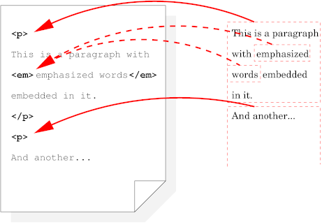
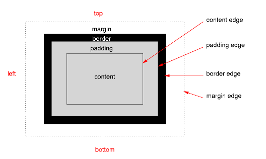
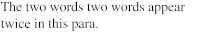
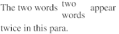
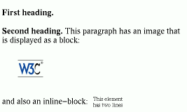
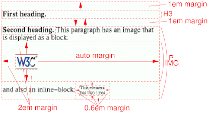
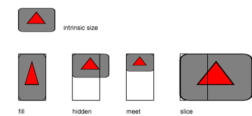
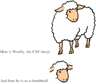
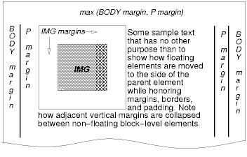
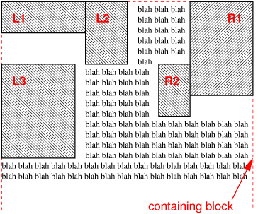
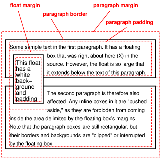
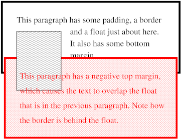
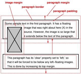
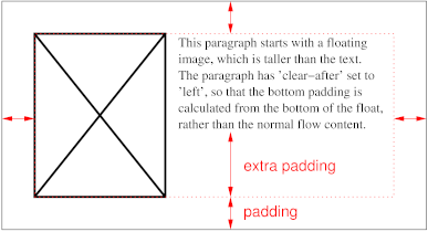