摘要(Abstract)
CSS (Cascading Style Sheets) is a language for describing the rendering of
structured documents (such as HTML and XML) on screen, on paper, in speech,
etc. This draft contains the proposed functionality for CSS level 3 to
describe borders and backgrounds, including borders consisting of images and
backgrounds with multiple images. It includes and extends the functionality
of CSS level 2 [CSS2], which builds on CSS level 1
[CSS1].
CSS(Cascading Style Sheets)はスクリーン上、紙媒体、読み上げ等での
(HTMLやXMLの様な)構造化文書の表現方法を定義するための言語である。
この草案はCSS レベル 3でボーダーと背景を定義する機能の提案を含んでいる。
これには画像のボーダーやマルチ画像背景が含まれている。
また、CSS レベル 1[CSS1]
から作られたCSS レベル 2[CSS2]の機能を含み、拡張したものである。
This module replaces two earlier drafts: CSS3 Backgrounds and CSS3 Border.
このモジュールは先の草案、CSS3 BackgroundsとCSS3 Borderを置き換えるものである。
この文書の状態(Status of this document)
This section describes the status of this document at the time of its
publication. Other documents may supersede this document. A list of current
W3C publications and the latest revision of this technical report can be found
in the W3C technical reports index
at http://www.w3.org/TR/.
Publication as a Working Draft does not imply endorsement by the W3C
Membership. This is a draft document and may be updated, replaced or
obsoleted by other documents at any time. It is inappropriate to cite this
document as other than work in progress.
The (archived) public
mailing list www-style@w3.org (see instructions) is preferred for
discussion of this specification. When sending e-mail, please put the text
“css3-background” in the subject, preferably like this:
“[css3-background] …summary of
comment…”
This document was produced by the CSS Working
Group (part of the Style Activity).
This document was produced under the 24 January 2002 CPP as
amended by the W3C Patent Policy
Transition Procedure. The Working Group maintains a public list of patent
disclosures relevant to this document; that page also includes
instructions for disclosing a patent. An individual who has actual knowledge
of a patent which the individual believes contains Essential Claim(s) with
respect to this specification should disclose the information in accordance
with section 6 of
the W3C Patent Policy.
目次(Table of contents)
1. 他のCSS3モジュールとの依存関係(Dependencies with other
CSS 3 Modules)
2. コンテキスト(Context)
Members of the CSS Working Group proposed during the Clamart meeting to
modularize the CSS specification.
This modularization, and the externalization of the general syntax, of CSS
will reduce the size of the specification and allow new types of
specifications to use selectors and/or CSS general syntax.
This specification will have its own test suite, with
several tests per concept introduced in this document, as well as tests for
multiple concepts used together. This test suite will not consist of full
conformance tests, but is intended to ensure interoperability between
implementations and will form part of the CR exit criteria.
2.1. CSS 2.1からの変更点(Changes from CSS 2.1)
[This section needs to be revised.]
[このセクションは改訂が必要だ。]
'Background-clip', 'background-break',
and 'background-origin' are new. Also there
are changes to the 'background' shorthand property.
'Background-attachment' has a new
value 'local'.
The background can now have multiple images. As a consequence, several
properties now accept a comma-separated list of values.
3. 背景とボーダーのレイアウトモデル(The layout model of
backgrounds and borders)
(This section is informative.)
(このセクションは参考である。)
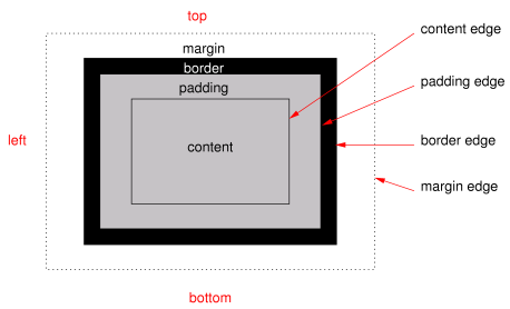
When elements are rendered according to the CSS box model [CSS3BOX], each
element is either not displayed at all, or formatted as one or more
rectangular boxes. Each box has a rectangular content area, a band of padding
around the content, a border around the padding, and a margin outside the
border. (The margin may actually be negative, but margins have no influence
on the background and border, so that doesn't concern the model for borders
and backgrounds.)
要素がCSSボックスモデル[CSS3BOX]に従ってレンダリングされる時、
それぞれの要素は全てが表示されない、または一つ、もしくはそれ以上の矩形ボックスとしてフォーマットされる。
それぞれのボックスは矩形の内容領域、内容の周りのパディング、
パディングの周りのボーダー、ボーダーの外側のマージンで構成される。
(マージンは実際には負の場合があるが、マージンは背景とボーダーには何の影響も与えない。
つまり、背景とボーダーのモデルには関係ない。)
The child elements of an element usually create boxes of their own, that
are placed inside the content area of their parent, although they may also be
placed outside it.
ある要素の子要素は通常、それらを持つボックスを生成する。
そのボックスはその親の内容領域の内側に配置される。
(外側に配置されるかもしれないが。)
The reason an element may result in more than one box, is that elements
may be broken at the end of a line (for inline elements), at the end of a
column or at the end of a page and create further boxes in the next line,
column or page.
ある要素がひとつ以上のボックスを返す理由は、その要素が行末(インライン要素の場合)、
カラムの終端、ページの終端で分断され、それ以降のボックスが次の行、カラム、ページに
生成されることがあるからである。
The properties of this module deal with the contents of the border area
and the background of the content, padding and border areas.
このモジュールのプロパティはボーダー領域の内容や内容、パディング、ボーダー領域の背景を扱う。
That background may be fully transparent (the default), or it may be
filled with a color, one or more images, or both. The background properties
specify what color ('background-color') and images ('background-image')
to use, where they are placed ('background-position'), whether they
are repeated or scaled ('background-repeat', 'background-size'),
etc.
背景は完全に透明(デフォルト)だったり、ある色によって塗りつぶされていたり、
一つ以上の画像で埋められていたり、その両方の場合もある。
背景のプロパティはどのような色にするか('background-color')、画像を用いるか('background-image')、
画像をどう配置するか('background-position')、
繰り返し表示するのか、伸縮させるのか('background-repeat'、'background-repeat')等を指定するものである。
The border can either be a predefined style (solid line, double line,
dotted line, pseudo-3D border, etc.) or it can be an image. In the former
case, three properties define the style of the four border sides ('border-style'), color
('border-color')
and thickness ('border-width'). In the latter case, the
sides and corners are taken from the sides and corners of an image specified
with 'border-image'. The image can be sliced,
scaled and stretched in various ways to fit the size of the border.
ボーダーはあらかじめ定義されたスタイル(実線、二重線、点線、疑似立体線等)、
または特定の画像で表現できる。前者の場合、三つのプロパティが四方向のボーダーのスタイル('border-style')、色('border-color')、
太さ('border-width')を定義する。
後者の場合、辺や角を'border-image'に指定された画像の辺や角から得る。
その画像は様々な方法で、ボーダーのサイズに合わせて分割、伸縮、伸張される。
If an element is broken into multiple boxes, 'border-break' and 'background-break' define how the borders
and background are divided over the various boxes.
ある要素が複数のボックスに分割される場合、'border-break'と'background-break'がボーダーと背景が
様々なボックスでどのように分割されるかを定義する。
There is also another kind of border-like decoration that can be added to
an element: a drop shadow, via the 'box-shadow' property.
また、もう一つ要素に加えることのできるボーダーの様な修飾がある。
それは'box-shadow'プロパティによる、ドロップシャドウである。
4.
'background-color'プロパティ(The
'background-color' property)
| 名前:
| background-color
|
| 値:
| <color>
|
| 初期値:
| transparent
|
| 適用対象:
| 全ての要素
|
| 継承:
| しない
|
| パーセント値:
| しない
|
| メディア:
| visual
|
| 算出値:
| 指定値
|
This property sets the background color of an element. Valid color values
are defined in the Color Module [CSS3COLOR].
このプロパティは要素の背景色を指定する。
適当な色の値についてはカラーモジュール[CSS3COLOR]で定義されている。
Example(s):
例:
h1 { background-color: #F00 }
5.
'background-image'プロパティ(The
'background-image' property)
| 名前:
| background-image
|
| 値:
| <uri> [ , <uri> ]* | none
|
| 初期値:
| none
|
| 適用対象:
| 全ての要素
|
| 継承:
| しない
|
| パーセント値:
| 無し
|
| メディア:
| visual
|
| 算出値:
| 絶対URI
|
This property sets the background image(s) of an element, or 'none' for no image.
このプロパティは要素の背景画像を指定するか、もしくは'none'により、画像無しを指定する。
Images are drawn with the first specified one on top (closest to the user)
and each subsequent image behind the previous one. The 'background-color' is
painted below all the images.
最初に指定された画像を上(ユーザから見て、手前)に描画し、
その後の画像は前の画像の後ろ側へ描画していく。'background-color'は
全ての画像の下側に描画される。
See the section “Layering multiple background
images” for how each image is tiled or stretched.
それぞれの画像がどのように敷き詰められるか、伸縮されるかは“複数の背景画像の重なり”を参照。
Example:
例:
body { background-image: url("marble.svg") }
p { background-image: none }
div { background-image: url(tl.png), url(tr.png) }
Implementations may optimize by not downloading and drawing
images that are not visible (e.g., because they are behind other, fully
opaque images).
実装されたUAは(完全に不透明な画像の背後に回り込むため)見えない画像をダウンロードも描画もしないという最適化を行っても良い。
An image that is empty (zero width or zero height), that fails to
download, or that otherwise cannot be displayed (e.g., because it is not in a
supported image format) has the same effect as a non-empty transparent image.
(ゼロ幅、ゼロ高の)空の画像や、ダウンロードに失敗に失敗した画像、
(サポートしていないフォーマットの)表示できない画像は空では無い透明な画像と同じ効果を持つ。
If 'background-repeat' or 'background-position' has more
comma-separated values than 'background-image', the series of values
is repeated as needed.
もし'background-repeat'か'background-position'が'background-image'よりもカンマ区切りの値が多い場合、
値のリストは必要なだけ繰り返される。
For example, these rules
例えば、このようなルールの場合。
background-image: url(a), url(b);
background-position: top, right, bottom, left, center;
background-repeat: no-repeat, no-repeat;
have the same effect as:
次のものと同じ効果を持つ。
background-image: url(a), url(b), url(a), url(b), url(a);
background-position: top, right, bottom, left, center;
background-repeat: no-repeat, no-repeat, no-repeat,
  no-repeat, no-repeat;
It seems more intuitive to let 'background-image' determine the number
of layers and truncate or extend 'background-repeat' and 'background-position' accordingly.
Also because only 'background-image' has the value 'none'.
'background-image'がレイヤーの数を決定し、
'background-repeat'や'background-position'の値を削除、もしくは追加する方が
おそらく直感的だろう。
また、'background-image'が'none'である場合もそうだ。
Editor's Note: Conformance properties for an image should be
addressed here: MIME type image/*, require support for PNG, refer to
profiles…
6.
'background-repeat'プロパティ(The
'background-repeat' property)
| 名前:
| background-repeat
|
| 値:
| <repeat> [ , <repeat> ]*
|
| 初期値:
| repeat
|
| 適用対象:
| 全ての要素
|
| 継承:
| しない
|
| パーセント値:
| 無し
|
| メディア:
| visual
|
| 算出値:
| 指定値
|
The value <repeat> stands for:
repeat-x | repeat-y | [repeat | space | no-repeat]{1,2}.
<repeat>値は、
repeat-x | repeat-y | [repeat | space | no-repeat]{1,2}
See the section “Layering multiple background
images” for how each comma-separated value is applied to each image
of the 'background-image' property.
どのようにカンマ区切りの値が'background-image'プロパティのそれぞれの画像に適用されるかについては、
“複数画像の重なり”を参照。
The tiling and positioning of the background image on inline elements is
described under the 'background-break' property.
インライン要素における背景画像の敷き詰め方、配置は'background-break'プロパティで定義されている。
Should there also be values of "repeat-up", "repeat-down",
"repeat-right", and "repeat-left" for this property?
"repeat-up"、"repeat-down"、"repeat-right"、"repeat-left"値をこのプロパティに追加すべきか?
Values have the following meanings:
値は意味は次の通りである。
- repeat-x
Equivalent to 'repeat no-repeat'.
'repeat no-repeat'と同じ。
- repeat-y
Equivalent to 'no-repeat repeat'
'no-repeat repeat'と同じ。
Otherwise, if there is one value, it sets both the horizontal and vertical
repeat. If there are two, the first one is for the horizontal direction, the
second for the vertical one. As follows:
これ以外の場合、値が一つだけなら、水平方向と垂直方向の両方にその値が設定される。
もし、値が二つなら、最初の値が水平方向のためのもので、二番目の値が垂直方向のためのものである。
値は次の通り。
- repeat
The image is repeated in this direction as often as needed to cover the
area. The image is clipped at the border or padding edge (depending on 'background-clip').
画像はこの方向の領域を埋めるのに必要なだけ繰り返される。
画像はボーダー、もしくはパディング領域で('background-clip'による)切り抜かれる。
- no-repeat
The image is not repeated in this direction. If it is too large, the
image is clipped at the border or padding edge (depending on 'background-clip').
画像はその方向に繰り返されない。もし、十分に大きい場合、画像はボーダー、もしくはパディング領域で('background-clip'プロパティによる)切り抜かれる。
- space
The image is repeated as often as it will fit without being clipped and
then the images are spaced out to fill the area. The value of 'background-position' for this
direction is ignored. Be more precise? Is the space at
the edge the same as between the images or is there no space at the edge
(unless there is only one image)? If the image is too big to fit, one
image is placed in the center and clipped. Or: If the
image is too big, it is positioned according to 'background-position'.
画像は切り抜かれないように繰り返され、領域を埋めるために間隔を取る。この方向への'background-position'の値は無視される。
より詳細に? 辺の空白は画像間のスペースと同じだけあるのか?
もしくは(画像がひとつだけの場合を除いて)辺にはスペースが無い?もし、大きすぎる場合、
一つの画像を中央に配置し、切り抜く。もしくは、画像が大きすぎる場合、
'background-position'に合わせて配置する。
Unless one of the two keywords is 'no-repeat', the whole background will be tiled,
i.e., not just one vertical strip and one horizontal strip.
二つのキーワードのうちの一つが'no-repeat'でない限り、背景は繰り返される。
つまり、単に垂直方向に帯状にはならないし、水平方向に帯状にもならない。
Example(s):
例:
body {
  background: white url("pendant.png");
  background-repeat: repeat-y;
  background-position: center;
}
p {
  background-image: url(star.svg), url(pattern.png);
  background-repeat: no-repeat, repeat
}
7. The
'background-attachment' property
| Name:
| background-attachment
|
| Value:
| scroll | fixed | local [, scroll | fixed | local]*
|
| Initial:
| scroll
|
| Applies to:
| all elements
|
| Inherited:
| no
|
| Percentages:
| N/A
|
| Media:
| visual
|
| Computed value:
| as specified
|
If background images are specified, this property specifies whether they
are fixed with regard to the viewport
('fixed') or scroll along with
the document ('scroll' and
'local').
See the section “Layering multiple background
images” for how each comma-separated value is applied to each image
of the 'background-image' property.
The difference between 'scroll' and 'local' is only visible when the element has a
scrolling mechanism (see 'overflow'): in the case of 'scroll', the background does not scroll with the
element's content. (It is attached to the element's border, as it were.) In
the case of 'local', the
background scrolls along with the element's content. In the this case, the
background behind the element's border (if any) scrolls as well, even though
the border itself does not scroll with the contents.
Even if the image is fixed, it is still only visible when it is in the
content, padding, or border area of the element. Thus, unless the image is
tiled ('background-repeat: repeat'), it may be
invisible.
Example(s):
This example creates an infinite vertical band that remains
“glued” to the viewport when the element is scrolled.
body {
  background: red url("pendant.gif");
  background-repeat: repeat-y;
  background-attachment: fixed;
}
User agents that do not support 'fixed' backgrounds (for example due to limitations
of the hardware platform) should ignore declarations with the keyword
'fixed'. For example:
body {
   /* For all UAs: */
   background: white url(paper.png) scroll;
   /* For UAs that do fixed backgrounds: */
   background: white url(ledger.png) fixed;
}
h1 {
   /* For all UAs: */
   background: silver;
   /* For UAs that do fixed backgrounds: */
   background: url(stripe.png) fixed, white url(ledger.png) fixed;
}
8. The
'background-position' property
| Name:
| background-position
|
| Value:
| <bg-position> [ , <bg-position> ]*
|
| Initial:
| 0% 0%
|
| Applies to:
| all elements
|
| Inherited:
| no
|
| Percentages:
| refer to the size of the box itself
|
| Media:
| visual
|
| Computed value:
| for <length> the absolute value, otherwise a percentage
|
The <bg-position> stands
for: [ [ <percentage> |
<length> | left | center | right ]
[ <percentage> | <length> | top | center | bottom ]? ] | [
[ left | center | right ] || [ top | center | bottom ] ]
If a background image has been specified, this property specifies its
initial position. The section “Layering multiple
background images” defines to which image of 'background-image'
each of the comma-separated values applies.
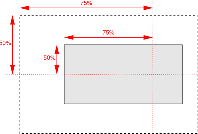
- <percentage> <percentage>
- With a value pair of '0% 0%', the upper left
corner of the image is aligned with the upper left corner of some area,
usually the box's padding edge, but possibly the border
edge, content edge or the viewport (see below). A value pair of '100%
100%' places the lower right corner of the image in the lower right
corner of the area. With a value pair of '14% 84%',
the point 14% across and 84% down the image is to be placed at the point 14%
across and 84% down the area.
- <length> <length>
- With a value pair of '2cm 1cm', the upper left
corner of the image is placed 2cm to the right and 1cm below the upper left
corner of the area.
- top left,
- left top
- Same as '0% 0%'.
- top,
- top center,
- center top
- Same as '50% 0%'.
- right top,
- top right
- Same as '100% 0%'.
- left,
- left center,
- center left
- Same as '0% 50%'.
- center
- center center
- Same as '50% 50%'.
- right,
- right center,
- center right
- Same as '100% 50%'.
- bottom left
- left bottom
- Same as '0% 100%'.
- bottom,
- bottom center,
- center bottom
- Same as '50% 100%'.
- bottom right
- right bottom
- Same as '100% 100%'.
If only one percentage or length value is given, it sets the horizontal
position only, and the vertical position will be 50%. If two values are
given, the horizontal position comes first. Combinations of keyword, length
and percentage values are allowed, (e.g., '50% 2cm'
or 'center 2cm' or 'center
10%'). For combinations of keyword and non-keyword values, 'left' and
'right' may only be used as the first value, and 'top' and 'bottom' may only
be used as the second value. Negative positions are allowed.
Example:
body { background: url("banner.jpeg") right top }    /* 100%   0% */
body { background: url("banner.jpeg") top center }   /*  50%   0% */
body { background: url("banner.jpeg") center }       /*  50%  50% */
body { background: url("banner.jpeg") bottom }       /*  50% 100% */
If the background image is fixed within the viewport
(see the 'background-attachment' property),
the image is placed relative to the viewport. Otherwise, it is placed
relative to the element's padding or border area, depending on 'background-origin'.
Example:
body {
  background-image: url("logo.png");
  background-attachment: fixed;
  background-position: 100% 100%;
  background-repeat: no-repeat;
}
In the example above, the (single) image is placed in the lower-right
corner of the viewport.
9. The
'background-clip' property
| Name:
| background-clip
|
| Value:
| [border | padding] [, [border | padding]]*
|
| Initial:
| border
|
| Applies to:
| all elements
|
| Inherited:
| no
|
| Percentages:
| N/A
|
| Media:
| visual
|
| Computed value:
| same as specified value
|
Determines whether the background extends into the border area or not. If
the value is 'padding', the
background is clipped to the padding edge and the background of the border is
transparent. If the value is 'border', the background extends into the border
area.
Each comma-separated value applies to one image of 'background-image'.
See the section “Layering multiple background
images” for how clip values and images are paired.
Editor's Note: Can the background color be placed under the
border but not background images? Not currently.
Is it useful to allow separate clip values for each image,
or is one value for the whole background enough?
10. The
'background-origin' property
| Name:
| background-origin
|
| Value:
| [border | padding | content] [, [border | padding | content]]*
|
| Initial:
| padding
|
| Applies to:
| all elements
|
| Inherited:
| no
|
| Percentages:
| N/A
|
| Media:
| visual
|
| Computed value:
| same as specified value
|
Determines how the 'background-position' is calculated.
With a value of 'padding', the position is relative to the
padding edge ('0 0' is the upper left corner of the
padding edge, '100% 100%' is the lower right
corner). 'Border' means the position is relative to the
border edge, and 'content' means relative to the content edge.
Each comma-separated value applies to one image of 'background-image'.
See the section “Layering multiple background
images” for how origin values and images are paired.
Note that if 'background-clip' is 'padding', 'background-origin' is
'border', and 'background-position' is 'top left' (the initial value), then the top left of the
background image will be clipped.
11. The
'background-size' property
| Name:
| background-size
|
| Value:
| [ [ <length> | <percentage> | auto ]{1,2} || round ]
[ [ , [ <length> | <percentage> | auto ]{1,2} ] || round
]*
|
| Initial:
| auto
|
| Applies to:
| all elements
|
| Inherited:
| no
|
| Percentages:
| see text
|
| Media:
| visual
|
| Computed value:
| same as specified value
|
Is 'background-stretch' a better name?
Specifies the size of the background images. The section “Layering multiple background images”
defines to which image of the 'background-image' property each of the
comma-separated values applies.
If a comma-separated value has only one part (not counting the keyword
'round'), the second part is set to 'auto'. Of the two parts, the first one refers to the
width, the second to the height of the corresponding background image. The
addition of the keyword 'round' indicates that the
width and height are approximate, as explained below. 'round' on its own is equivalent to 'auto auto round'.
The size of an image is established in two steps. The first step derives
sizes as follows:
- auto
- The size that keeps the background image's original aspect ratio.
Additionally, if the other part of the value is also 'auto', the image has its intrinsic size.
- <length>
- A specific size.
- <percentage>
- The percentage is relative to the width or height of the area given by
'background-origin'.
Negative values are not allowed. A size of zero is allowed, but causes the
image not to be displayed. (The effect is the same as if it had been a
transparent image.)
If the given size is accompanied by the keyword 'round', and the computed value of 'background-repeat'
is repeat for the horizontal
and/or vertical direction, there is a second step: The UA must reduce the
width, resp., height so that the image fits a whole number of times in the
background area. In the case of the width:
If X ≠ 0 is the width of the image (i.e., the specified
length or percentage, or the intrinsic width if the 'background-size' is 'auto') and W is the width of the background
area, then the rounded width X' = W / ceil(W
/ X)
The height is analogous. ceil() is a function that returns its argument if
it is a whole number, otherwise the next bigger whole number.
If the width is reduced because of this formula, the aspect ratio is not
retained, not even if the height was specifed as 'auto' and the vertical repeat as 'no-repeat'. Ditto if the height is reduced.
Should 'round' be specified for width and height separately?
It then becoems possible to round in one direction and keep the aspect ratio
in the other. E.g., instead of allowing the keyword in 'background-size', it
could be one of the possible values in 'background-repeat': [ repeat | space
| no-repeat | round ]{1,2}.
Is 'round' the right word? How about '~' in front of the
number, or 'approx' or 'about'?
Is it better allow the size of the image to be rounded up as
well as down?
Here are some examples. The first example stretches the background image
independently in both directions to completely cover the content area:
div {
    background-image: url(plasma.png);
    background-size: 100%;
    background-origin: content}
The second example stretches the image so that exactly two copies fit
horizontally. The aspect ratio is preserved:
p {
    background-image: url(tubes.png);
    background-size: 50% auto;
    background-origin: border}
This example forces the background image to be 15 by 15 pixels:
para {
    background-size: 15px;
    background-image: url(tile.png)}
This example uses the image's intrinsic size. Note that this is the only
possible behavior in CSS level 1 and 2.
body {
    background-size: auto;
    background-image: url(flower.png)}
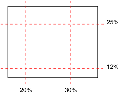
The following example rounds the height of the image to 25%, down from the
specified value of 30%. At 30%, three images would fit entirely and a fourth
only partially. After rounding, four images fit. The width of the image is
20% of the background area width and is not rounded.
p {
    background-image: url(chain.png);
    background-repeat: repeat-y;
    background-size: 20% 30% round; }
12. The
'background-break' property
| Name:
| background-break
|
| Value:
| bounding-box | each-box | continuous
|
| Initial:
| continuous
|
| Applies to:
| inline elements and block-level elements (see text)
|
| Inherited:
| no
|
| Percentages:
| N/A
|
| Media:
| visual
|
| Computed value:
| same as specified value
|
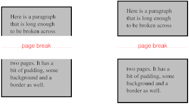
This property applies to inline flow elements (specifically, it does not
apply to elements that are inline-block or inline-table), and to block-level
elements when they are broken into several boxes (for example, across pages).
The property does different things for different types of boxes.
For inline flow elements, values have the following meanings:
- bounding-box
- The background is drawn in a rectangle which is the smallest rectangle
that encloses all inline boxes of the element. It is only visible within the
padding (or border, depending on the 'background-clip' property) area of the
inline boxes. If the boxes are on different pages, the pages are treated as
one continuous page, glued together at their top and bottom (after stripping
away the top and bottom page margins) and the rectangle is drawn on this
continuous page. Still an issue if the pages aren't the
same width, e.g., one is in landscape.
- each-box (or discontinuous?)
- The background is drawn in each inline box of the element. A no-repeat
background image will thus be rendered once in each inline box of the
element.
- continuous
- The effect is as if, after the element has been laid out (including any
justification, bidi reordering, page breaks, etc.), all the element's boxes
are taken and put one after the other in one long row; the background is
applied to the bounding box of this row and then the boxes are put back, with
their share of the background. The order in the row is the visual order of
the boxes, not the logical order of the source. I.e., in a right-to-left
containing block ('direction' is 'ltr'), the first box is the leftmost box on the first
line and subsequent boxes are put to the right of it. In a right-to-left
containing block, the first box is the rightmost on the first line and
subsequent boxes are put to the left of it. Is this true?
or the direction of the element itself?
For block-level elements, values have the following meanings: (EDITOR'S NOTE: following needs to be checked against what was
in old "background-break (open|close)" property)
- bounding-box
- The background is tiled in a rectangle which is the smallest rectangle
that encloses all boxes of the block-level element.
- each-box
- (or 'discontinuous'?) Each box of the
block-level element is treated separately for background rendering.
- continuous
- For block-level elements, 'continuous' works
identical to 'bounding-box'
13. Layering multiple background
images
The properties 'background-image', 'background-origin',
'background-clip', 'background-repeat',
'background-size', and 'background-position' may have
multiple comma-separated values. Excepting the case that 'background-image' is
'none', if the values are specified as follows:
backgound-image:
w1,…wM
backgound-repeat:
x1,…xR
backgound-size:
y1,…yS
backgound-position:
s1,…sP
the number of layers is N = max(M, R,
S, P) [shouldn't it be M
instead?].
Each of the properties is interpreted as if it had N values, by
repeating the specified values like this:
backgound-image:
w1,…wM,
w1,…wM,
w1,… /* N values */
backgound-repeat:
x1,…xR,
x1,…xR,
x1,… /* N values */
backgound-size:
y1,…yS,
y1,…yS,
y1,… /* N values */
backgound-position:
s1,…rP,
s1,…rP,
s1,… /* N values */
This set of declarations:
background-image: url(flower.png), url(ball.png), url(grass.png);
background-position: center center, 20% 80%, top left;
background-origin: border, content;
has exactly the same effect as this set with the origin values repeated
(bolded for clarity):
background-image: url(flower.png), url(ball.png), url(grass1.png);
background-position: center center, 20% 80%, top left;
background-origin: border, content, border;
Likewise, this set of declarations:
background-image: url(red.png), url(blue.png);
background-repeat: repeat-x, repeat-y, repeat-y;
background-position: 20% 25%, 40% 10%, 50% 15%, 70% 40%, 90% 35%;
has the same effect as:
background-image: url(red.png), url(blue.png), url(red.png),
    url(blue.png), url(red.png);
background-repeat: repeat-x, repeat-y, repeat-y, repeat-x, repeat-y;
background-position: 20% 25%, 40% 10%, 50% 15%, 70% 40%, 90% 35%;
There are other ways to add missing values: repeat the last
value at the end, repeat the first value at the start, fill either at the end
or at the start with the initial value…
Each of the images is repeated, sized, and positioned according to the
corresponding value in the other properties. The first image in the list is
the layer closest to the user, the next one is painted behind the first, and
so on.
If 'background-image' is 'none', there are no layers (N = 0).
14. The 'background'
property
| Name:
| background
|
| Value:
| [ <bg-layer> , ]* <final-bg-layer>
|
| Initial:
| see individual properties
|
| Applies to:
| all elements
|
| Inherited:
| no
|
| Percentages:
| see individual properties
|
| Media:
| visual
|
| Computed value:
| see individual properties
|
<bg-layer> stands for:
<'background-image'> && [
( <'background-size'> ) ]?
&& <'background-repeat'>?
&& <'background-position'>?
&& <'background-attachment'>?
&& [ <'background-clip'> <'background-origin'>? ]?
<final-bg-layer>
stands for: <'background-image'> || (
<'background-size'> ) ||
<'background-repeat'> ||
<'background-position'> ||
<'background-attachment'> ||
[ <'background-clip'> <'background-origin'>? ] ||
<'background-color'>
Note that <bg-layer> requires a <uri> for an image, while an image is
optional in <final-bg-layer>; a color and
attachment are permitted in <final-bg-layer>, but not in
<bg-layer>.
The 'background'
property is a shorthand property for setting most background properties at
the same place in the style sheet. It sets each of 'background-color', 'background-position', 'background-size',
'background-repeat', 'background-clip',
'background-origin', 'background-attachment' and 'background-image' to
the value given, or to its initial value, if no explicit value was specified.
(It does not set 'background-break'.)
Note that the ::first-line pseudo-element is like
an inline-level element for the purposes of the background (see section
5.12.1 of [CSS21]).
That means, e.g., that in a left-justified first line, the background does
not necessarily extend all the way to the right margin.
Examples:
In the first rule of the following example, only a value for 'background-color'
has been given and the other individual properties are set to their initial
values. In the second rule, many individual properties have been specified.
body { background: red }
p { background: url("chess.png") (10em round) gray
       40% repeat fixed border border}
The first rule is equivalent to:
body {
    background-color: red;
    background-position: 0% 0%;
    background-size: 30% 30%;
    background-repeat: repeat repeat;
    background-clip: border;
    background-origin: padding;
    background-attachment: scroll;
    background-image: none }
The second is equivalent to:
p {
    background-color: gray;
    background-position: 40% 50%;
    background-size: 10em 10em round;
    background-repeat: repeat repeat;
    background-clip: border;
    background-origin: border;
    background-attachment: fixed;
    background-image: url(chess.png) }
The following example shows how a both a background color (#CCC) and a background image (url(metal.jpg)) are set. The image is stretched to the
full width of the element:
E { background: #CCC url("metal.jpg") (100% auto) no-repeat top left }
Another example shows equivalence:
div { background: padding url(paper.jpg) white center }
div {
    background-color: white;
    background-image: url(paper.jpg);
    background-repeat: repeat;
    background-attachment: scroll;
    background-position: center;
    background-clip: padding;
    background-origin: padding;
    background-size: auto auto }
The following declaration with multiple, comma-separated values
background: url(a.png) top left no-repeat,
  url(b.png) center (100% 100%) no-repeat, url(c.png) white
is equivalent to
background-image:      url(a.png), url(b.png),        url(c.png);
background-position:   top left,   center,            top left;
background-repeat:     no-repeat,  stretch no-repeat, repeat;
background-clip:       border,     border,            border;
background-origin:     padding,    padding,           padding;
background-size:       auto auto,  100% 100%,         auto auto;
background-attachment: scroll,     scroll,            scroll;
background-color:      white;
Note that 'background: url(foo)
white' and 'background: url(foo), white' have
the same effect.
Having both clip and origin in the shorthand may be
confusing, since they use the same keywords and their order is thus
important. Maybe a simplification (due to Fantasai) is to allow '[border |
padding | content]?' only once and use it to set clip and origin to the same
value (or to their defaults, if absent).
15. 'border-color'プロパティ(The 'border-color'
properties)
| 名前:
| border-top-color、border-right-color、border-bottom-color、border-left-color
|
| 値:
| <color>
|
| 初期値:
| 現在の色
|
| 適用対象:
| 全ての要素
|
| 継承:
| しない
|
| パーセント値:
| 無し
|
| メディア:
| visual
|
| 算出値:
| <color>
|
| 名前:
| border-color
|
| 値:
| <color>{1,4}
|
| 初期値:
| (各プロパティ参照)
|
| 適用対象:
| 全ての要素
|
| 継承:
| しない
|
| パーセント値:
| 無し
|
| メディア:
| visual
|
| 算出値:
| 各プロパティ参照
|
These properties set the foreground color of the border specified by the
border-style
properties.
これらのプロパティでborder-style
プロパティによって指定されたボーダーの前景色を指定する。
'Border-color'
is a shorthand for the four 'border-*-color' properties. The four values set
the top, right, bottom and left border, respectively. A missing left is the
same as right, a missing bottom is the same as top, and a missing right is
also the same as top.
'border-color'
は4種の'border-*-color'プロパティの略記である。
四つの値はそれぞれ上、右、下、左のボーダーへの指定である。
左が省略されている場合、右と同じとし、下も省略されている場合は上と同じとする。
更に右も省略されている場合は上と同じとする。
16. 'border-style'プロパティ(The 'border-style'
properties)
| 名前:
| border-top-style、border-right-style、border-bottom-style、border-left-style
|
| 値:
| <border-style>
|
| 初期値:
| none
|
| 適用対象:
| 全ての要素
|
| 継承:
| しない
|
| パーセント値:
| 無し
|
| メディア:
| visual
|
| 算出値:
| 指定値
|
| 名前:
| border-style
|
| 値:
| <border-style>{1,4}
|
| 初期値:
| (各プロパティ参照)
|
| 適用対象:
| 全ての要素
|
| 継承:
| しない
|
| パーセント値:
| 無し
|
| メディア:
| visual
|
| 算出値:
| 各プロパティ参照
|
These properties set the style of the border, unless there is a border
image (see 'border-image').
これらのプロパティはボーダー画像('border-image'参照)が無い場合における、ボーダーのスタイルを設定する。
'Border-style'
is a shorthand for the other four. Its four values set the top, right, bottom
and left border respectively. A missing left is the same as right, a missing
bottom is the same as top, and a missing right is also the same as top.
'border-style'は
他の四つのプロパティの簡略化プロパティである。
その四つの値は、それぞれ上、右、下、左のボーダーを設定する。
左が省略されている場合、右と同じに、下が省略されている場合は上と同じに、
右も省略されている場合は上と同じになる。
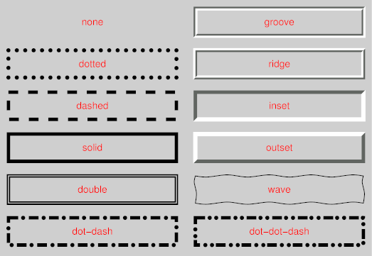
<border-style> is: none
| hidden | dotted | dashed | solid | double | dot-dash | dot-dot-dash | wave
| groove | ridge | inset | outset. Values have the following meanings:
<border-style>は'none | hidden | dotted | dashed | solid | double
| dot-dash | dot-dot-dash | wave | groove | ridge | inset | outset'を値にとる。
それぞれの意味は次の通りである。
- none
No border. Color and width are ignored (i.e., the border has width 0,
unless the border is an image, see 'background-image'
ボーダー無し。
色と、幅は無視される(例えば、ボーダーに画像が指定されていない限り、
ボーダーの幅がゼロとなる。'background-image'参照)。
- hidden
Same as 'none', but has different behavior in the conflict resolution
rules for tables [CSS3TBL].
'none'と同じ。
ただし、表組み[CSS3TBL]のボーダーの競合時には別の意味がある。
- dotted
A series of dots.
点の連なり。
- dashed
A series of dashes.
短い線の連なり。
- solid
A single line segment.
実線。
- double
Two parallel solid lines with some space between them. (The thickness of
the lines is not specified, but the sum of the lines and the space must equal
'border-width'.)
2本の実線と、それらの間は空白。
(各線の太さは定義しないが、各線と空白の合計は
'border-width'
と一致しなくてはいけない。)
- dot-dash
Alternating dots and dashes.
点と短い線を交互に描画する。
- dot-dot-dash
Two dots and a dash.
2つの点と、短い線。
- wave
A wavy line.
波線。
- groove
Looks as if it were carved in the canvas. (This is typically achieved by
creating a “shadow” from two colors that are slightly lighter and
darker than the 'border-color'.)
キャンバスに刻まれたかのような線。
(これは一般的に、
'border-color'
より若干明るい色と、暗い色の2色で“陰”を作られる)
- ridge
Looks as if it were coming out of the canvas.
キャンバスから盛り上がったかのような線。
- inset
Looks as if the content on inside of the border is sunken into the
canvas. Different meaning on table[ref] elements.
ボーダーの内側の内容がキャンバスより窪んで見えるような線。
ただし、table要素では異なる意味を持つ。
- outset
Looks as if the content on the inside of the border is coming out of the
canvas. Different meaning for table[ref] elements.
ボーダーの内側の内容がキャンバスより盛り上がっているかのように見えるような線。
ただし、table要素では異なる意味を持つ。
Borders are drawn in front of the element's background, but behind the
element's content (in case it overlaps).
ボーダーは要素の背景と内容の間に描画される(重なることもある)。
Note: There is no control over the spacing of the dots and
dashes, nor over the length of the dashes. Implementations are encouraged to
choose a spacing that makes the corners symmetrical.
メモ: 点と短い線の間の空白や短い線の長さを操作することはできない。
推奨される実装は、空白を調整し、角が左右対称となるようにすることである。
Note: This specification does not define how borders of
different styles should be joined in the corner. Also note that rounded
corners may cause the corners and the contents to overlap, if the padding is
less than the radius of the corner.
メモ: 本仕様は角において、異なるスタイルのボーダー同士がどのように結合すべきかを定義しない。
また、丸角は、その丸さよりもパディングが小さい場合、角と内容が重なることに注意。
17. 'border-width'プロパティ(The 'border-width'
properties)
| 名前:
| border-top-width、border-right-width、border-bottom-width、border-left-width
|
| 値:
| <border-width>
|
| 初期値:
| medium
|
| 適用対象:
| 全ての要素
|
| 継承:
| しない
|
| パーセント値:
| 包含ブロックのwidth*
|
| メディア:
| visual
|
| 算出値:
| 指定値
|
| 名前:
| border-width
|
| 値:
| <border-width>{1,4}
|
| 初期値:
| (各プロパティ参照)
|
| 適用対象:
| 全ての要素
|
| 継承:
| しない
|
| パーセント値:
| 各プロパティ参照
|
| メディア:
| visual
|
| 算出値:
| 各プロパティ参照
|
[Border-width doesn't allow percentages in CSS2; should we
allow percentages (of the containing block's width) in CSS3?]
[border-widthはCSS2ではパーセント値は受け付けなかった。
CSS3では(包含ブロックの幅に対する)パーセント値を許容すべきだろうか?
These properties set the thickness of the border.
これらのプロパティはボーダーの太さを設定する。
The <border-width> is
'<length> | <percentage> | thin | medium | thick'.
The <length> and <percentage> may not be negative. The
lengths corresponding to 'thin', 'medium' and 'thick' are not specified, but
the values are constant throughout a document and thin ≤ medium ≤
thick. A UA could, e.g., make the thickness depend on the 'medium' font size:
one choice might be 1, 3 & 5px when the 'medium' font size is 17px or
less.
<border-width>の値は'<length> | <percentage> | thin | medium | thick'である。
<length>と<percentage>は負の値であってはならない。
'thin'、'medium'、'thick'に対応する太さは定義しないが、
文書全体において一貫した太さで、thin ≤ medium ≤
thickの関係である。UAは例えば、フォントサイズ'medium'から太さを決定することもできる。
'medium'フォントサイズが17pxか、それ以下の場合に、1、3、5pxといった具合である。
'Border-width'
is a shorthand that sets the four 'border-*-width' properties. If it has four
values, they set top, right, bottom and left in that order. If left is
missing, it is the same as right; if bottom is missing, it is the same as
top; if right is missing, it is the same as top.
'border-width'は
四つの'border-*width'の簡略化プロパティである。
もし、値が四つなら、順に、上、右、下、左となる。
もし、左が省略されている場合、右と同じになる。
もし、下が省略されている場合、上と同じになる。
右も省略されている場合、上と同じになる。
Note that the initial width is 'medium', but the initial
style is 'none' and therefore the used width is 0.
初期値が'medium'であることに注意。
だが、スタイルの初期値が'none'なので利用値は0となる。
When the used width of the border is 0, we say that the border is absent.
ボーダーの幅の利用値が0の場合、ボーダーが無いと言う。
18. 'border-image'プロパティ(The 'border-image'
property)
| 名前:
| border-image
|
| 値:
| none | <uri>
[<number> | <percentage>]{4} [ / <border-width>{1,4} ]? [stretch |
repeat | round]{0,2}
|
| 初期値:
| none
|
| 適用対象:
| 全ての要素。ただし、'border-collapse'が'collapse'のtableを除く。
|
| 継承:
| しない
|
| パーセント値:
| 無し
|
| メディア:
| visual
|
| 算出値:
| 指定値。URIの場合は絶対URI。
|
Specifies an image to use instead of the border styles given by the 'border-style' properties
and an additional background image for the element. If the value is 'none' or if the image cannot be displayed, the border
styles will be used.
'border-style'プロパティによって
指定されたボーダースタイルと要素に指定された背景画像の代わりに用いる画像を指定する。
もし、値が'none'、もしくは、画像を表示できない場合はボーダースタイルを利用する。
The four numbers or percentages immediately following the <uri> specify which part of that image is
used for which part of the border. They divide the image into nine parts:
four corners, four edges and a middle part. The middle part is used as an
extra background image.
<uri>の直後の、四つの数値、もしくはパーセント値は
画像のどの一部が、どのボーダーに利用されるかを示す。
画像を九つに分割し、四つの角、四つの辺、そして中央部に分ける。
中央部は特別な背景画像として用いられる。
The first of the four values is the height of the top edge and of the two
top corners. The second is the width of the right edge and the two right
corners. The third is the height of the bottom edge and the two bottom
corners. The fourth is the width of the left edge and the two left corners.
四つの値の最初は上辺と上二つの角の高さを表す。
二番目は右辺と右二つの角の幅を表す。
三番目は下辺と下二つの角の高さを表す。
四番目は左辺と左二つの角の幅を表す。
Percentages are relative to the size of the image. Numbers represent
pixels in the image (if the image is a raster image) or CSS px units (if
not). Negative values are not allowed and values bigger than the size of the
image are interpreted as 100%.
パーセント値は画像のサイズの相対値である。
数値は(もしラスター画像なら)画像内でのピクセルに、(もし、そうでないなら)CSSのpx単位に変換される。
負の値は受け入れられない。また、画像のサイズを超える大きな値は100%と解釈される。
The <number>s are slightly confusing.
People may be tempted to write 5px instead of 5, since on most screens, 5px
is the same size as 5 image pixels.
<number>は紛らわしい。
5の代わりに5pxと書きたくなる人も多いだろう。
多くのスクリーンにおいては、5pxは画像の5ピクセルと同じサイズなのだ。
If the sum of the right and left widths is equal to or greater than the
width of the image, the images for the top and bottom edge and the middle
part are empty, which has the same effect as if a non-empty transparent image
had been specified for those parts. Analogously for the top and bottom
values.
もし右と左の幅の合計が画像の幅以上なら、上辺と下辺の中央部分は空になり、
それらの部分に空ではない透明な画像が指定されたのと同じことになる。
上下の場合においても同じである。
If the slash is present in the property value, the one to four values
after it are used for the width of the border instead of the 'border-width'
properties (but only if the specified image can be displayed). The order of
the values is the same as for 'border-width'.
もし、プロパティ値にスラッシュがあるなら、その後にある一つから四つの値は'border-width'プロパティの代わりに
幅として用いられる(ただし、指定画像が表示できる場合のみ)。
値の指定順序は'border-width'と同じである。
At the end of the value, there may be up to two keywords, that specify how
the images for the sides and the middle part are scaled and tiled. If the
second is absent, it is assumed to be the same as the first. If both are
absent, the effect is the same as 'stretch stretch'.
値の最後に、最高で二つのキーワードがあるかもしれない。
これらは辺の中央部分の画像が、伸縮されるか繰り返されるのかを指定する。
もし、二つめが省略されている場合、最初の値と同じ物が指定されていることとする。
もし、両方の値が省略されている場合、'stretch stretch'と同じ効果となる。
The nine images are scaled in two steps:
九つの画像は二段階で伸縮される。
- ステップ 1
-
-
The two images for the top and bottom edges are made as tall as the top
and bottom borders, respectively, (either using 'border-width' or the values specified after
the slash) and their width is scaled proportionally.
上辺と下辺の二つの画像はそれぞれ上下のボーダーの高さ('border-width'か、スラッシュの後に指定された値のどちらか)に調整され、それらの幅は比例して伸縮される。
-
The images for the left and right edge are made as wide as the left and
right borders, respectively, and their height is scaled proportionally.
左辺と右辺の画像は左右のボーダーの幅に調整され、高さはそれに比例して伸縮される。
-
The corner images are scaled to be as wide and as tall as the two borders
they are part of.
角画像は二つのボーダーの幅と高さにあわせて調整される。
-
The middle part is not scaled.
中央部は伸縮されない。
- ステップ 2
-
-
If the first keyword is 'stretch', the top,
middle and bottom images are further scaled to be as wide as the element's
padding box. The height is not changed any further.
もし最初のキーワードが'stretch'なら、
上、中、下の画像は要素のパディングボックスの幅にまで伸縮される。
高さはそれ以上変更されない。
-
If the first keyword is 'round', the top, middle
and bottom images are reduced in width, so that exactly a whole number of
them fit in the width of the padding box, as follows:
もし最初のキーワードが'round'なら、
以下のように、上、中、下の画像は縮められ、パディングボックスの幅にちょうど合うように数を決める。
If X ≠ 0 is the width of the image and W is the
width of the padding area, then the rounded width X' =
W / ceil(W / X)
X ≠ 0が画像の幅で、Wがパディング領域の幅なら、
繰り返される画像の幅X' = W / ceil(W / X)
-
The effects of 'stretch' and 'round' for the second keyword are analogous, acting on
the height of the left, middle and right images.
二番目のキーワードの'stretch'や'round'の効果は、同様に、左、中、右画像の高さについて処理される。
The resulting images are placed centered in their respective parts of the
border (the middle image is put in the middle of the padding area) and then
tiled. All images are drawn behind the element's content, in front of the
element's background.
こうして得られた画像はボーダーの各パーツの中央に配置され
(中央の画像はパディング領域の中央に)、そして敷き詰められる。
全ての画像は要素の内容の背後、かつ要素の背景の前面に描画される。
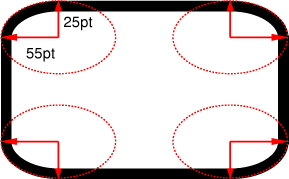
This example creates a top and bottom border consisting of a whole number
of orange diamonds and a left and right border of a single, stretched
diamond. The corners are diamonds of a different color. The image to tile is
as follows. Apart from the diamonds, it is transparent:
この例は上下のボーダーがいくつかのオレンジのダイヤモンドで、
左右のボーダーが一つの、伸張されたダイヤモンドでできている。
角は異なる色のダイヤモンドである。
その画像は次の物である。ダイヤモンド以外の部分は透明である。

The image is 81 by 81 pixels and has to be divided into 9 equal parts. The
style rules could thus be as follows:
この画像は81×81ピクセルで、9分割される。
そのスタイルルールは次のようになる。
DIV {
  border-image: url("border.png") 27 27 27 27 round stretch;
  border: double orange 1em }
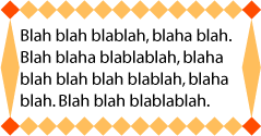
The result, when applied to a DIV of 12 by 5em, will be similar to this:
DIVの幅が5emにより、12回適用される場合、その結果は次のようになる。
The 'border-image' property does not apply to
table elements in a table with 'border-collapse' set to 'collapse'.
'border-image'プロパティは'border-collapse'に'collapse'が設定されているtable要素には適用されない。
19. 'border-radius'プロパティ(The 'border-radius'
properties)
| 名前:
| border-top-right-radius、border-bottom-right-radius、border-bottom-left-radius、border-top-left-radius、border-radius
|
| 値:
| <length> <length>?
|
| 初期値:
| 0
|
| 適用対象:
| 全ての要素。ただし、'border-collapse'が'collapse'のtableを除く。
|
| 継承:
| しない
|
| パーセント値:
| 無し
|
| メディア:
| visual
|
| 算出値:
| 指定値
|
The two length values of the 'border-radius' properties define the radii
of a quarter ellipse that defines the shape of the corner (see the diagram
below). The first value is the horizontal radius (or vertical if the 'writing-mode' is
vertical). If the second length is omitted it is equal to the first (and the
corner is thus a quarter circle). If either length is zero, the corner is
square, not rounded. The border radius also causes the element's background
to be rounded, even if the border is 'none'.
Negative values are not allowed.
'border-radius'プロパティの2つのlength値は、
角の形がどのような四半円形になっているかを表す(以下の図を参照)。
最初の値は水平方向の半径(もしくは'writing-mode'が垂直方向であるなら垂直方向の半径)。
2番目の値が省略されている場合は、最初の値と同じとする(その場合、正円の4分の1のような角になる)。
もし共にゼロならば角は四角くなり、丸くならない。
ボーダーの角を丸めた場合、その要素の背景もまた丸められる
(borderが'none'の場合も同様)。
負の値は不正である。
All border styles ('solid',
'dotted', 'inset', etc.) follow the curve of the border.
Border images specified with 'border-image', however, are clipped at the
outer edge of the curve. Or are they not affected at
all?
全てのボーダーのスタイル('solid'、
'dotted'、'inset'等)はボーダーの曲線でも有効である。
'border-image'によって指定されたボーダーの画像は
曲線の外側で切り抜かれる。もしくは、全ての効果を消すか?
20. 'border-break'プロパティ(The 'border-break'
property)
When a box that has a border is broken at a page break, column break, or,
for inline elements, at a line break, a border and some padding can be
inserted at the break, or the border can be left open.
ボーダーを持つボックスが改ページや、カラムをまたぐとき、インライン要素なら改行がある時に、
ボーダーとパディングをそこに挿入するか、ボーダーを開いたままにするかを表す。
If the style is set to 'none', no border and no
padding are inserted.
もしスタイルが'none'なら、
ボーダーとパディングは挿入されない。
Otherwise, padding is added as wide as the corresponding side of the 'padding' property and a
border is added. If borders on that side would get an image, the image is
used, scaled to the given width, otherwise the border gets the given style
and color.
それ以外の場合、パディングは'padding'プロパティの対応する方向と
同じだけ挿入され、ボーダーが挿入される。
もし、その方向のボーダーが画像なら、その画像を用い、
その幅に伸縮され、それ以外の場合、ボーダーは指定されたスタイルと色によって決定される。
Note that, unlike for the other borders of the element, a
value of 'none' suppresses any image border as well.
If you want an image or nothing, use 'hidden' instead.
注意。要素の他のボーダーの場合とは違い、
'none'値は画像のボーダーを抑制する。
もし、画像か、ボーダー無しかを望む場合、代わりに'hidden'を用いよ。
Is this asymmetry in the meaning of 'none' a problem?
Another possibility is to have a simple on/off switch for the border at the
break: 'border-break: show | hide'.
この'none'の意味のずれは問題にならないだろうか?
他に可能な手としてボーダーをON/OFFするだけの単純なスイッチとすることも考えられる。
例えば'border-break: show | hide'といった感じである。
21.
'border-top'、'border-bottom'、'border-right'、'border-left'及び'border'プロパティ(The
'border-top', 'border-bottom', 'border-right', 'border-left', and 'border'
properties)
This is a shorthand property for setting the width, style, and color of
the top, right, bottom, and left border of a box. Omitted values are set to
their initial values.
これは、ボックスの上、右、下、左のボーダーの幅、スタイル、色を指定するための簡略化プロパティである。
省略された値はそれぞれの初期値に設定される。
The 'border' property
is a shorthand property for setting the same width, color, and style for all
four borders of a box. Unlike the shorthand 'margin' and 'padding' properties, the 'border' property cannot set
different values on the four borders. To do so, one or more of the other
border properties must be used.
'border'プロパティは
ボックスの四つ、全てのボーダーに同じ幅、スタイル、色を指定する簡略化プロパティである。
'margin'や'padding'プロパティとは異なり、
'border'プロパティは四つのボーダーに異なる値を設定することはできない。
そうしたいのであれば、一つ、もしくはそれ以上の他のborderプロパティを使う必要がある。
For example, the first rule below is equivalent to the set of four rules
shown after it:
例えば、以下の最初のルールはその後の四つのルールのセットと同じである。
p { border: solid red }
p {
  border-top: solid red;
  border-right: solid red;
  border-bottom: solid red;
  border-left: solid red;
}
Since, to some extent, the properties have overlapping functionality, the
order in which the rules are specified is important.
これらのプロパティは機能が重複しているので、指定されるルールの順番は重要である。
Consider this example:
次の例について考えてみる。
blockquote {
  border-color: red;
  border-left: double;
  color: black
}
In the above example, the color of the left border is black, while the
other borders are red. This is due to 'border-left' setting the width, style, and
color. Since the color value is not given by the 'border-left' property, it will be taken from
the 'color' property. The
fact that the 'color'
property is set after the 'border-left' property is not relevant.
上の例では、左のボーダーの色は黒になり、他のボーダーは赤になる。
'border-left'が幅、スタイル、色を設定しているためである。
'border-left'で色の値が与えられていないので、
colorプロパティから色を取得することになる。
'color'プロパティが
後から設定されているが、これは関係無いことである。
22. 'box-shadow'プロパティ(The 'box-shadow'
property)
Multiple shadows may be overkill and hard to implement. What
are the use cases?
複数のシャドウはやりすぎで、実装が困難かもしれない。
使用するようなケースはどんなものだろうか?
One or more drop-shadows can be attached to a box. They are drawn just
outside the border edge. The property is a comma-separated list of shadows,
each specified by 3 length values and a color. Omitted lengths are 0, omitted
colors are equal to the computed value of the 'color' property.
ひとつ以上のドロップシャドウをボックスに付けることができる。
それらはボーダーの外側にのみ描画される。
このプロパティはシャドウのリストをカンマ区切りで指定し、
それぞれ、3つのlength値とひとつのcolor値である。
長さを省略された場合は0、
色を省略された場合は'color'プロパティの算出値と同様とする。
Shadows do not influence the layout: they may overlap with other boxes.
Like backgrounds and borders, if they overlap other boxes, they are drawn
behind any text or replaced element. In terms of the stacking
context, the shadow of an element is drawn immediately below the
background of that element.
シャドウはレイアウトには影響しない:
それらは他のボックスと重なり合うことになる。
もし他のボックスと重なり合う場合、背景と枠線の様に、テキストや置換要素の背面に描画される。
スタッキングコンテキストで考えると、要素のシャドウは要素の背景のすぐ下に描画される。
The 3 lengths and the color of each shadow are interpreted as follows:
それぞれのシャドウの3つのlength値と色は次のように解釈される。
The first length is the horizontal offset of the shadow. A positive value
draws a shadow that is offset to the right of the box, a negative length to
the left.
最初のlengthはシャドウの水平方向のオフセットである。
正の値ならボックスの右方向へずれたシャドウを描画し、
負の値なら左へとずれる。
The second length is the vertical offset. A positive value offsets the
shadow down, a negative one up.
2番目のlengthは垂直方向へのオフセットである。
正の値なら下側へシャドウを配置し、負の値は上側へ配置する。
The third length is a blur radius. Negative values are not allowed. If it
is 0, the shadow is sharp, otherwise the larger the value, the more the
shadow is blurred. The exact algorithm is not specified.
3番目のlengthはぼかし半径である。
負の値は不正である。
もし値がゼロであればシャドウはぼけないが、
それ以外の場合、シャドウはぼかされる。
そのためのアルゴリズムは定義しない。
The color is the color of the shadow.
colorはシャドウの色である。
If an element has multiple boxes, all of them get drop shadows, but
shadows are only drawn where borders would also be drawn, see 'border-break'. If the
box has a non-zero border-radius', the shadow is rounded in the
same way.
要素が複数のボックスを持っている場合、それら全てにドロップシャドウが付くが、
シャドウはボーダーが描画される部分でのみ描画される。
'border-break'を参照。
もし、ボックスのborder-radius'がゼロ以外の場合、
シャドウも同様に丸められる。
Here is an example of single words with a drop shadow. Assume the words
were enclosed in <span> and the style rule
was
ドロップシャドウの簡単な例である。
<span>内に単語が収まっていると仮定したスタイル指定は
span {border: thin solid; box-shadow: 0.2em 0.2em #CCC}
The result might look like this:
これの結果は次のようになるだろう。
This example shows a shadow on the bottom right only, even
though the box is transparent. Shouldn't we see a “real” shadow,
projecting exactly the opaque parts of the box? What if the opaque parts are
actually semi-opaque? Will the shadow be less intense there?
この例ではボックスが透明にも関わらず、下と右にのみシャドウが表示されている。
正確にボックスの不透明な部分が投影された、“リアルな”シャドウが描画されるべきではないだろうか?
不透明な部分が半透明だとしたらどうなるだろうか?
影も薄くなるのだろうか?
23. The background of the
canvas
The background of the root element becomes the background of the
canvas and extends to cover the entire canvas, although any images
are positioned and stretched relative to the root element as if they were
painted for that element alone. If the root's background-color value is 'transparent', the color is UA dependent. The root element
does not paint this background again.
For HTML documents, however, it is recommended that authors specify the
background for the BODY element rather than the
HTML element. User agents should observe the
following precedence rules to fill in the background of the canvas of HTML
documents: if the value of any of the 'background' properties on the HTML element is different from its initial value, then
use the background of the HTML element, else use
the background of the BODY element. This does
not apply to XHTML documents.
According to these rules, the canvas underlying the following HTML
document will have a “marble” background:
<!DOCTYPE html PUBLIC '-//W3C//DTD HTML 4.0//EN'
  >
<html>
  <head>
    <title>Setting the canvas background</title>
    <style type="text/css">
       body { background: url("http://example.org/marble.png") }
    </style>
  </head>
  <body>
    <p>My background is marble.</p>
  </body>
</html>
24. Profiles
(NOTE: Check profiles because of changes made!)
CSS1 Profile:
CSS2 Profile:
Mobile and TV Profiles (informative, see their specifications):
CSS3 Profile:
- Everything (as described in this specification)
This section will define conformance with the present specification only.
The inability of a user agent to implement part of this specification due
to the limitations of a particular device does not imply non-conformance.
User agents must observe the rules for handling parsing errors.
26. Tests
This specification will contain a test suite allowing user agents to
verify their basic conformance to the specification. This test suite does not
pretend to be exhaustive and does not cover all possible combined cases of
W3C background functionality.
27. Acknowledgments
Tapas Roy was editor of the Border Module, before it was merged with the
Background Module.
A set of properties for border images was initially proposed by
fantasai. The current simplification (one image cut into nine parts)
is due to Ian Hickson. (Though the original idea seems to originate with some
anonymous Microsoft engineers.)
28. CR exit criteria
As described in the W3C process document, a Candidate
Recommendation (CR) is a specification that W3C recommends for use on the
Web. The next stage is “Recommendation,” when the specification
is sufficiently implemented.
For this specification to be proposed as a W3C Recommendation, the
following conditions shall be met:
-
There must be at least two interoperable implementations for every feature
in the Module. For the purposes of this criterion, we define the following
terms:
- feature
-
a section or subsection of the specification
- interoperable
-
passing the respective test case(s) in the CSS test suite, or, if the
implementation is not a web browser, an equivalent test. Every relevant test
in the test suite should have an equivalent test created if such a UA is to
be used to claim interoperability. In addition if such a UA is to be used to
claim interoperability, then there must one or more additional UAs which can
also pass those equivalent tests in the same way for the purpose of
interoperability. The equivalent tests must be made publicly available for
the purposes of peer review.
- implementation
-
a user agent which:
- implements the feature.
- is available (i.e. publicly downloadable or available through some other
public point of sale mechanism). This is the "show me" requirement.
- is shipping (i.e. development, private or unofficial versions are
insufficient).
- is not experimental (i.e. is intended for a wide audience and could be
used on a daily basis.)
-
A minimum of sixth months of the CR period must have elapsed. This is to
ensure that enough time is given for any remaining major errors to be caught.
-
Features will be dropped if two or more interoperable implementations are
not found by the end of the CR period.
-
Features may/will also be dropped if adequate/sufficient (by judgment of
CSS WG) tests have not been produced for those feature(s) by the end of the
CR period.
29. References
Normative references
-
- [CSS3BOX]
- Bert Bos. CSS3 module: The box model. 24 October 2002. W3C
Working Draft. (Work in progress.) URL: http://www.w3.org/TR/2002/WD-css3-box-20021024
- [CSS3CASCADE]
- Håkon Wium Lie. CSS3 module: Cascading and inheritance.
19 February 2002. W3C Working Draft. (Work in progress.) URL: http://www.w3.org/TR/2002/WD-css3-cascade-20020219
- [CSS3COLOR]
- Tantek Çelik; Chris Lilley. CSS3 Color Module. 14 May
2003. W3C Candidate Recommendation. (Work in progress.) URL: http://www.w3.org/TR/2003/CR-css3-color-20030514
- [CSS3SYN]
- L. David Baron. CSS3 module: Syntax. 13 August 2003. W3C
Working Draft. (Work in progress.) URL: http://www.w3.org/TR/2003/WD-css3-syntax-20030813
- [CSS3TEXT]
- Michel Suignard. CSS3 Text Module. 14 May 2003. W3C
Candidate Recommendation. (Work in progress.) URL: http://www.w3.org/TR/2003/CR-css3-text-20030514
- [CSS3VAL]
- Håkon Wium Lie; Chris Lilley. CSS3 module: Values and
Units. 13 July 2001. W3C Working Draft. (Work in progress.) URL: http://www.w3.org/TR/2001/WD-css3-values-20010713
Other references
-
- [CSS1]
- Håkon Wium Lie; Bert Bos. Cascading Style Sheets (CSS1) Level
1 Specification. 17 December 1996. W3C Recommendation. Revised 11
January 1999. URL: http://www.w3.org/TR/1999/REC-CSS1-19990111
- [CSS2]
- Bert Bos; et al. Cascading Style Sheets, level 2 (CSS2)
Specification. 12 May 1998. W3C Recommendation. URL: http://www.w3.org/TR/1998/REC-CSS2-19980512
- [CSS21]
- Bert Bos; et al. Cascading Style Sheets, level 2 revision 1.
25 February 2004. W3C Candidate Recommendation. (Work in progress.) URL: http://www.w3.org/TR/2004/CR-CSS21-20040225
- [CSS3POS]
- Bert Bos. CSS3 Positioning Module. (forthcoming). W3C
Working Draft. (Work in progress.)
- [CSS3TBL]
- Bert Bos; David Hyatt. CSS3 Tables Module. (forthcoming).
W3C Working Draft. (Work in progress.)
Property index
| Property
| Values
| Initial
| Applies to
| Inh.
| Percentages
| Media
|
| background
| [ <bg-layer> , ]* <final-bg-layer>
| see individual properties
| all elements
| no
| see individual properties
| visual
|
| background-attachment
| scroll | fixed | local [, scroll | fixed | local]*
| scroll
| all elements
| no
| N/A
| visual
|
| background-break
| bounding-box | each-box | continuous
| continuous
| inline elements and block-level elements (see text)
| no
| N/A
| visual
|
| background-clip
| [border | padding] [, [border | padding]]*
| border
| all elements
| no
| N/A
| visual
|
| background-color
| <color>
| transparent
| all elements
| no
| N/A
| visual
|
| background-image
| <uri> [ , <uri> ]* | none
| none
| all elements
| no
| N/A
| visual
|
| background-origin
| [border | padding | content] [, [border | padding | content]]*
| padding
| all elements
| no
| N/A
| visual
|
| background-position
| <bg-position> [ , <bg-position> ]*
| 0% 0%
| all elements
| no
| refer to the size of the box itself
| visual
|
| background-repeat
| <repeat> [ , <repeat> ]*
| repeat
| all elements
| no
| N/A
| visual
|
| background-size
| [ [ <length> | <percentage> | auto ]{1,2} || round ] [ [ , [
<length> | <percentage> | auto ]{1,2} ] || round ]*
| auto
| all elements
| no
| see text
| visual
|
| border
| <'border-width'> || <border-style> || <color>
| See individual properties
| all elements
| no
| N/A
| visual
|
| border-break
| <'border-width'> || <border-style> || <color>
| none
| elements with a border
| yes
| N/A
| visual
|
| border-color
| <color>{1,4}
| (see individual properties)
| all elements
| no
| N/A
| visual
|
| border-image
| none | <uri> [<number> | <percentage>]{4} [ /
<border-width>{1,4} ]? [stretch | repeat | round]{0,2}
| none
| All elements, except table element when 'border-collapse' is 'collapse'
| no
| N/A
| visual
|
| border-style
| <border-style>{1,4}
| (see individual properties)
| all elements
| no
| N/A
| visual
|
| border-top, border-right, border-bottom, border-left
| <'border-width'> || <border-style> || <color>
| See individual properties
| all elements
| no
| N/A
| visual
|
| border-top-color
, border-right-color, border-bottom-color, border-left-color
| <color>
| currentcolor
| all elements
| no
| N/A
| visual
|
| border-top-right-radius, border-bottom-right-radius,
border-bottom-left-radius, border-top-left-radius, border-radius
| <length> <length>?
| 0
| all elements, except table element when 'border-collapse' is 'collapse'
| no
| N/A
| visual
|
| border-top-style
, border-right-style, border-bottom-style, border-left-style
| <border-style>
| none
| all elements
| no
| N/A
| visual
|
| border-top-width, border-right-width, border-bottom-width, border-left-width
| <border-width>
| medium
| all elements
| no
| width* of containing block
| visual
|
| border-width
| <border-width>{1,4}
| (see individual properties)
| all elements
| no
| see individual properties
| visual
|
| box-shadow
| none | [ <length> <length> <length>? || <color> ]
[ , <length> <length> <length>? || <color> ]+
| none
| all elements
| no
| N/A
| visual
|
The following properties are defined in other modules:
- 'border-bottom-width' 'border-left-width', 'border-right-width', 'border-top-width', 'border-width', see [CSS3BOX]
- 'color', see [CSS3COLOR]
- 'margin', 'padding', see
[CSS3BOX]
- 'overflow', see [CSS3BOX]
- 'writing-mode', see [CSS3TEXT]
- 'z-index', see [CSS3POS]
The following data types are defined in [CSS3VAL]:
- <percentage>
- <length>
- <uri>
- <color>
Index
- background, #
- background-attachment, #
- background-break, #
- background-clip, #
- background-color, #
- background-image, #
- background-origin, #
- background-position, #
- background-repeat, #
- background-size, #
- border, #
- border-bottom, #
- border-bottom-color, #
- border-bottom-left-radius, #
- border-bottom-right-radius, #
- border-bottom-style, #
- border-bottom-width, #
- 'border-bottom-width', #
- border-break, #
- border-color, #
- border-image, #
- border-left, #
- border-left-color, #
- border-left-style, #
- border-left-width, #
- 'border-left-width', #
- border-radius, #
- border-right, #
- border-right-color, #
- border-right-style, #
- border-right-width, #
- 'border-right-width', #
- border-style, #
- border-style-none, #
- border-top, #
- border-top-color, #
- border-top-left-radius, #
- border-top-right-radius, #
- border-top-style, #
- border-top-width, #
- 'border-top-width', #
- border-width, #
- 'border-width', #
- box-shadow, #
- clip-border, #
- clip-padding, #
- 'color', #
- dashed, #
- dot-dash, #
- dot-dot-dash, #
- dotted, #
- double, #
- fixed, #
- groove, #
- hidden, #
- inset, #
- local, #
- <border-style>, #
- <color>, #
- <length>, #
- <percentage>, #
- <uri>, #
- 'margin', #
- no-repeat, #
- origin-border, #
- origin-content, #
- origin-padding, #
- outset, #
- 'overflow', #
- 'padding', #
- repeat, #
- ridge, #
- scroll, #
- solid, #
- space, #
- <bg-layer>, #
- <bg-position>, #
- <border-width>, #
- <final-bg-layer>, #
- <repeat>, #
- viewport, #
- wave, #
- 'writing-mode', #
- 'z-index', #
 WD-css3-background-20050216